Sprung too soon?
When I started my current quilt, I was all about leaning into the happy feelings. I wanted to sew with fabrics and colors that felt optimistic and joyful. Really, it is a spring palette with pinks, greens and cheery blues, plus a preponderance of cute prints.

But after my second or third batch of blocks, I felt a nagging worry. Perhaps this spring palette was sprung too soon, given that it’s still winter here in The Netherlands and given the bumpy shape of my days? Maybe these fabrics don’t fit me after all.
I shared my doubts with a friend, and putting them into words helped me move forward, as it so often does. I realized that I don’t want to abandon the project (which I rarely/never do), but to make it better. To make it fit. For starters I would select my favorite blocks to zoom in on a feel-good palette.


And here they are! This feels hopeful and punchy, instead of sugar-sweet. I think it’s mainly the browns that I need to consciously continue adding. Their grounding energy makes the girly spring shades feel good to me.

Plus, I’ll sew more low-volume background blocks to keep the overall palette light - - -

So here we are now, including all of the blocks I have sewn so far. Once I zoomed in on my feel-good palette and sewed more in that mood, the couple of less-than-favorite blocks were able to blend right in. I’m glad.


After so much planning, it is fantastic to actually cut into cloth. Here I have arranged my hexagons over the blues, and the fabrics are singing to me! I am sure I will tweak some things (maybe less red), but this feels like the right direction after all.

I am going to sew improv cross blocks (free tutorial!) using magic number block sizes! I can use a variety of bigger scraps for the project, as well as string scraps. So, here’s a start! I am keeping the backing fabric in view to help me stay color-focused, since I so easily veer towards more saturated and contrasty shades. These cross blocks are so, SO easy to sew. You really can’t go wrong.

My favorite setting in the whole wide world is the beach at sunset. The constant crashing of the waves, the warm breeze on bare skin and that showy blast of sunset colors - no place delights and inspires and simultaneously soothes my soul like it.
But after my second or third batch of blocks, I felt a nagging worry. Perhaps this spring palette was sprung too soon, given that it’s still winter here in The Netherlands and given the bumpy shape of my days? Maybe these fabrics don’t fit me after all.

Welcome to a fresh new year and to a fresh new Stitched in Color pattern club! It is such an honor that so many of you are sewing along. Exciting! After you registered for the club, you downloaded the Positivities Prelude document and probably started dreaming up ideas for your quilt. But are still feeling hesitant about how to approach this project?

Next week the Starbright Stars sew-along begins. I am excited about making another rendition of this quilt - my fifth! I had already decided that I would not sew from scraps. Instead, I plan to create a color scheme from my stash fabrics and make each star from a single print, like my Autumn Fading version from 2018/2019.

For starters I’ve decided on an ombre colored background for my sew-along Teeter Totter quilt, as with this original version. However, I will use fewer colors and colors more alike in value so that the background is subtly ombre. Hmmm, what if I challenge myself to use a color that I often neglect for the background hue?

While strolling through Keukenhof, I thought of the master gardeners who compose these resplendent flower beds. Their artistry inspires me, particularly when it comes to color, and I managed to capture some favorite palettes. Perhaps I will lean into of one these color stories when choosing fabrics for our Teeter Totter sew-along this May?
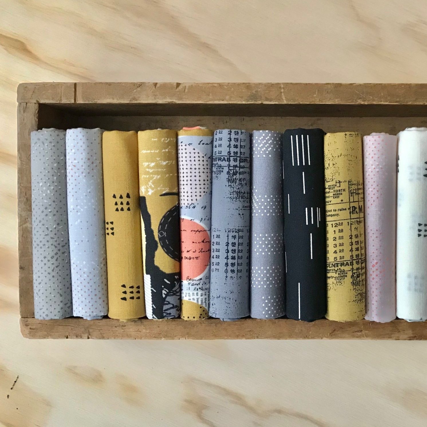
So, you already have your copy of the Wild Oranges pattern? Now, let’s talk about those fabric choices. Will you be working from your stash or featuring a fabric collection with your Wild Oranges quilt? Here are two possible flows for selecting fabrics.

I so appreciate your suggestions about possible background colors for my red, red, red economy stars quilt! Here I try out a few and come up with a plan that strikes me as adventurous.

It is the first day of August, the warmest month, when the wild days of summer burn themselves out. I have begun a new quilt with green as my mental starting point. Lively, living green. It brings the energy of growth and the relaxing cool of the shade.

Over the course of a few days, I’ve created a new group for my Pas de Deux quilt. This one turned out nothing like the original group. Instead, it was created by making color connections with surrounding blocks, and experimenting with fabrics on hand.
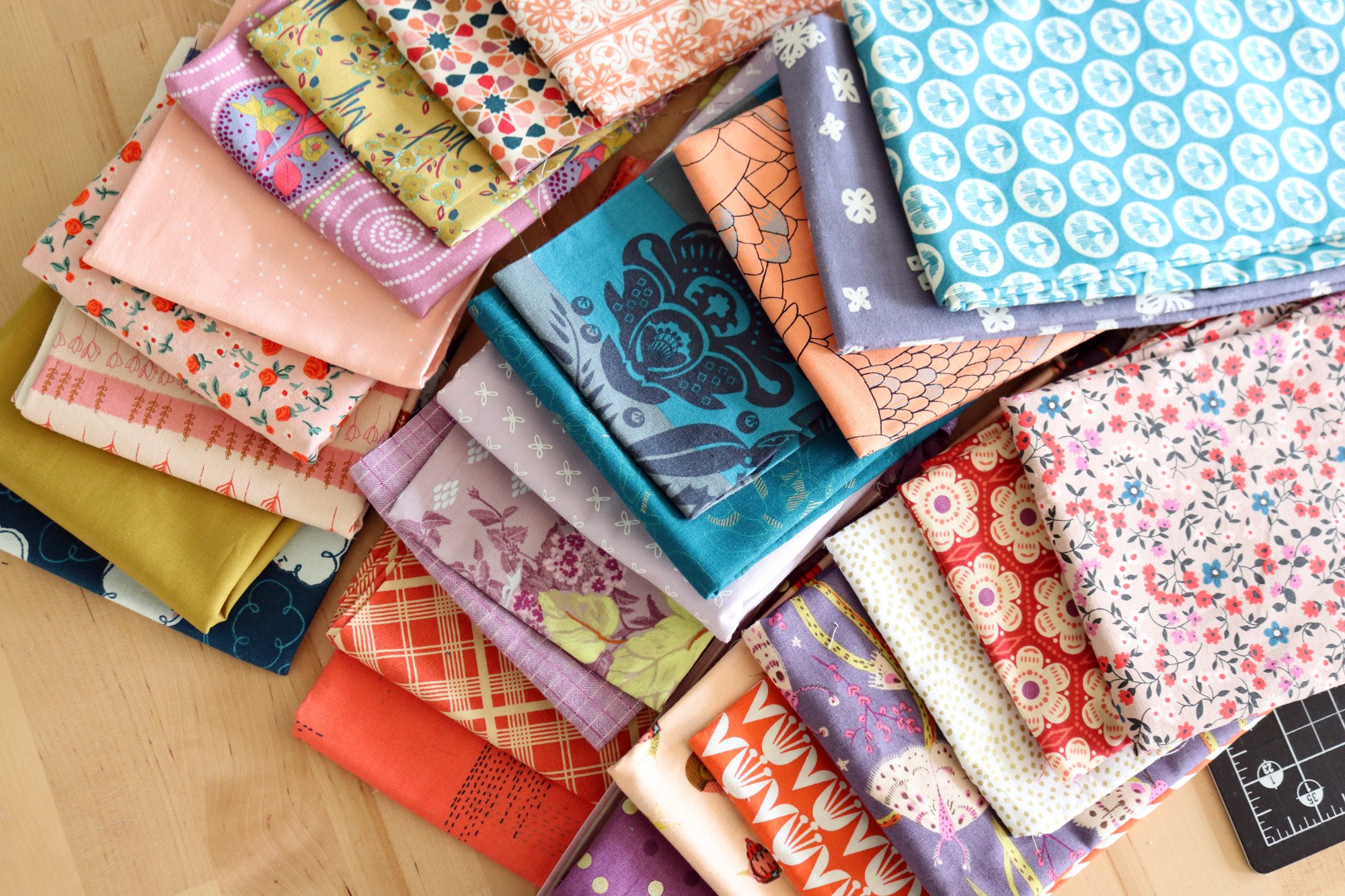
For my second version of Pas de Deux, I’m choosing a color palette for the quilt as a whole. I want a limited palette of 3 or so colors, so that the patchwork groups naturally harmonize and the edges between them can blur. Here’s how I pulled together fabrics, questioned myself and spiraled finally toward a decision.

Your Pas de Deux beginnings are inspiring me today. I’m feeling the tug to finish the scrappy rainbow version I’ve already started, and begin a fresh Pas de Deux quilt with a limited palette. Why not? It’s not, after all, a particularly time-consuming quilt.

I love scrap quilts! Each one is special and totally unique. Here are some tips for planning a scrappy sampler quilt like Pas de Deux. Start with Your Scraps, Combine Colors, Develop a Theme and Avoid Total Overwhelm!

Is making fabric and color choices taking way too long? When fabric choices feel disjointed color-wise, repeating fabrics and colors will help, but first you need to feel certain about those choices. Here’s how to refine and clarify a color scheme for patchwork.
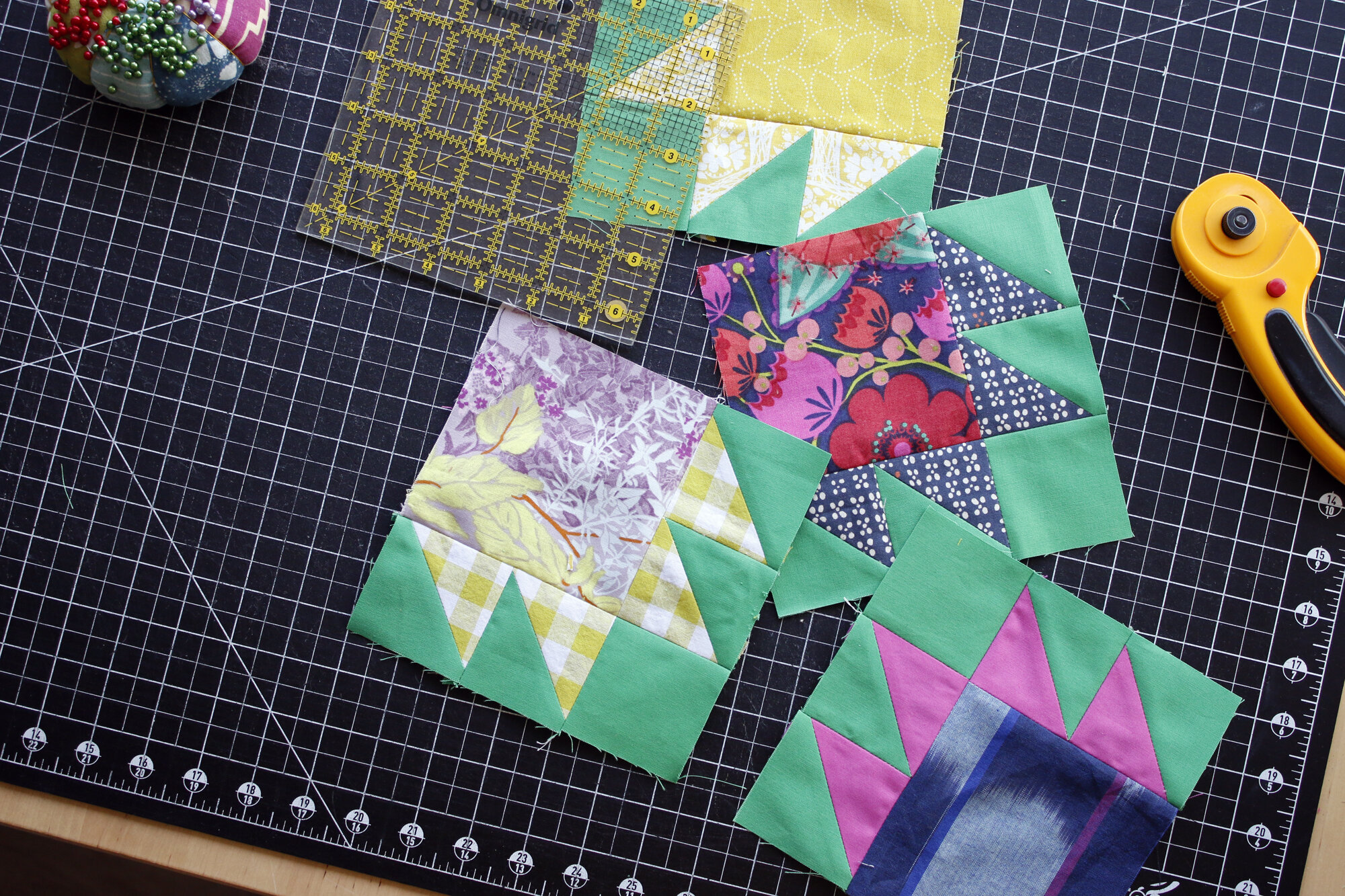
Have you ever selected fabrics that match beautifully and yet something still seems so very off about the combination? Sometimes different fabric styles can create friction between fabrics, even when the colors delight.

I always try to keep a balance of limiting and helpful fabrics on hand. The limiting prints often inspire my color schemes. The helpful prints allow me to reinforce my favorite colors, all while creating space for the showy fabrics to shine.
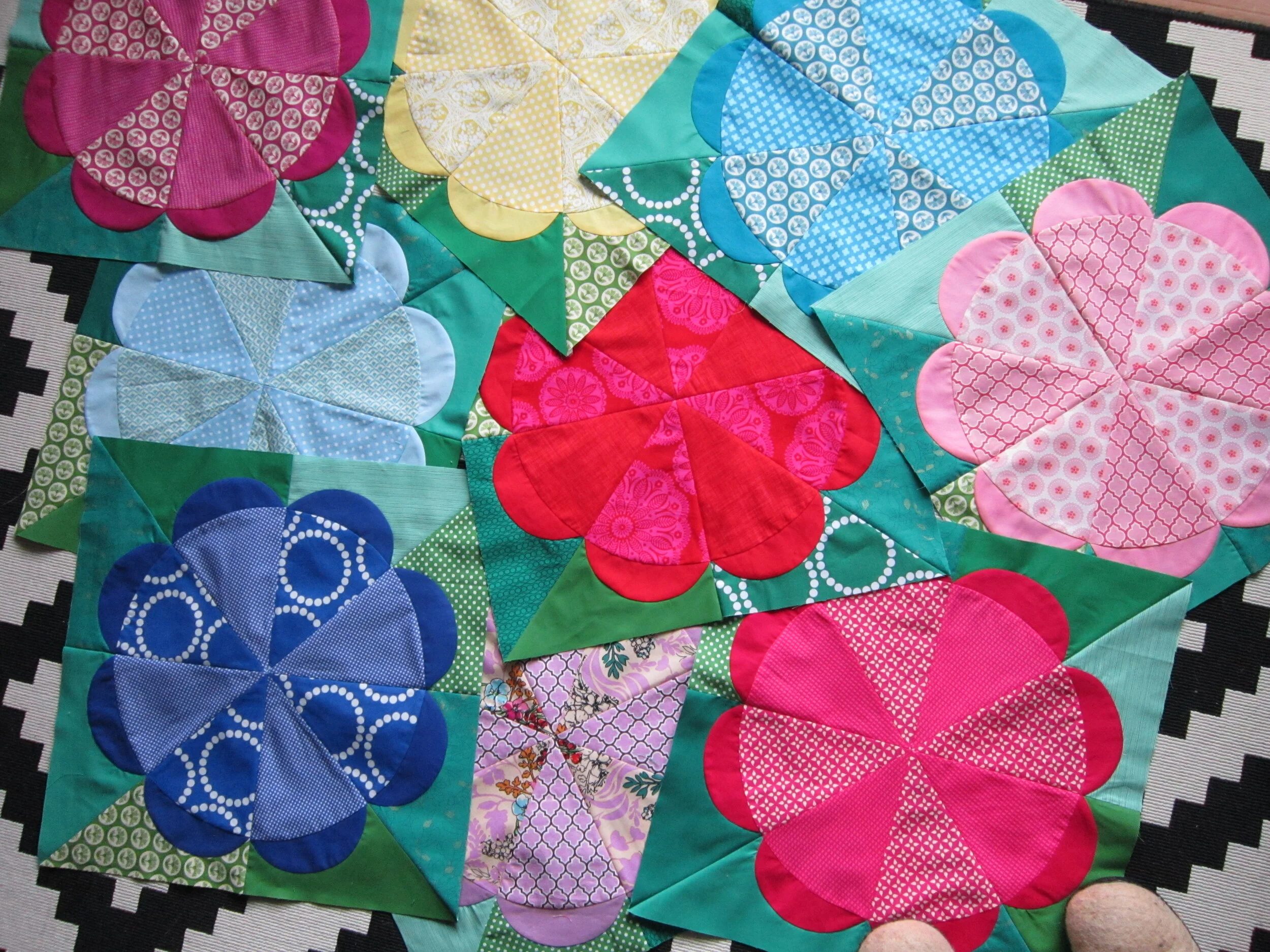
The world is bursting with inspiration and you are full of fantastic palettes just waiting to happen. Let’s practice finding and following inspiration via Experiment 12 in my book.

A Picnic at the Park, anyone? Story gives you something with so much depth and texture to inspire your color and pattern choices. If you haven’t used story before, now is the time to give it a try!
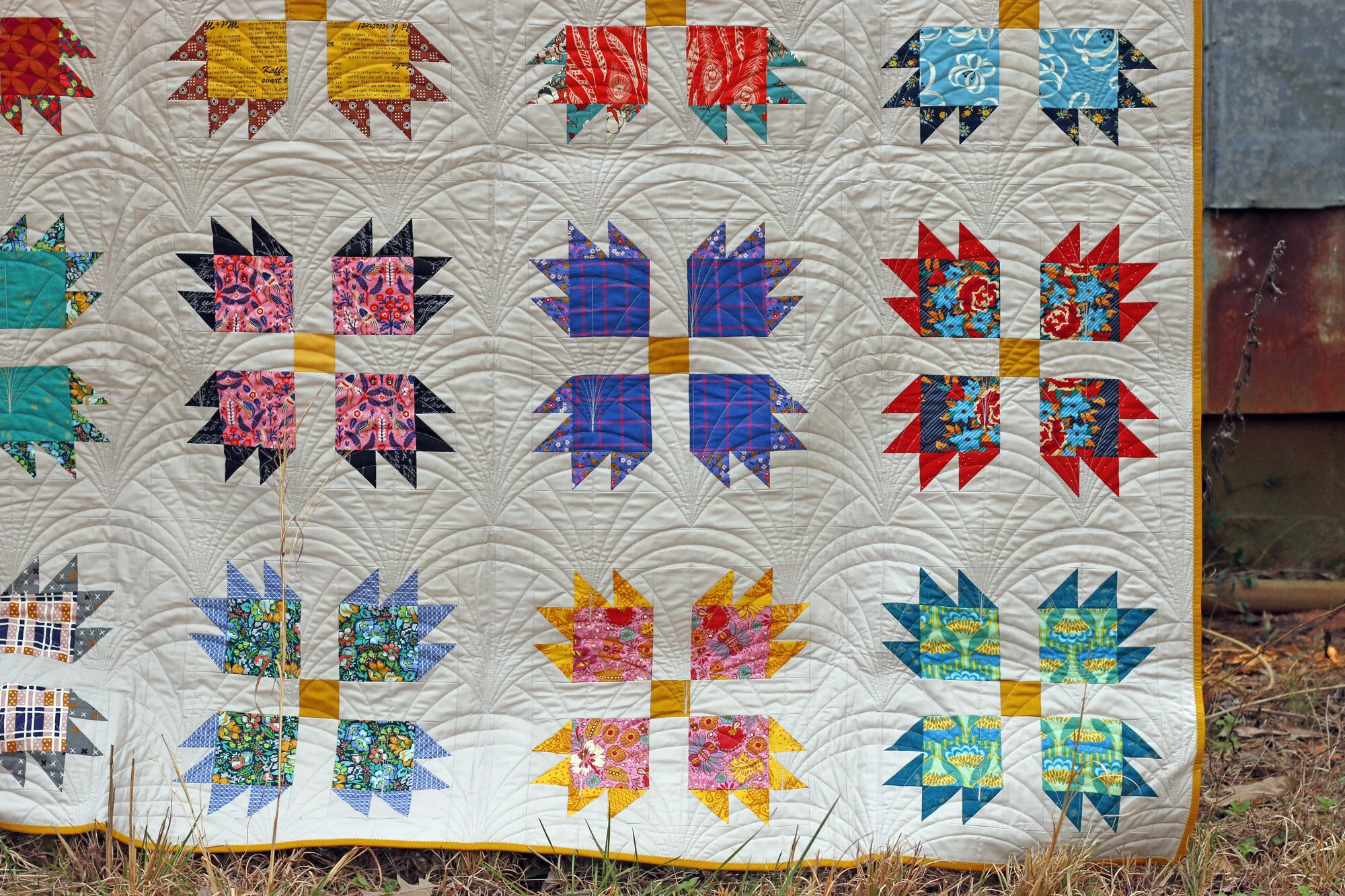
Have you ever tried to replicate a color scheme, say from another quilt, painting, etc? Sometimes you get the colors right, but the collective effect doesn’t satisfy. Pay attention to the artist’s use of neutrals!

Have you ever struggled to decide if certain red fabrics “match” or are too different to work well together? Fabrics don't have to match. Instead, when we put several types of “red” in one fabric pull, their perceived differences fall away. More variety can actually create a stronger sense of unity!
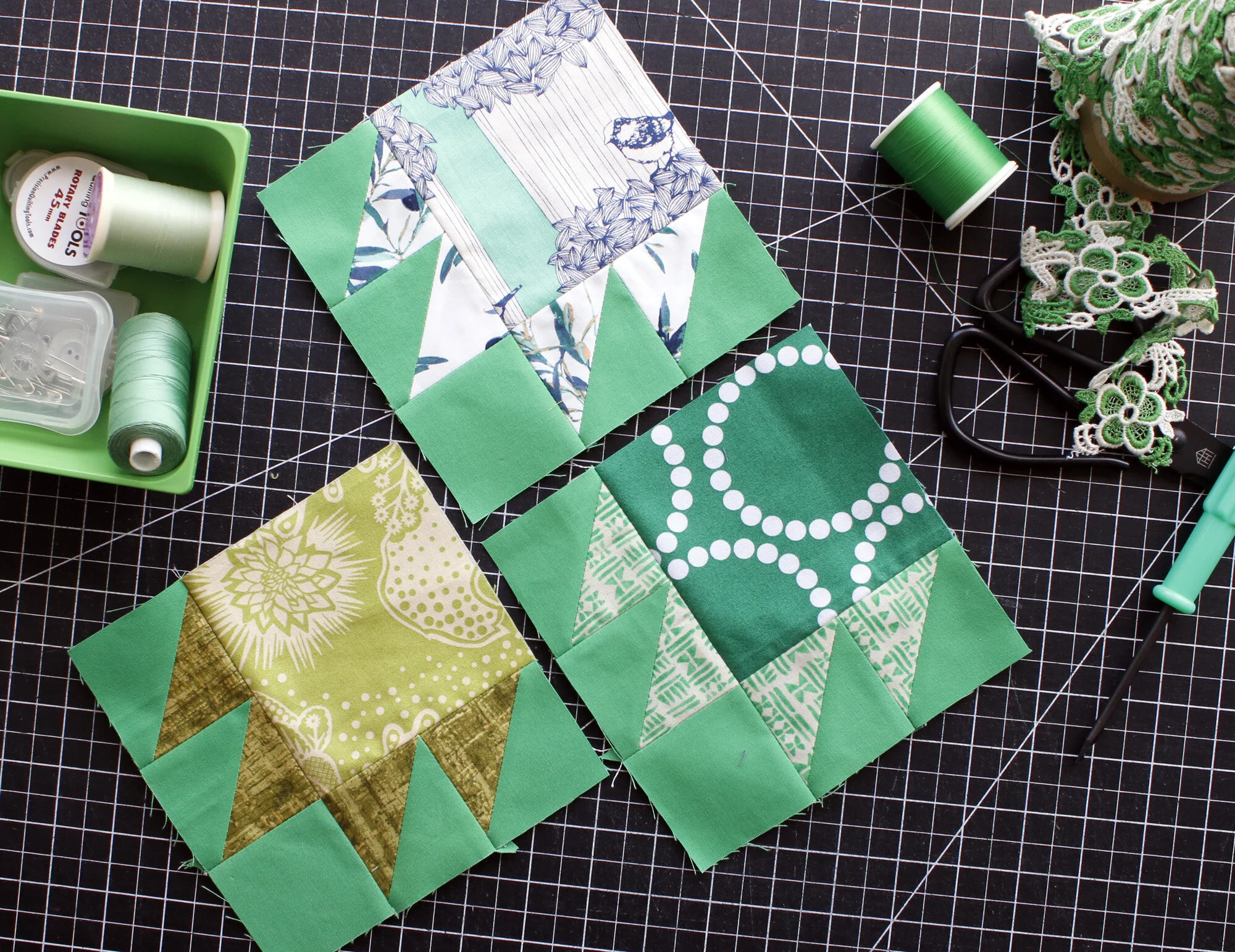
Value can be a confusing concept. The term is a little odd, and its meaning stands apart from color itself, though the two are related. It’s an important concept for all quilters to explore!

Using all the colors doesn’t necessarily mean creating a classic rainbow quilt. When you think of the rainbow, you probably imagine those hues that appear in the sky. But, if rich, pure hues aren’t your cup of tea, don’t write rainbows off yet.

The swatch challenge in this chapter is a particularly good one. On page 42 the challenge starts with choosing one color swatch that particularly appeals to you today. I chose Mauve, which is the warm, dusty purple shown on my page at top left.

What is choosing fabrics? For me it is the moment when a quilt transforms from concept to concrete. The idea comes alive in colors and patterns that pull me in and onward. Discover prints, solids + giveaways for the Penny Sampler.
a perfectly Delightful PINK bedroom