how to Refine a Color Scheme for Patchwork
The first steps of a big project are often the hardest. Each decision feels critical and with little to build on, it’s easy to get lost. Over the last weeks I’ve sorted out what techniques I do and don’t like in terms of sewing words for my Patchwork Selfie. That progress was certainly hard won. Now, what to do next?

Feeling stuck, I sewed a handful of friendship star blocks for the Personality section. They’re pretty and simple, but choosing fabrics for the surrounding areas was anything but. I love that burgundy floral print (Overachiever by AMH), always have, but as much as I want to see it in this quilt, it feels wrong here. Flowers, flowers everywhere! I think I’d like something simpler.

Nothing from my original fabric pull worked in that spot, as a substitute for the burgundy flowers. After lots of deliberation, I settled on this rusty orange-brown arrow print (Hello Bear Cotton Bark) instead.
It took way too long to make this choice. Looking back at my work-in-progess on the design wall, it feels disjointed color-wise. Repeating fabrics and colors will help, but first I need to feel more certain about those choices. Time to refine and clarify my color scheme.

First I pulled out my scraps from the project to zero in on the colors already used. I see a warm, autumnal color scheme in large part inspired by the colors that I’ve recently realized I prefer to wear. I do like where this is going, but I need to make it more concrete so that fabric choices are easier going forward.
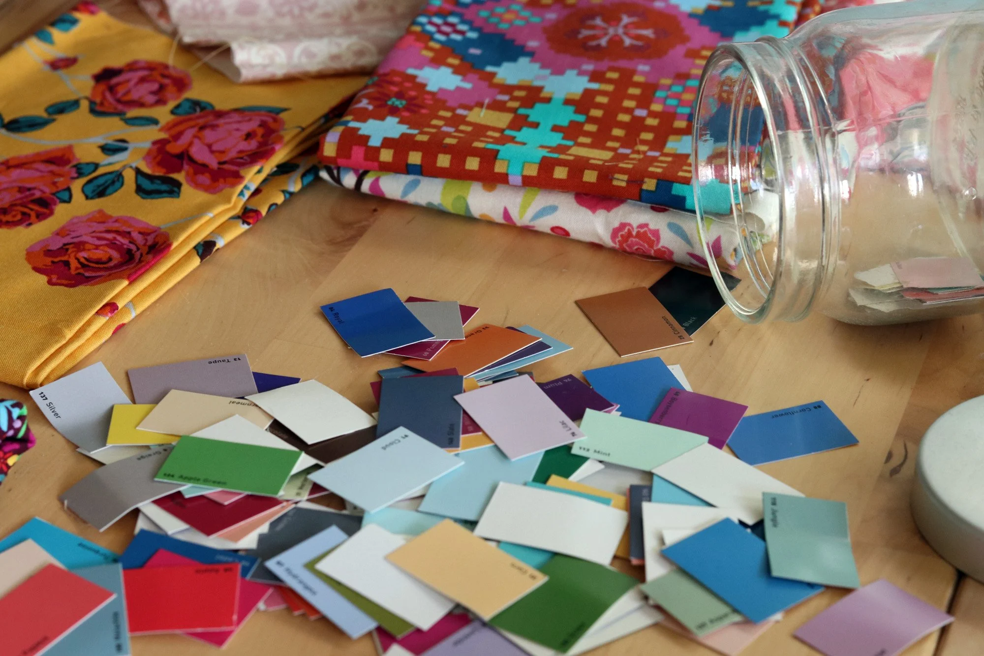

Color chips to the rescue! I keep the color swatches from my book A Quilter’s Field Guide to Color in a jar nearby. Pouring them out releases a colorful chaos, but as we know chaos often goes hand in hand with creativity. All those possibilities, each distinct and concrete, lend themselves beautifully to this process. Slowly, meditatively, I sort through the swatches choosing my ideal shades.

One advantage of working with the color swatches is that they force me to define an ideal shade of red or teal or brown. And importantly, this is independent from my already-selected fabrics. Thus, even if my fabrics don’t precisely match the ideal shade, I’ve designated true north. Now I can confidently add additional fabrics as needed with a clear color scheme in place.

Low volumes: Cloud and Natural.
Teals: Jungle, Aloe, Teal.
Warm Autumnal Shades: Gold, Cinnamon, Coral, Amber, Ruby

Dark values: Cloves, Coffee, Graphite, Cadet
More Rich Autumnal: Rouge, Wine, Goldfish
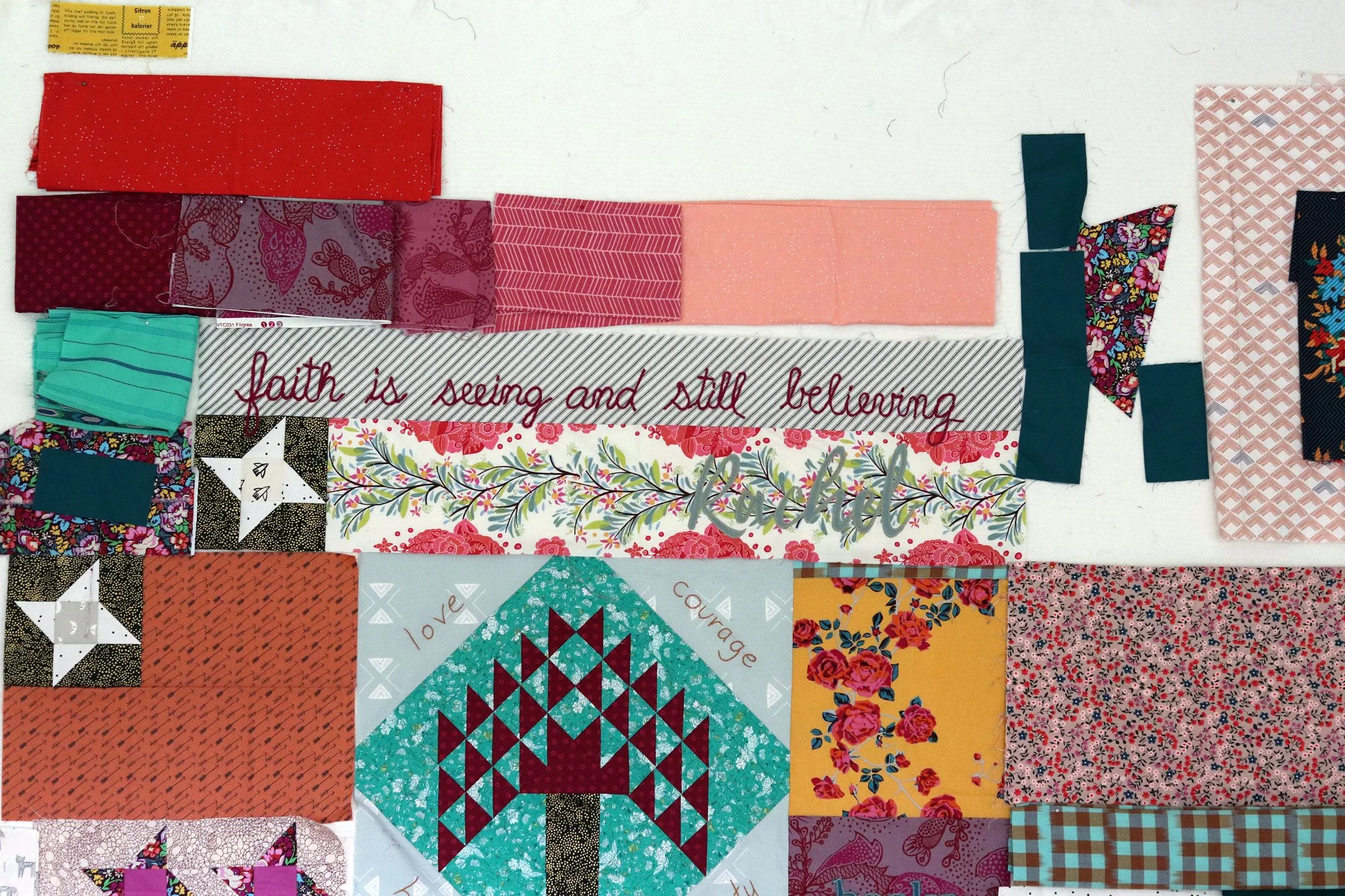
With renewed clarity I returned to the design wall and began choosing fabrics in advance for future blocks. Now it’s so much fun! Once everything starts clicking and my key colors are reinforced by repetition, the project transforms into something that gives me energy and joy.
I see a bit of a rainbow developing as the colors move upward toward the top left corner of the quilt. That yellow fabric marks the future location of a sun block for the Beginning section. Above the “faith is” block, I’m creating a burgundy-to-peach color blend. Plus, I made a plan to use that Overachiever burgundy floral in a series of blocks that repeats through the quilt. This way it’s a strong presence, but not as a large block of fabric.


Yay! I’m excited and can’t wait to get back to it. This new heart block for my Favorite Things section is making me smile each time I see it.

And you know what? The colors are spot on.


