Context: Quilter's Color Quest

This June in Quilter’s Color Quest we will unpack two more chapters in my book, The Quilter’s Field Guide to Color: A Hands-on Workbook for Mastering Fabric Selection.
Today we’ll focus on Context, a tool for creating color palettes. Flip to page 60 to join us.
This chapter brings into focus the fact that our perception of color is fluid. We see each color in relation to its surroundings.
Have you ever struggled to decide if certain red fabrics “match” or are too different to work well together? On page 62, I hope to convince you that fabrics don't have to match. Instead, when we put several types of “red” in one fabric pull, their perceived differences fall away. More variety can actually create a stronger sense of unity!
“As the brain takes in color it processes it, with the goal of creating meaning. Because of this, colors seem to change right before our eyes when they are placed first beside one color and then beside another.”
In the checklist for creating color palettes found on page 63, I pointed out that designers usually use many varieties of one hue in a single fabric collection, in order to create a “more nuanced, lively feeling of that hue.” In fact, designers often do this even within a single fabric!

Here are two charming snail fabrics by Heather Ross, part of her 20th anniversary fabric collection (in stock now at Sojo Fabric or preorder from Purple Stitches in the EU). Let’s look more closely at these fabrics, by way of example.
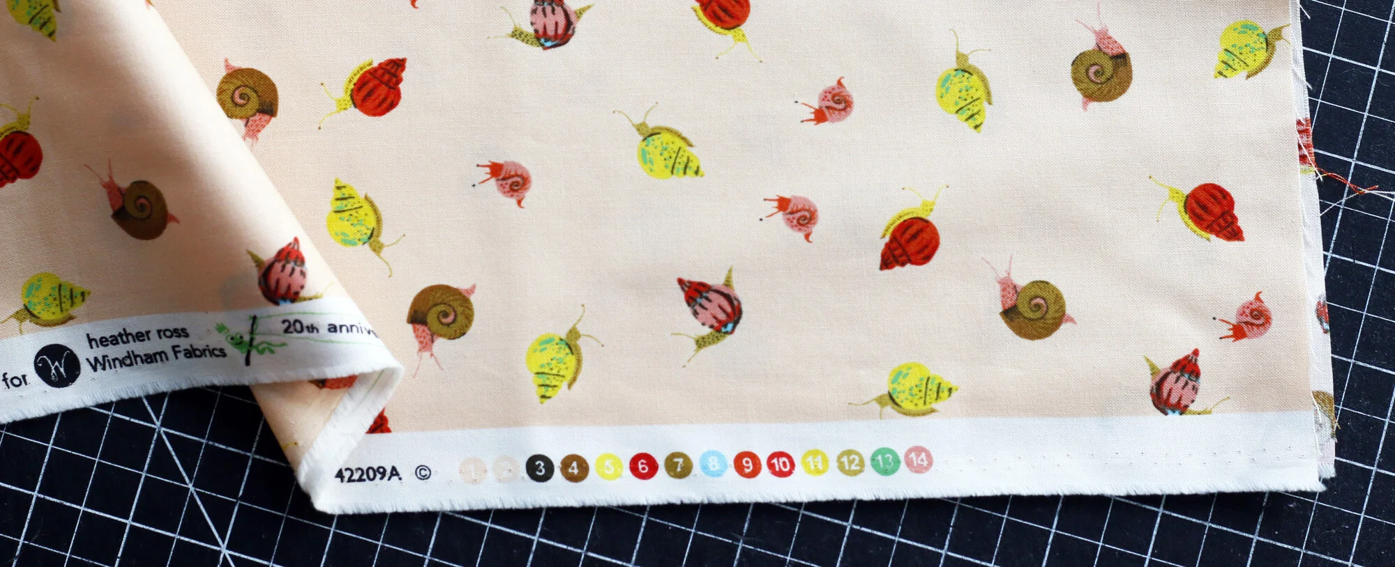
Peach snails is one of my favorites. These colored dots on the selvedge display the colors included in the print. Notice that Heather has used three shades of brown, two different yellows (one more golden, more more lime), three different reds, etc. The color palette is rich, with lovely depth and nuance.

In contrast, the selvedge confirms that this print uses just one shade of blue and of red. Do you see how this print is relatively simple and “flat” compared to the example above? Both will work beautifully in patchwork - there’s no “bad” fabric here. My point is that when you think of your finished quilt, do you want it to feel more nuanced and rich, like the Peach Snail, or more one-dimensional?
If you’re working really hard to match fabrics exactly, you’re headed toward the second example. Consider relaxing and not working so hard. A little variety can really be a beautiful thing!
Take the Challenge
The swatch challenge on pg 65 is a straightforward exercise. Isolate and mix and match colors to see how your perception is affected by context.
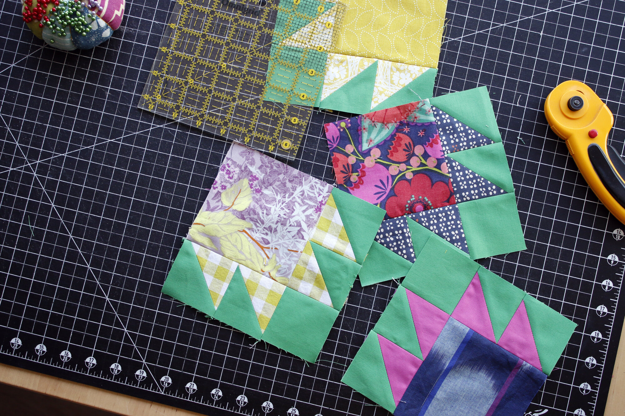
The Patchwork Challenge for Context is more challenging. I’m asking you to try to reimagine a fabric that you struggle to use, by giving it a new context. For example, I really like this floral print with the periwinkle-denim background. But, when I try to use it in patchwork, I tend to get stuck. Via this exercise I realized that I typically pull warm tones from the flowers when I try to find coordinating fabrics for this print, like so:

The resulting fabric pairings aren’t necessarily bad, but they detract from what I like about the print.
Ok, so how could I give this print a new context? Any ideas?

Instead of using a warm color or any of the “fun” colors from the flowers, I zeroed in on the darker hue of the leaves and stems. In my example bear paw block, I’ve combined the floral print with a cool navy fabric and a simple neutral. In this context, the print feels delicate. I realize that the next context allows the print to maintain the feeling that drew me to it in the first place.
This week, do one or both challenges for Context. Share a photo of your results on Instagram with #QuiltersColorQuest and #QuiltersFieldGuidetoColor. Each month I’ll be drawing one random winner from those who use the Color Quest hashtag. Each photo is a chance to win fabric!
May’s winner is @SewLadyBug. She wins the cheery rainbow bundle I curated at Purple Stitches (now sold out). I’ll be in touch about delivery of your prize! June’s prize will also be a specially curated bundle to accompany one of the color themes we’re exploring this month. I’ll pop in later on to reveal that bundle as we continue on Quilter’s Color Quest.