spiraling toward a Fresh Palette
I adore mixing and matching fabrics! When sunlight in streaming into my sewing studio, I could make color palettes all day long. The natural light makes the colors sing and gives me energy to explore.
Like those starting fresh in Round 2 of the Pas de Deux block-of-the-month (sale ends today!), I’ll begin a new sampler quilt this April. For my second version of Pas de Deux quilt I plan to take a different approach. Rather than thinking of each patchwork group as a stand-alone color palette, I’ll choose a color palette for the quilt as a whole. I want a limited palette of 3 or so colors, so that the groups naturally harmonize and the edges between them can blur.
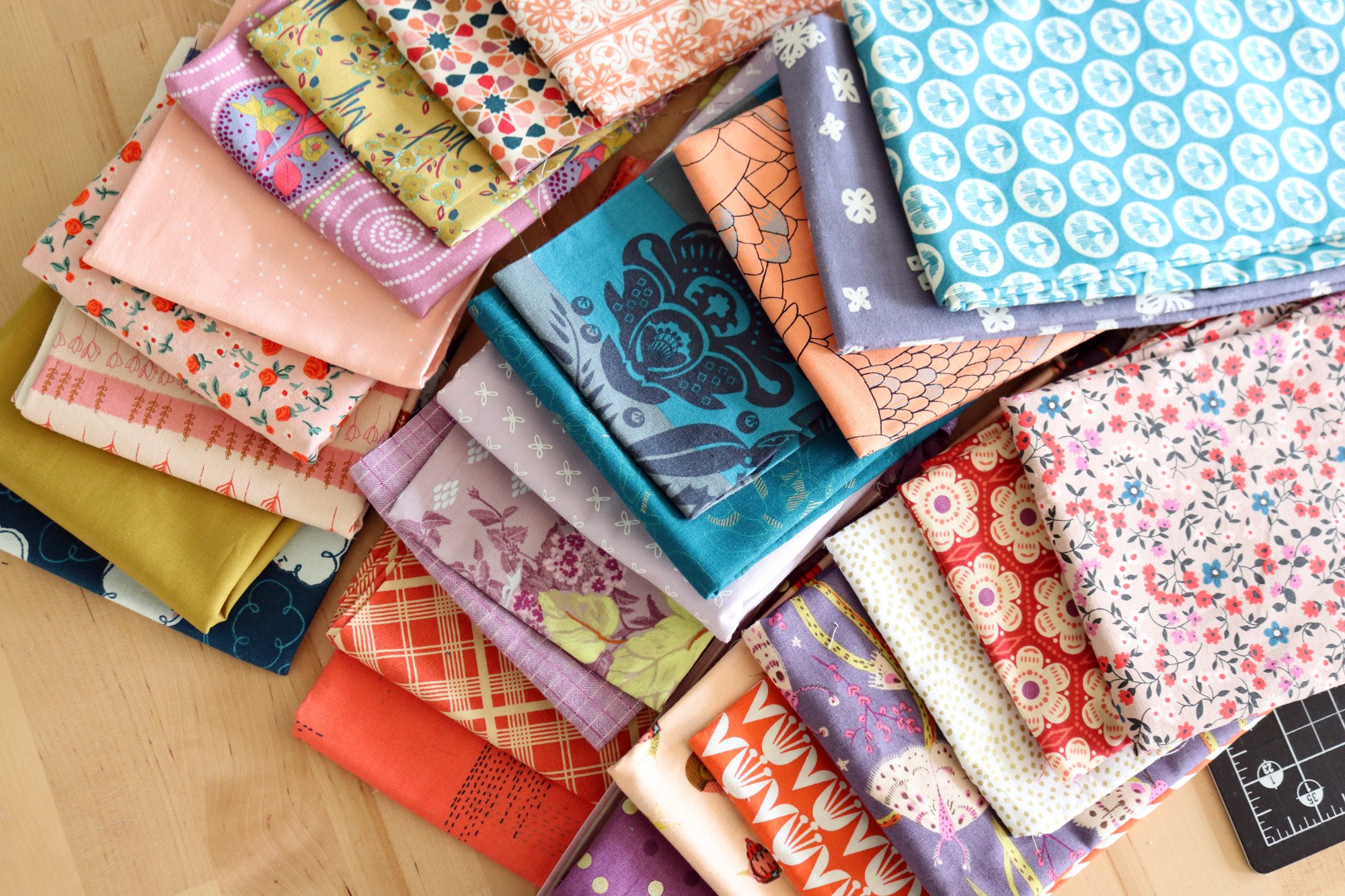
On a sunny day last week, this happened. I started with one multi-colored fabric scrap, whose color scheme I particularly like, and pulled all these fabrics based on that inspiration print.
This starburst print at top left was my inspiration print. It’s a scrap I received from my friend Svetlana @sotakhandmade. I’d love to buy more of it. Do you know who/what it is?

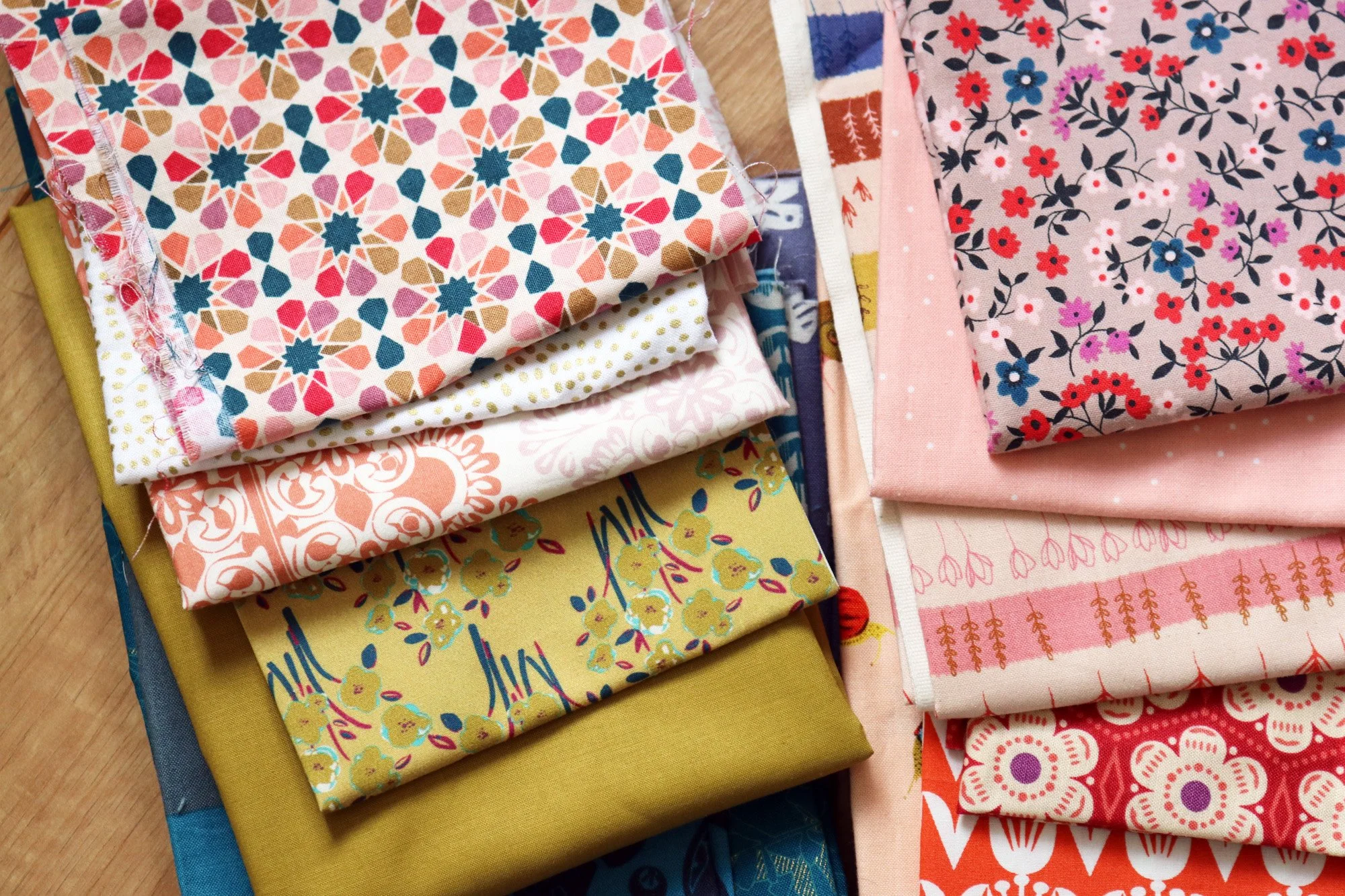
Here’s that fabric pull sorted out into color families. The main colors are peach (which darkens to coral) and lots of purple, plus accents of gold and petrol blue. I feel satisfied with this palette’s sweet, uplifting vibe, but is it limited enough for my goals? Best to sleep on it.
Sponsor of the Week
Purple Stitches
This UK-based quilt shop offers unique modern fabrics that you don’t see around everywhere. A good example is Millefleur by Jessica Nielsen. She is a designer with Danish roots who lives now in The Netherlands. What a lovely group of fabrics, at once soft and modern
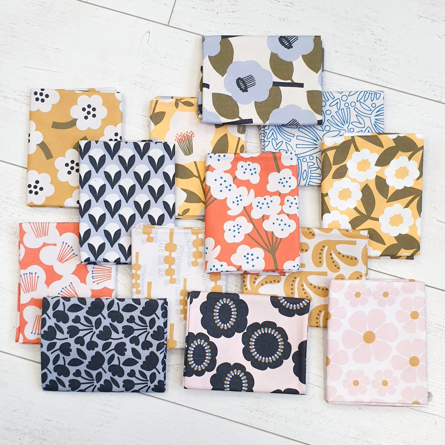

The next day I set aside my first palette and sought to try something totally different. This time I was drawn to the Rifle Paper Fabric Co. crane print on the black background (upper right). This is a fabric that always intrigues me, but hardly ever mixes well with my color schemes. Here are the fabrics I pulled to coordinate.
Yikes - black and orange! For me, that’s a no-no combination. I find it so harsh and so Halloween, and yet, I do love the crane print. Hmm.

I attempted to soften the black/orange vibe by adding gray and cream fabrics, plus more blues. It looks calmer, right?
Then it struck me - this fabric pull reminds me of a Mosaic Contest I created, once upon a time. Click over to Evening Ember, and you’ll see what I mean. I LOVE that color prompt. Could I push the palette further in that direction?

Yes. Now I really like it! It has darks and lights and strong colors, but doesn’t overwhelm me. I think this could make a really powerful Pas de Deux quilt.
Is that what I want? I still wasn’t ready to commit.


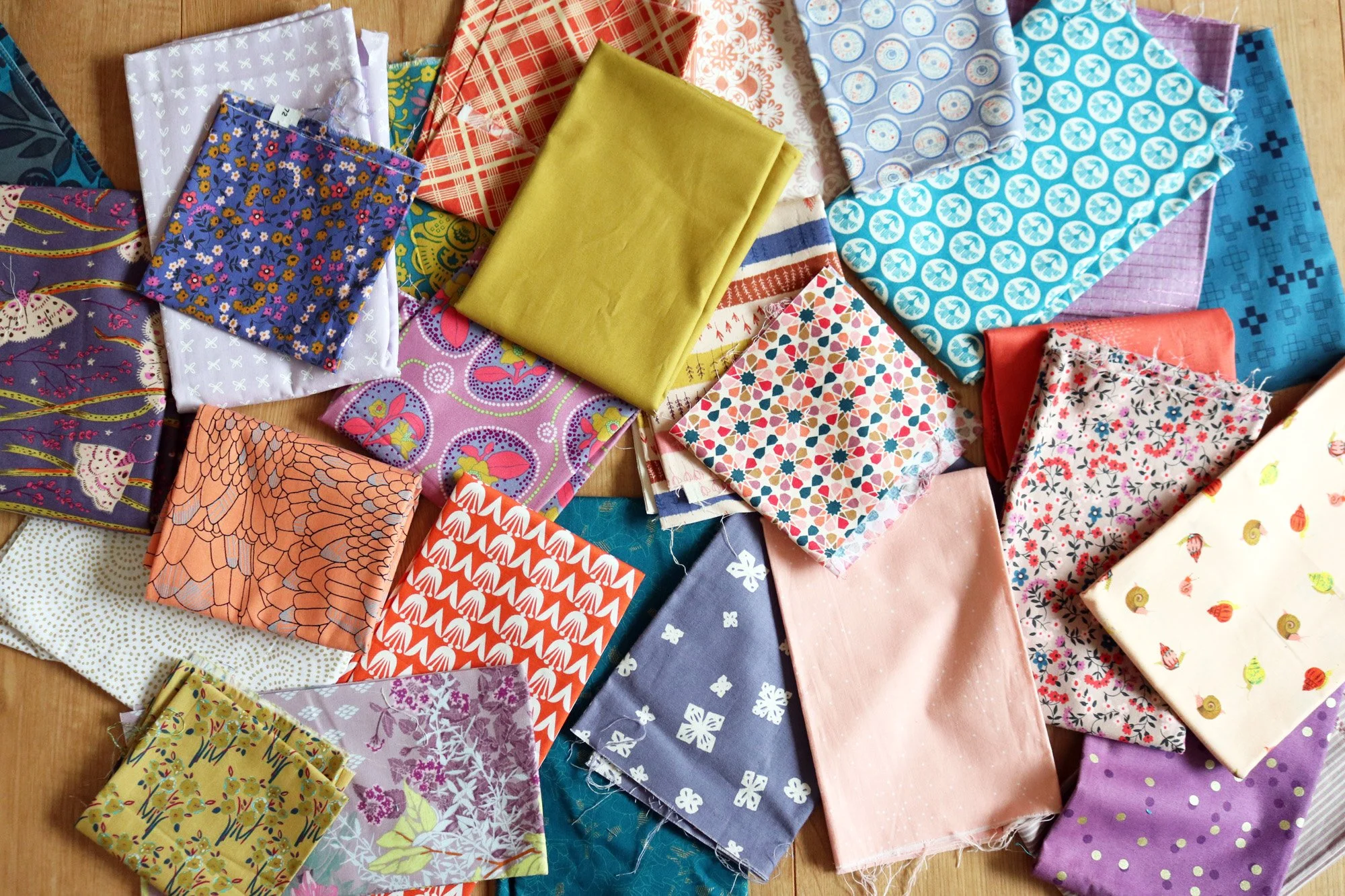
Then I wandered a good twenty minutes down this rabbit hole. These are fabrics I pulled last fall for an auto-biographical quilt. I adore the colors and fabrics. It’s very ME. But, the process of making the blocks wasn’t so fun, so I’m going to re-think the whole project. Unfortunately the lovely color palette is not limited enough for the Pas de Deux quilt I have in mind. That’s ok, I’ll definitely sew a quilt in these fabrics later.
So, back to the beginning! Here’s my first fabric pull, scattered again on the floor to see it with fresh eyes. And I like it. It’s not too dramatic or too broad, and I feel at last that it’s the one for me. Sometimes you just need to spin your wheels a bit to be really, really sure.
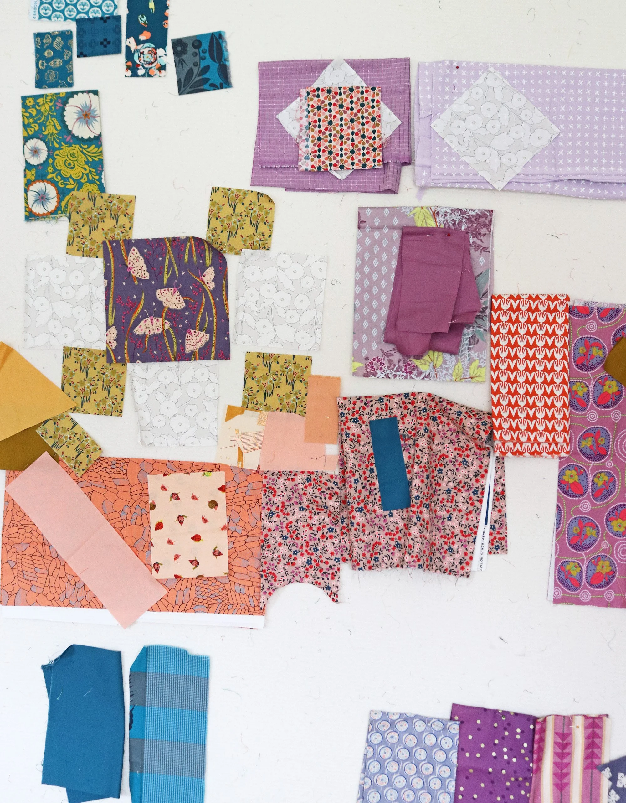
I’ve put some fabrics up on the design wall to imagine how they might work together. I’m sure that lots will change, but this feels promising. I’ve started sewing already!