Neutrals: Quilter's Color Quest

Exploring Neutrals is Part III in my book, The Quilter’s Field Guide to Color: A Hands-on Workbook for Mastering Fabric Selection. I think of neutrals as black, white, brown and gray. Let’s take a closer look at each as we continue Quilter’s Color Quest!
Have you ever tried to replicate a color scheme, say from another quilt, painting or even a photo of a home or garden? Sometimes you get the colors right, but the collective effect doesn’t satisfy. I’ve noticed this can happen if I neglect to imitate the artist’s use of neutrals.
Yep, neutrals are easy to overlook, but they have serious impact.
This section of my book takes time to examine how black, brown, white and gray each transform color. I hope you find this thought-provoking and useful, next time you are developing a palette.
Don’t forget, when you read the section on gray and brown, to look at the pertinent color swatches to visualize the colors up for discussion. You might also like to compare those swatches to your fabric stash, if you have one, to get an idea of what kinds of grays and browns you have on hand.
When you look at my quilts, you might not think that I give neutrals much thought. For sure, color is my muse. Neutrals are more of a means to an end in my work.
But, actually, I have adopted certain characteristic ways to use neutrals over the years. For one, I don’t often use true white. I like to have little white in my work both for practical reasons (it stains easily) and because it makes the overall project less saturated.

For example, this is one of the quilts I made for my book, using the Flower Pod bear paw block. Instead of white, I used Sand Dune by Freespirit, similar to the Sand swatch from The Quilter’s Field Guide to Color. (This reminds me of natural linen, which I don’t use much for patchwork because it frays so easily.)

Sponsor of the Week
Purple Stitches
Charming fabrics by Mia Charro are newly arrived at Purple Stitches. Whether you’re a cat fan or a dog lover, these fabrics are special enough to become the star of a project.
I also adore this coordinating print!

More often my quilts don’t have a white/low volume background at all. Very often I choose to fill up the “canvas” with color, rather than have neutral backgrounds.
I also tend to sprinkle black in most of my projects. I like the zing of contrast it brings!

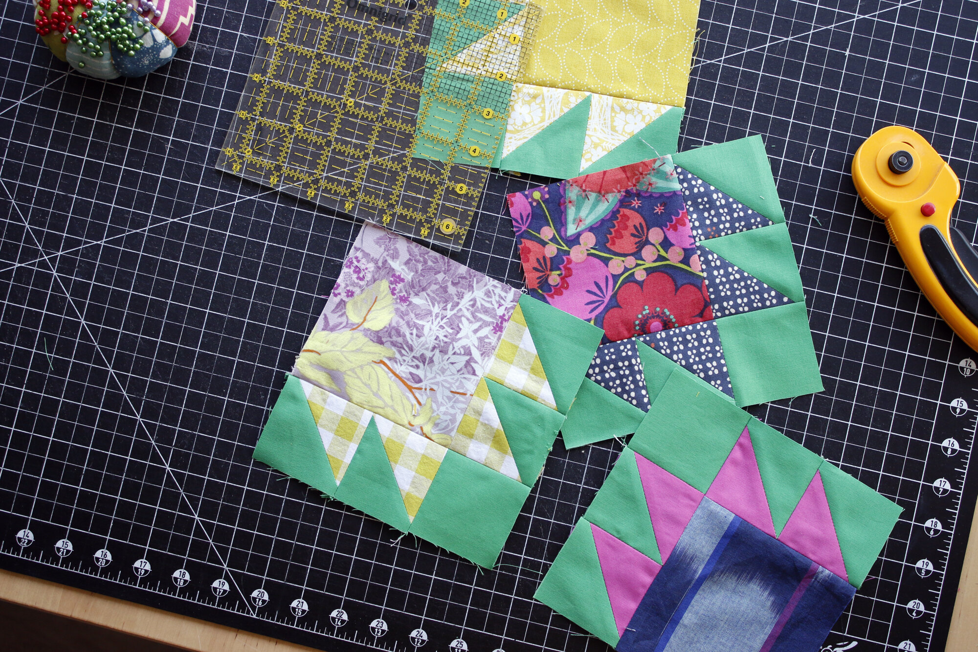
Can you spy black, brown and gray in this Flower Pod quilt? The pink block with the black claws is one I made in response to the “add black” challenge; while the yellow block with brown claws above developed from the “use brown” challenge. More details on those challenges below.
This quilt really did develop from blocks made in response to the patchwork challenges in The Quilter’s Field Guide to Color, with a few extra blocks added. A consistent background color pulls it all together in a colorful, scrappy kind of way.
Take the Challenge
The swatch challenge on pg 75 encourages you to play around with making palettes using the different neutrals. Make one palette for each neutral, rather than a combined multi-neutral palette.

I suggest you make the palettes one at a time, so that they don’t visually compete with each other. Here’s what I came up with for gray, using the Coyote swatch. Just having fun!
The Patchwork Challenge for Neutrals actually combines two challenges from the original version of my manuscript. For space reasons they’re combined now, but I hope you’ll do both.
Add Black: Find a black solid or print that you’d like to use and compare it with a bunch of prints in your fabric stash. See if you can find a print that actually looks better when spiced with black. The goal here is to experiment with high contrast. Maybe you’ll discover something unexpected.
Use Brown: What kind of brown fabrics do you have? Are they warm, medium or cool? Follow the rest of the Patchwork Challenge on page 75 to use a brown fabrics you have on hand to make a satisfying patchwork block.
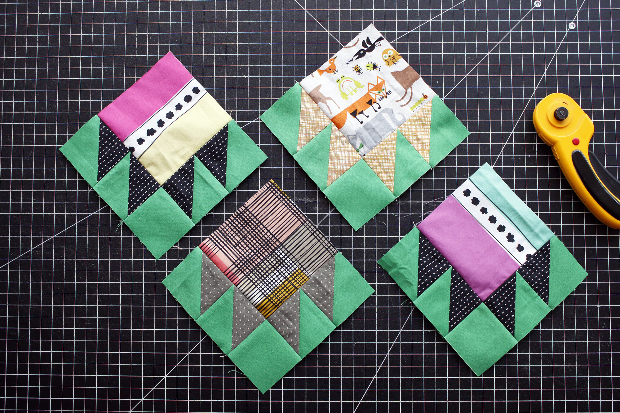
I took it easy with my Neutrals challenge this time. I chose prints that already had black or brown in them and followed the fabric designer’s lead. I really like how the “add black” blocks came out. The top right block with the warm brown clams pleases me too, but the bottom brown claw feels a bit muddy. I tried to work with a gray-brown (tricky!) and think it doesn’t play so well here with my vibrant Kona fern background.

Ah well, you live and learn! Fortunately, any less favorite blocks will blend in with the rest, and the overall effect certainly makes me smile!
This week, do one or both challenges for Neutrals. Share a photo of your results on Instagram with #QuiltersColorQuest and #QuiltersFieldGuidetoColor. Each month I’ll be drawing one random winner from those who use the Color Quest hashtag. Each photo is a chance to win fabric!