Planning my Teeter Totter quilt
I do so love the quilt-planning process! In the beginning it feels like anything could happen, and that process of becoming is such a pleasure.

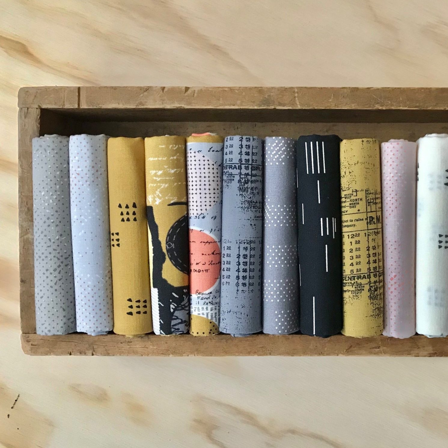
So! For starters I’ve decided on an ombre colored background for my sew-along Teeter Totter quilt, as with this original version. However, I will use fewer colors and colors more alike in value so that the background is subtly ombre, rather than the above extreme of white-to-dark-red.
I like the idea of green as my background color, but I am low on those solids. No surprise, as green is one of my favorite colors. Of course, I could buy more, but what if I challenge myself to use a color that I often neglect? I do have a thick stack of purples that have been waiting patiently for my attention.

Warm purples: Art Gallery Mauvelous, Kona Corsage, Kona Lupine, Kona Violet
Cool purples: Kona Lilac, Freespirit Lavender, Kona Morning Glory, Kona Heliotrope
So challenged, I came up with these two potential ombre bases. Each one contains four solid fabrics, the range on the left in warm purples and the range on the right in cool purples. Warm purples lean toward pink; whereas, cool purples lean toward blue. I’m especially wary of cool purples myself, but there is no harm in a little fabric play outside of my comfort zone.
A Warm Purple Palette
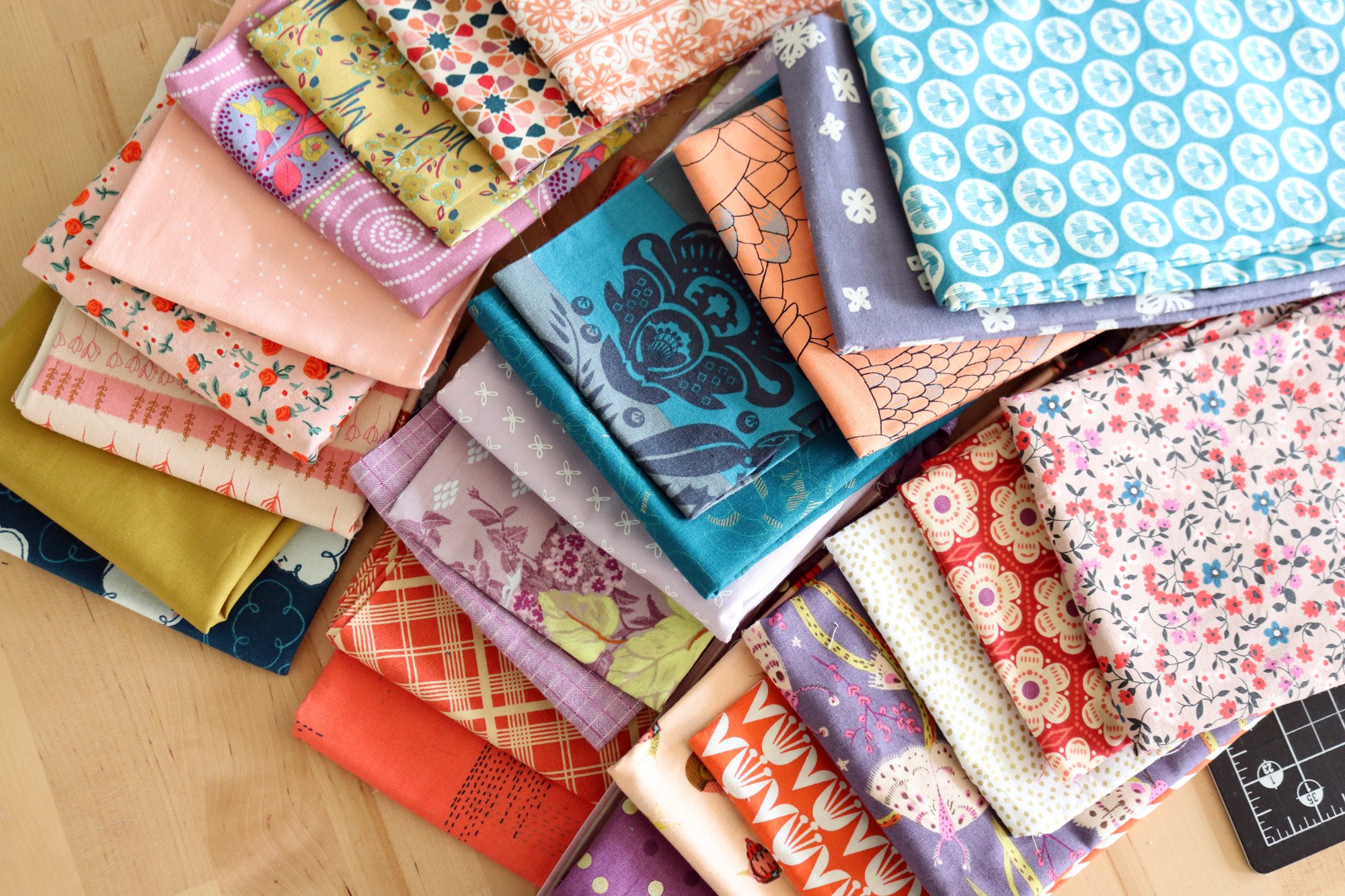
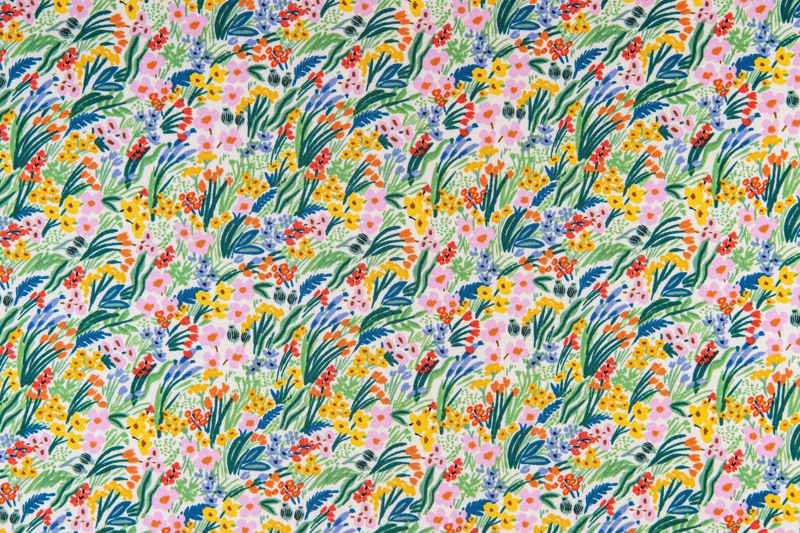
My inspiration for this fabric pull was spring flowers! I began by selecting basic helpful fabrics in limey greens, purply-pinks and yellows. The collection really cemented when I added two Rifle Paper Co. Bramble prints: the colorful Lea and the limy green Iris. These multi-color prints have blue, which I wasn’t planning to use, but they bring a flourishing, blooming energy that feels exactly like the joy of spring.


The Tangerine Dottie stripe was a last-minute addition. It ties in with the tomato red/orange bits present in some of the other prints and brings an unexpected kick. I would use it sparingly, as an accent color. I think that the Heather Ross frogs are really perfect here!
A Cool Purple Palette
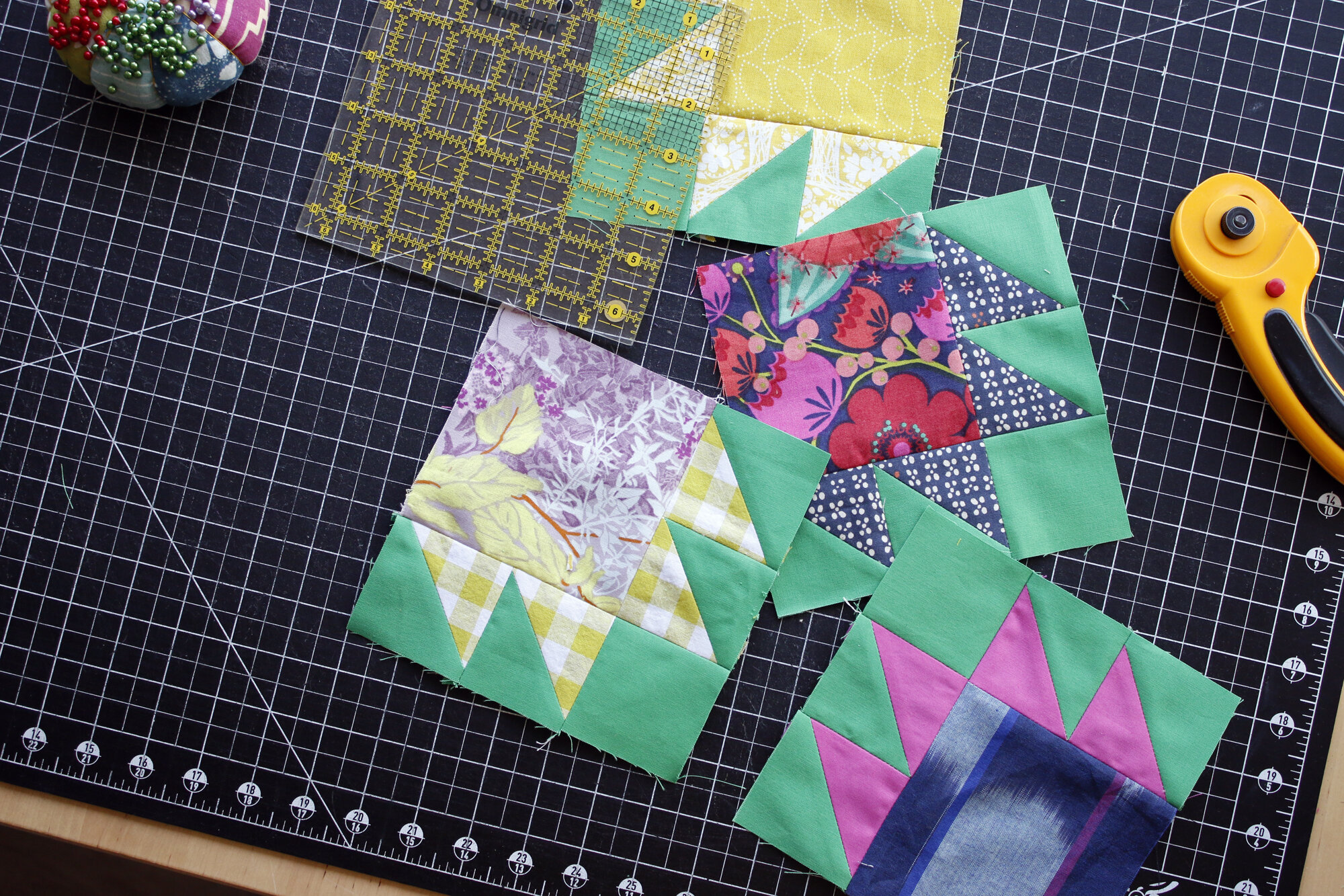
When working in a challenging hue, a complementary color scheme is a safe haven. A complementary scheme uses color neighbors on the color wheel. Cool purple flows easily with blues and blue-greens. Actually, I might not have included that perky aqua tone if it wasn’t for Tula Pink’s Tent Stripe in Petunia. That stripe includes an extremely cool purple, which is almost blue. If I’m ever going to use it, now is the time! Luckily, I quite like the fresh effect of that aqua shade with the rest.


I have several blue + purple combo prints which work so nicely in this fabric pull. I am definitely feeling the urge to cut into this group!
a Compromise?
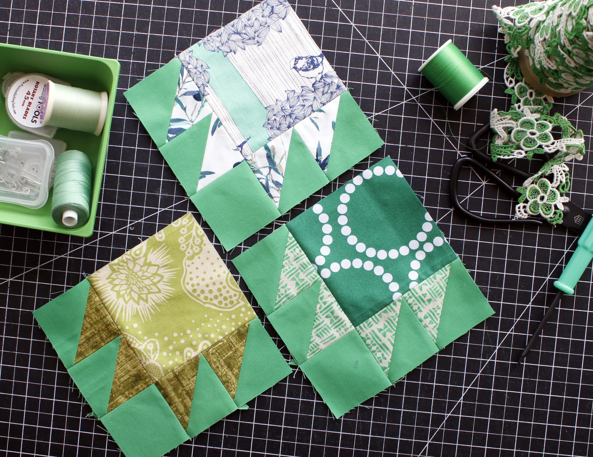
Both of these fabric pulls have been lounging for days in my sewing room. I will think that I have made up my mind, but then feel pulled the other way. Both really inspire me! So, maybe a compromise? What If I switch out the greens in the warm purple palette for royal blues from the cool purple palette, like so:

Hmm - - - I like it, but not as much as either of the original groups. Still, it was worth a try.
I shall have to make the difficult choice between my warm purple and cool purple fabric pulls, but I still have some time left. Our sew-along doesn’t start until May 1st. Until then, enjoy the fabric-gathering phase!