the one where I got Stuck
Sometimes color choices flow in a relaxing, meditative way. Other times…


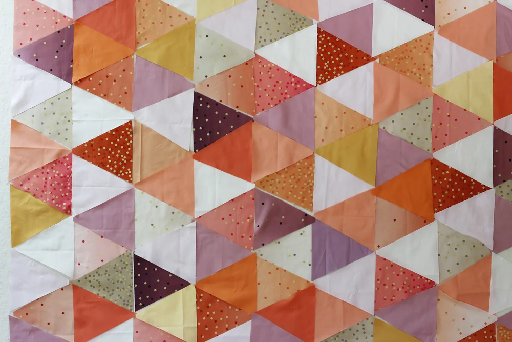
Today I’m working on laying out Rora’s quilt in warm colors, with Ombre Confetti fabrics and Paintbrush solids from Pineapple Fabrics. I started by cutting up all of the Ombre Confetti fabric and scattering it even-ish on the design wall. I know I want to use all of that! Now, to add my solids.
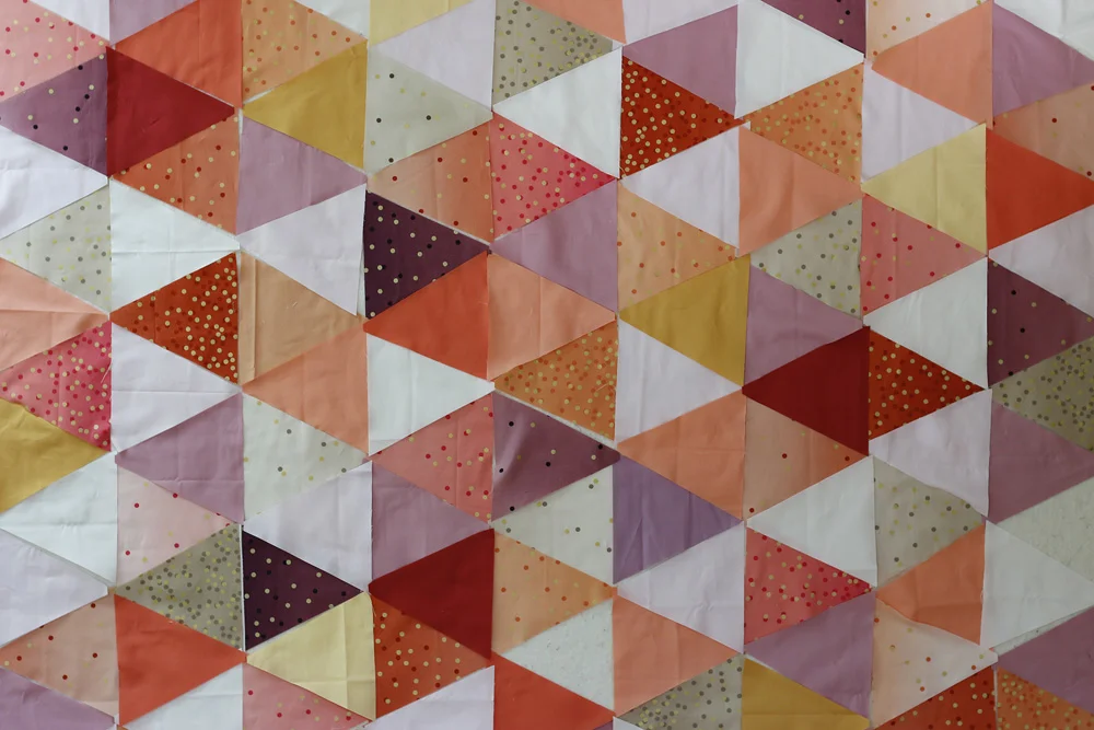
I’ve already cut some solids, based on my initial thoughts. I’m sure about the ones on the right, the softer colors. From top those are Paintbrush Solids Petal, Paintbrush Solids Rice Paper, Kona Creamsicle and Paintbrush Solids Mauve.
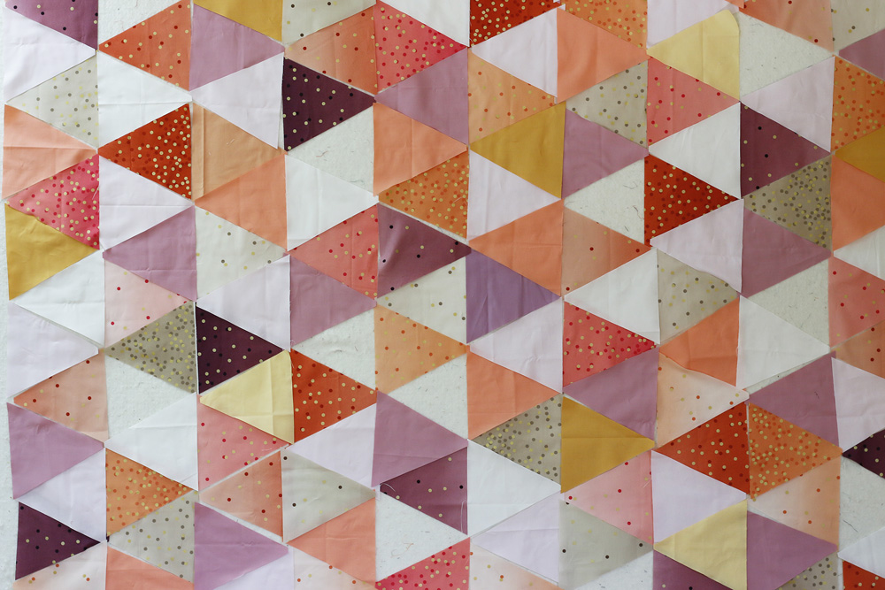
But I’m uncertain about the ones on the left. I want this quilt to feel somewhat serene, to match the vibe of Aria’s aquamarine version. Is that possible with these warm colors, which tend to evoke passion and energy?
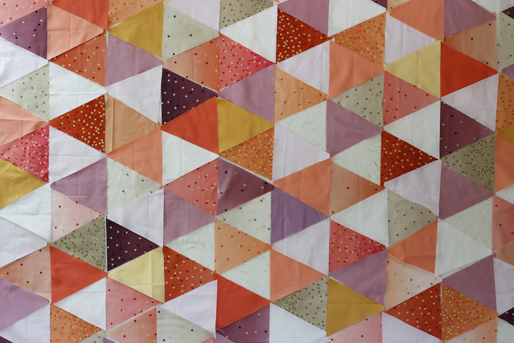
Here is the color mix I started with this morning. In this version I’ve added all the soft colors, plus the brighter peach color, Kona Nectarine, and two versions of yellow. Unfortunately, something’s not quite right. I find myself going back to my inspiration image, studying the design wall and then my solids stash. What’s missing or what’s wrong? Hm….
Maybe I need to add the reddish solid in order to tie in the Persimmon Ombre Confetti fabric. Here I’ve added Kona Cayenne.
Or maybe instead of red let’s try the orange solid. This is Paintbrush Solids Dare Devil. With a name like that, I should have realized it would be more punchy than I wanted. Haha!
Honestly I think I’m struggling because orange and purple are challenging colors for me. I don’t usually like them together, and yet my basic vision for this quilt is peach, coral-pink and mauve purple. It works for me in the the Ombre Confetti, but adding solids seems to sharpen the orange-purple energy. I think adding the yellow softens the palette, but the spicy solids: Kona Nectarine, Kona Cayenne and Paintbrush Solids Dare Devil are just too strong here.
I’ve stared. I’ve juggled fabric. I’ve begged my solid stash to produce the answer. And now I’m going to admit it: I need to order fabric. To create the desired effect, I must avoid emphasizing the bold red/orange tones in this quilt. I think I need to add a purple that’s darker than the Paintbrush Mauve but lighter than the Plum Ombre Confetti. Paintbrush Violet may do the trick. Purple is a cool color that may tip the balance toward serene.
So, now I have to wait. Waaah. But hopefully it will be worth it! I shall distract myself with quilting Aria’s aquamarine version today.

Wishing you color palettes that flow like water and an ever-ready fabric stash.
xo,
Rachel


