Fabrics for a Sunshowers Quilt
We are settling in at home again after our summer travels, picking up our old rhythms and making some new ones as well. Part of settling in for me is starting a new quilt, and I am very happy that my next project will be a quilt for Elora’s bed!
My seven-year-old daughter has her heart set on a rainbow quilt, with real rainbow arches. I have chosen the Sunshowers pattern from Megan Collins for the patchwork. The background fabrics will be misc. low volumes, instead of one consistent fabric. That’s more fun to sew and more fun on the bed. Since I was running low on low volume fabrics, I did some shopping with Fresh Modern Fabrics, while in the States.

Fresh Modern Fabrics is somewhat of a specialist is modern, low volume fabrics. She has 169 products in her Low Volume category! I had fun picking out a variety of soft-colored fabrics with a range of details. I found some geometrics like stripes, rectangles or dots and some organic prints like plants, woodgrain, and rainbows. The rainbows are part of a larger basics collection: Always Look for Rainbows. I chose the two lightest shades.
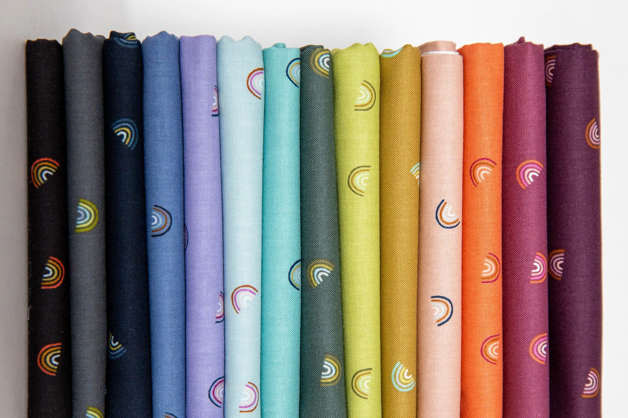
I notice that the low volume fabrics that sit longest on my shelf are those with black. I seem to prefer low volumes without bold black accents, probably because they are able to blend easier into the background of a project due to having less internal contrast. This time I have adventurously opted for a few multicolor low volumes, since they should work well with the quilt’s rainbow theme.

Here are my choices, from the top of the stack moving downward.
Left Stack: Mori No Nohara Grass, Far Far Away 3 Wildflowers Cream, Tweedy in Cloud and Mustard, Tarrytown Holepunch Dot Orchid, Zip White, Purebred Barnwood Maiden White, Speckled Natural Metallic.
Right Stack: Clover and Over Narwhal, Always Look for Rainbows Blissful and Modern Love, Speckled Sunstone Metallic, Animal ABS Dottie Stripes Baby Blue, Bound Looming in Stone, Tarrytown Farkle Shell.

The low volume fabrics will become the quilt’s background, but what fabrics should I use for the rainbow arches? I expect to use a mixture of solids and simple prints. For starters, I need to choose between these two rainbow palettes. The vivid colors at left are Ruby and Bee solids by Heather Ross for Windham Fabrics. The softer shades are Chambray Basics by Tilda Fabrics.

As much as I am drawn to Tilda’s softer palette, I know that Elora is craving those bright Ruby and Bee solids. Plus, I do think that the softer rainbow may not stand out so well on the low volume fabrics; whereas, the bolder rainbow will contrast nicely with the background.

At far left I have curated a stack of prints from my stash that jive with the bold rainbow palette. I sought out prints that are evenly filled in with color overall (as opposed to having big white dots, for example) so that the colors will show up clearly in the rainbow arches. Plus, I added a few more of my own low volumes at far right, for a bit more variety.
Okay, this is looking like a lot of fun. Time to start cutting!

Is it just me, or does quilt-making feel sometimes a bit like stirring molasses? It looks like it should be easy and then the resistance takes you by surprise. Putting together my latest quilt top wasn’t all that dramatic, but it did go slower than I expected because I didn’t have the right fabrics on hand.
We are settling in at home again after our summer travels, picking up our old rhythms and making some new ones as well. Part of settling in for me is starting a new quilt, and I am very happy that my next project will be a quilt for Elora’s bed!

A design wall allows the fabrics to speak to me along the way. Rather than following the prescribed route, sometimes we changed course. I am sure for the better. Here are several color choice processes facilitated by my design wall today.

Yesterday was a treat. The sun was shining, Elora was playing happily with a neighborhood friend, and I was able to spend loads of time in my sewing room. My goal? To start on Collaboration, a spin-off quilt for Positivities club. I got a great, leaping start!

Okay, can you give me some feedback? Given that I want to use the Brimming print, is there one or two other prints that you would suggest removing? In other words, does something stand out in a bad way or do you have any other tips for me regarding my fabric mix?

My favorite setting in the whole wide world is the beach at sunset. The constant crashing of the waves, the warm breeze on bare skin and that showy blast of sunset colors - no place delights and inspires and simultaneously soothes my soul like it.

You know what I love? When “start a new quilt” is at the top of my mental “to do” list. That is a good way to start the week! I had in mind to sew a more challenging quilt next, but wasn’t feeling it this morning. Instead, I gave myself the gift of freedom and have embarked on a feel-good, easy sew.

This week I really took my time with choosing the fabrics for my Inhibition quilt, especially the elements of the fan block. I will be using few fabrics, as I sense that repetition will be an important design element for this quilt. That makes each fabric choice weighty. What a contrast to relaxed scrappy sewing, where everything goes.

These bright, happy fabrics are my next quilt. It’s going to be quick, easy and perfectly pointy. Can you already guess what I’ll be sewing? Teeter Totter is gearing up for an April 17 pattern release and May sew-along!

On Monday I got to hold baby Livia for the first time! Such sweetness. Her quilt is coming along. Would you like to see? Choosing fabrics for the center medallion flower was challenging. It’s a totally different look than my original Nineteen Thirty quilt.
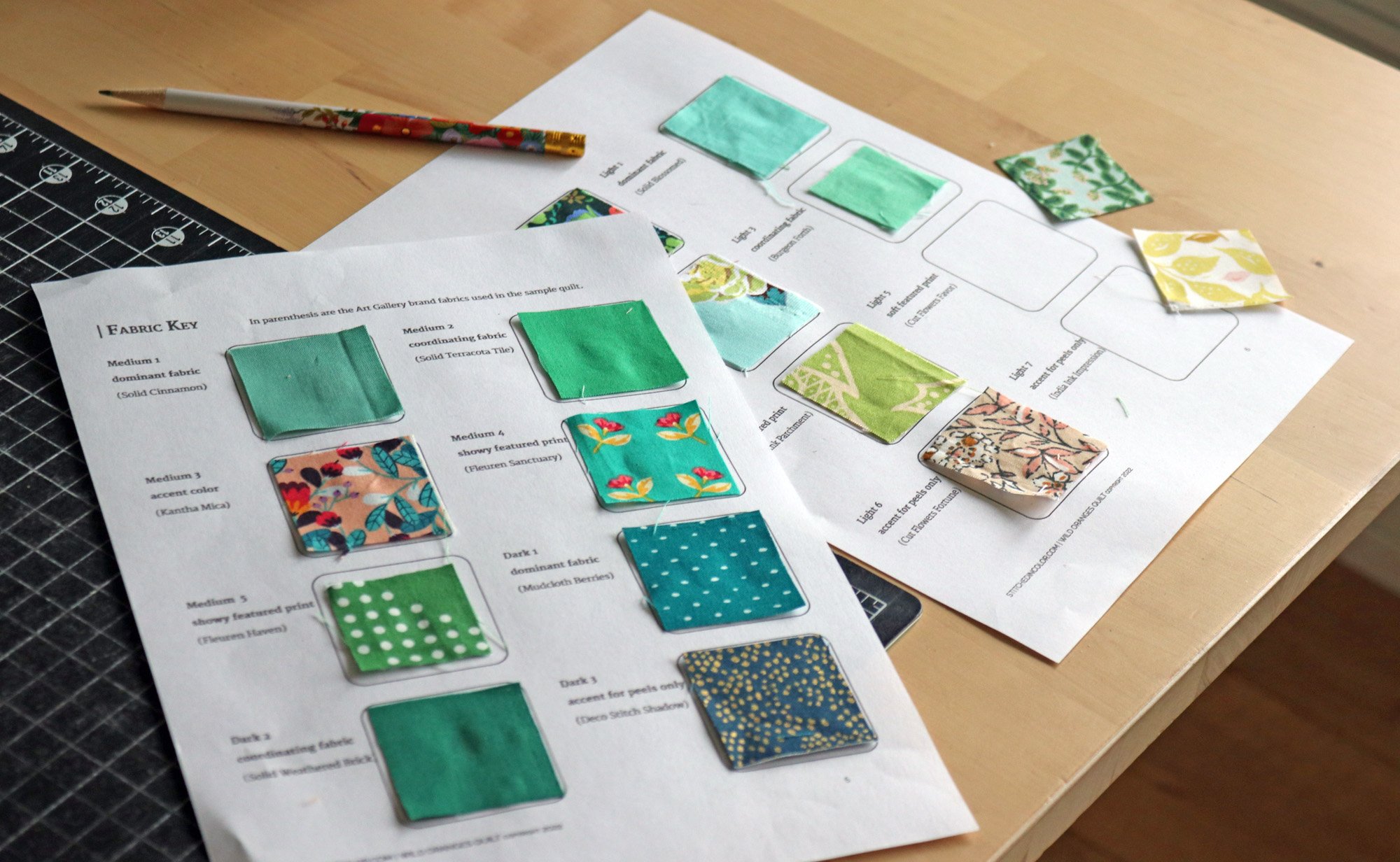
For my second go at Wild Oranges, I am inspired by the teal and green palette of my Orange Peel blocks for Pas de Deux. Watch my fabric selection process unfold from the original, oversize pull to a curated collection organized on the Fabric Key.
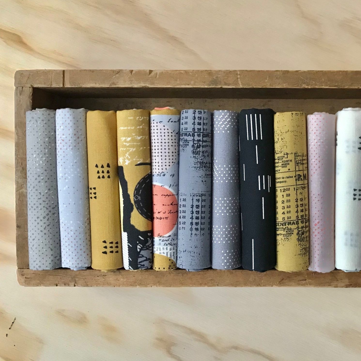
So, you already have your copy of the Wild Oranges pattern? Now, let’s talk about those fabric choices. Will you be working from your stash or featuring a fabric collection with your Wild Oranges quilt? Here are two possible flows for selecting fabrics.
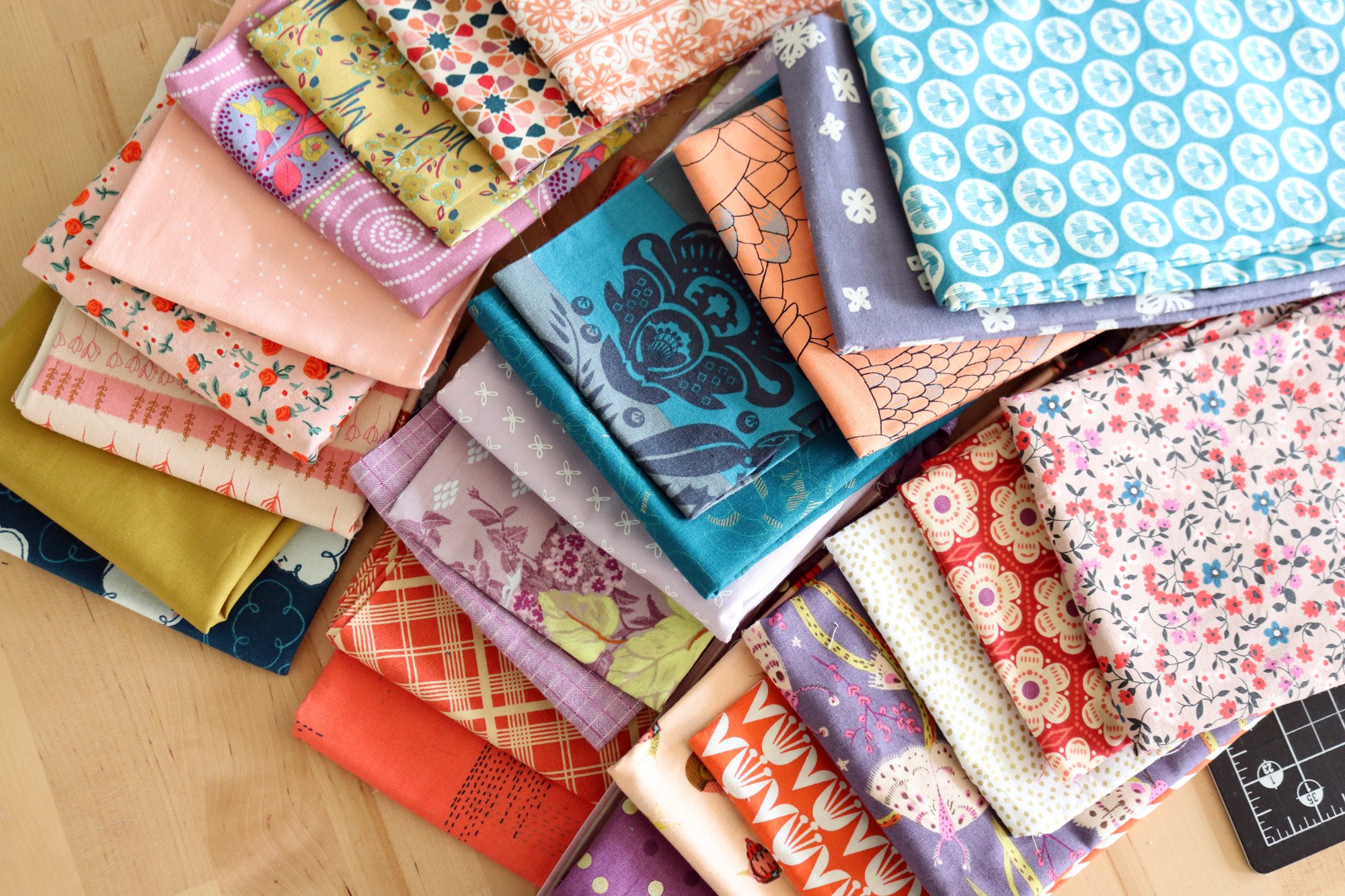
For my second version of Pas de Deux, I’m choosing a color palette for the quilt as a whole. I want a limited palette of 3 or so colors, so that the patchwork groups naturally harmonize and the edges between them can blur. Here’s how I pulled together fabrics, questioned myself and spiraled finally toward a decision.

Is making fabric and color choices taking way too long? When fabric choices feel disjointed color-wise, repeating fabrics and colors will help, but first you need to feel certain about those choices. Here’s how to refine and clarify a color scheme for patchwork.
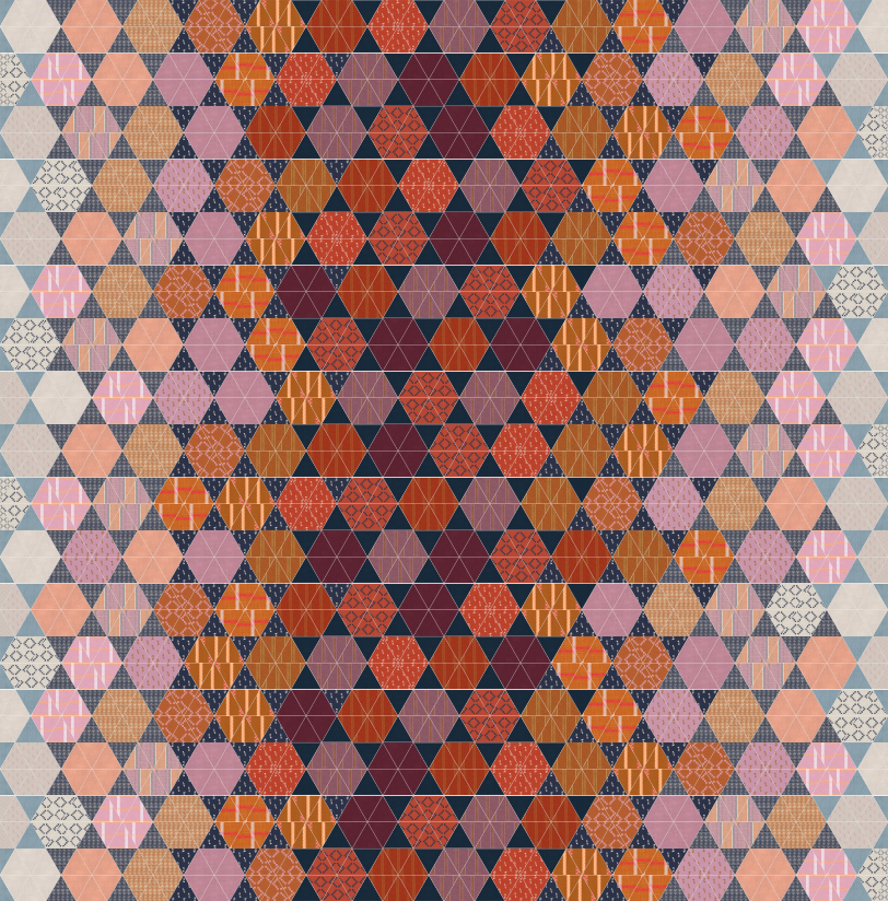
Today’s post is all about fabric - making choices and organizing your fabrics as needed for the pattern. I discuss a monochromatic vs. multicolor palette, how to sort fabrics by value and the difference if you sort by color.

Today I get to start a new quilt in bright, saturated colors. Know why? Because I’m gearing up for a pattern release and sew-along this June! Here’s how I assembled this bright, saturated mix of fabrics.

The economy quilt block is a classic. With just three fabrics and square-in-square shapes, it’s the ideal block for framing cute prints like those created by Heather Ross. Here are some different ways I went about combining the fabrics.

Heather Ross fabrics are made of fairytales and sunshine. Today I’m designing a quilt starting with a very special stack - the Heather Ross 20th Anniversary collection. My design process flows from fabric to patchwork and back again.

One way or another, it happens every spring. Sometimes it starts with warm weather, other times with fabric love. This time it started with a modest little package I received from The Confident Stitch last week.
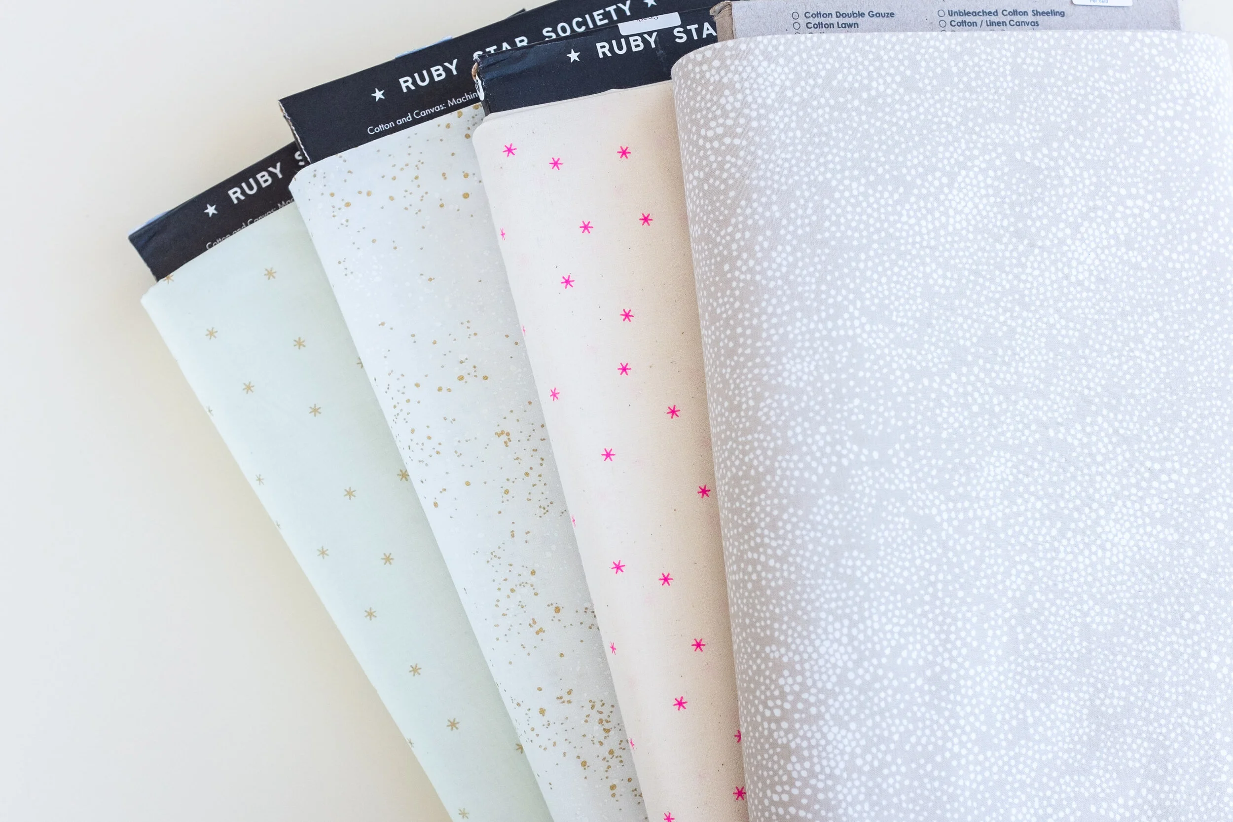
I bet you’ve noticed that the background fabric is a big deal for this quilt. It makes a strong visual impact and you need a LOT of it for this scrappy adventure. Here is what to look for in a background fabric and some specific fabric suggestions.

Choosing fabrics is definitely my favorite part! Here are some curated picks for the After the Rain quilt. I know not everyone enjoys the fabric selection stage, so if you’re feeling stumped, these fabrics are available at my sponsor shops!
Now, don’t be afraid! This is a chance to show off some fabrics that you really love. I have some tips today (and a fun surprise) to help you make good choices.

6 Tips for Choosing Fabrics for English Paper Piecing. What fabrics work best for fussy cutting? What else is important? From transformative fabrics to directional fabrics - let’s explore how to use fabrics creatively for EPP.
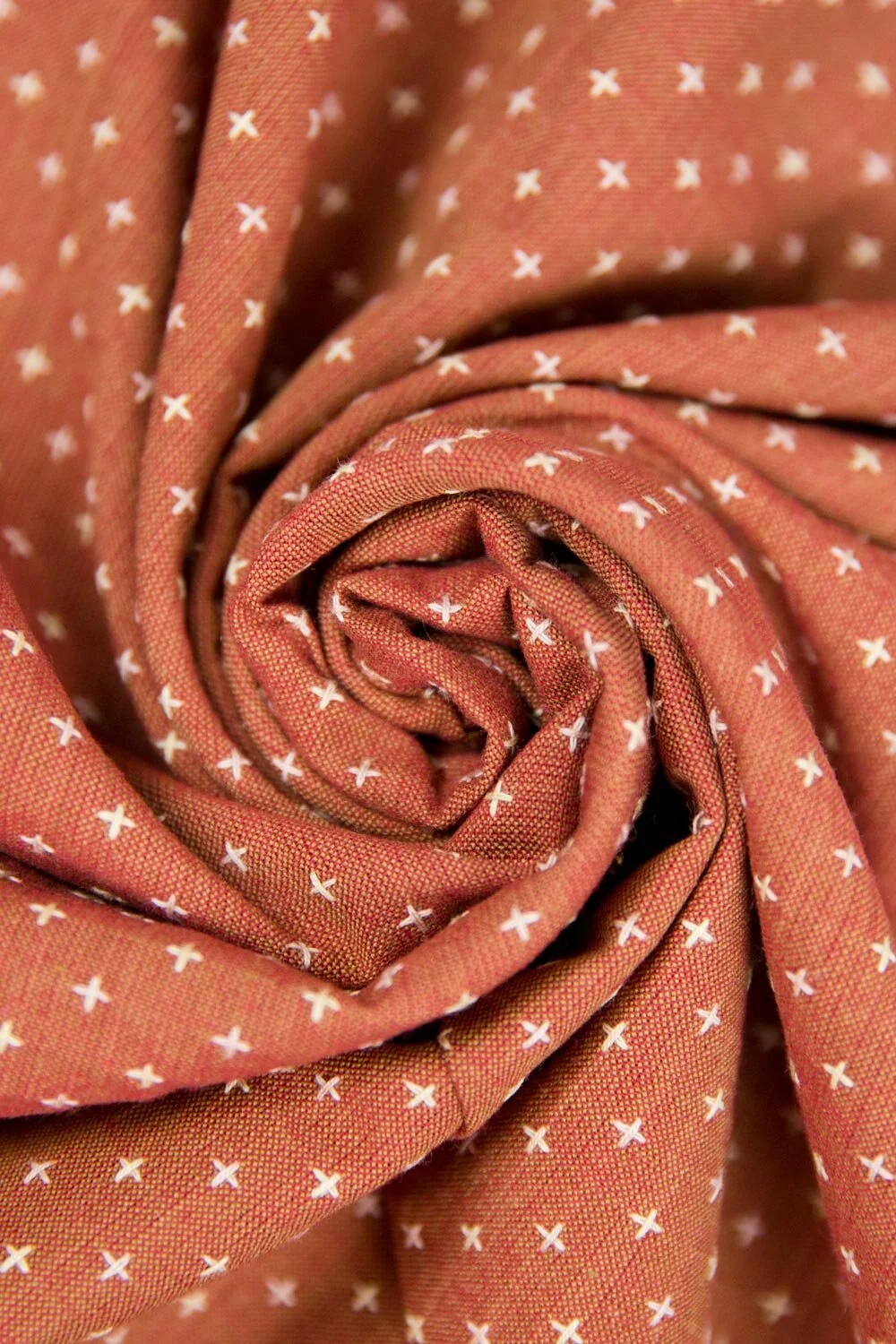
Do you remember the swatch service offered by The Confident Stitch? Last month I received the autumn mailing and began thinking about a new dress for Elora. Now I’ve received the fabric and started cutting!
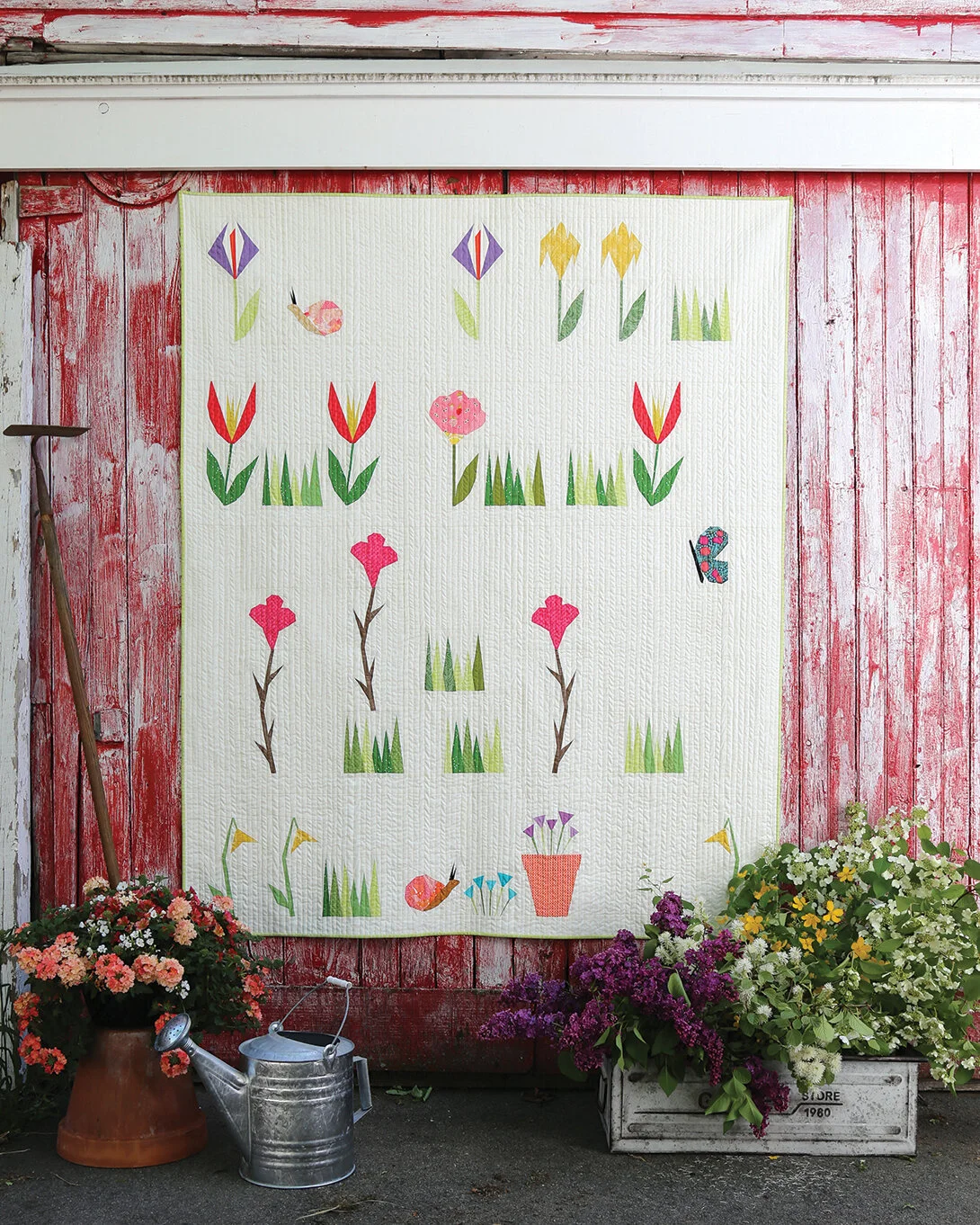
Today I’m popping in to share some color palette ideas for a brand new sew-along being hosted by Amy Friend for her book, Petal and Stem. Are you dreaming of a dusky garden, a sunny rock garden or something analogous perhaps?
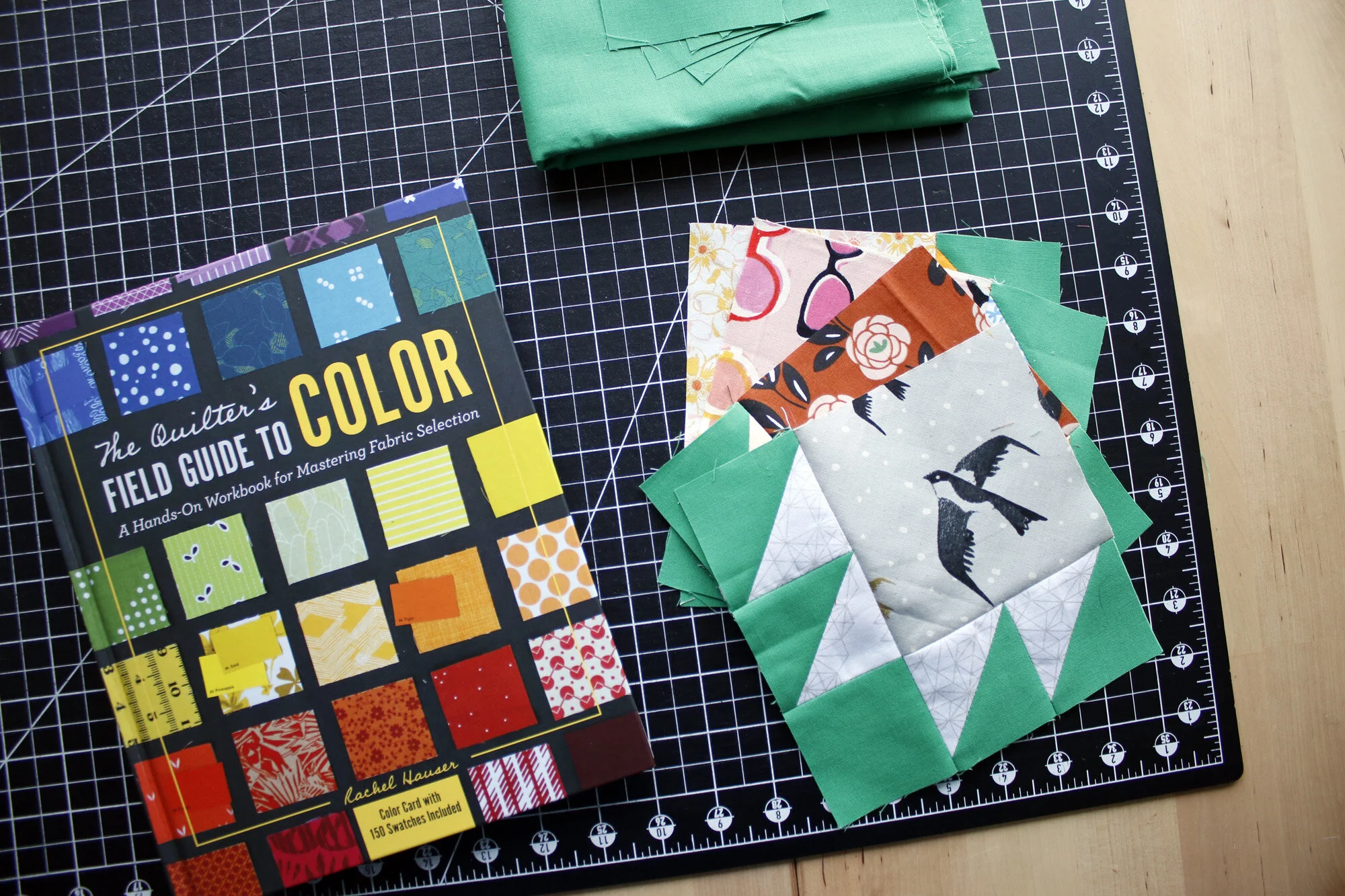
Right now the seasons are changing round the world. For most of us the change in seasons brings a fresh energy to mind and body. You can capture that energy and funnel it into your hobby!
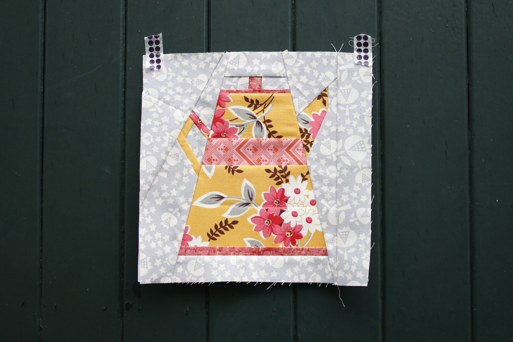
Do you know what’s really fun to sew? A teapot. Oh, and teacups! But we haven’t gotten to those yet. Come see my third rendition of the Penny Sampler teapot block. It’s warm and toasty!
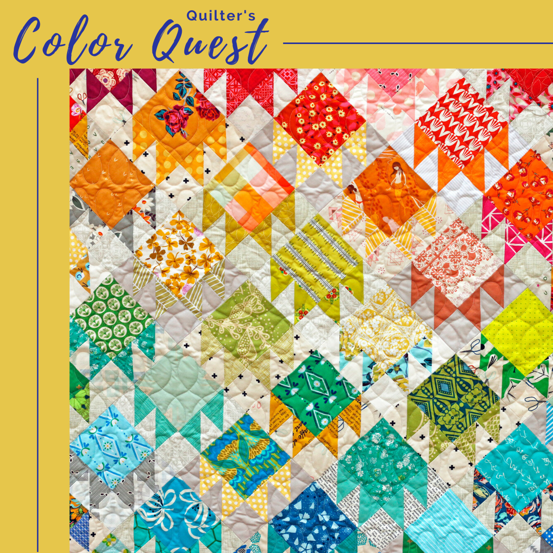
Do you own a copy of my book, The Quilter’s Field Guide to Color? Oh, that’s so cool! Well, friend, don’t let it sit on the shelf. Let’s unpack it together. You’re invited to join Quilter’s Color Quest. It’s time to take your field guide on an adventure.
+ an accidental Ikea flag