the Medium Contrast Ikat quilt
Since last time we talked about high contrast, you might be wondering why we’re not shifting to low contrast today. Why settle for medium?
Remember, contrast refers to the differences in design. Patchwork typically relies on differences in color and value - i.e. using different fabrics - to create that patchy-fun effect. A truly low contrast quilt has visually soft edges. It’s that dreamy, watercolor effect that though beautiful, isn’t at all what I have in mind when I sew all the bits and pieces of a quilt like Ikat.
But as I’ve said, making an Ikat quilt is an opportunity to play with your sense of contrast. if your dreaming of a low contrast version, don’t let me dampen that vibe! It’s always a treat to see the unexpected versions you come up with in our sew-alongs! For my part, I’m drawn to the medium contrast version. It’s softer and more peaceful than high contrast, while still sparkling with that cut-crystal effect from the stair-step patchwork piecing.
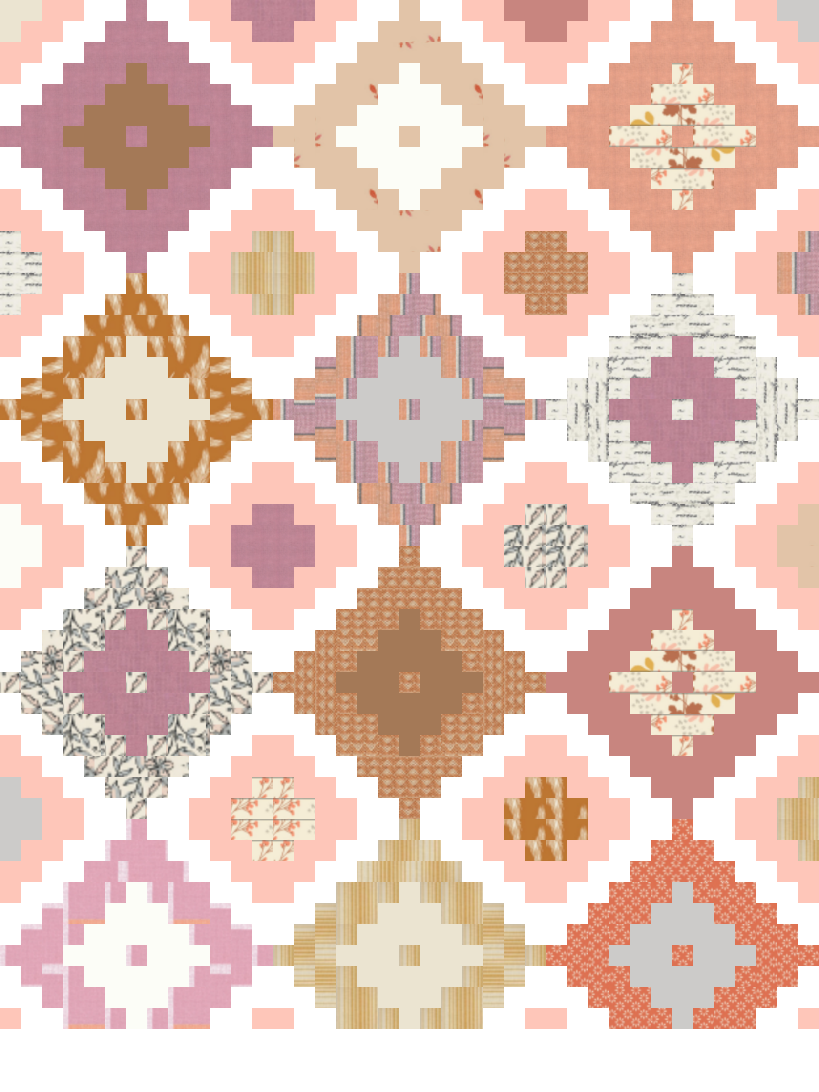
Medium Contrast Ikat


My second Ikat quilt was inspired by this flower bouquet. The quilt is all about orange, with different shades of the citrusy hue spiced with a bit of gray-green for variety.

Notice that the sashing colors are white and taupe - two fairly similar shades. By opting for a much, much lower contrast sashing (as opposed to black and white) the energy of the quilt instantly softens. Even though some blocks have fairly strong contrast, the pools of low contrast in between create an overall gentle and peaceful vibe.


I’ve used PreQuilt to mock up two new medium contrast Ikat quilt designs. Both sport medium contrast sashing schemes and multi-color palettes. Maize (left) feels like ripening summer with the corn-yellow sashing and soft, sun-washed palette. Amber (right) whispers of autumn with gray-purple sashing and a bundle of warm, sunset shades.
Don’t be shy about using a color in the sashing of your Ikat quilt. Since Ikat has two layers of sashing, it’s easy to incorporate color in combination with a neutral. The color sets the tone for your quilt, while the neutral provides a visual cushion between the colorful sashing and each individual Ikat diamond.
Color your Ikat
It’s time to experiment! I’ve created a second PreQuilt coloring page where you can digitally swap my colors for your own ideas.
Color tags labeled A control the inner Ikat diamonds and color tags labeled B control the outer Ikat diamonds. To really transform the quilt, change color tags C or D. Those are the sashing colors!
This new coloring page is based on my Maize Ikat mock up. Switch some of the Ikat diamonds (B) for your favorite colors and then try different colors for sashing D. You never know what you might find!


I’d love to see the results of your color experiments with the Ikat quilt coloring page! Share it on Instagram with #IkatQuilt.
Amber Ikat quilt kit
Of all the Ikat quilts I’ve designed lately, Amber is my favorite. I love the warm fall hues, like burnt orange, cranberry and ripe peach! I teamed up with Sojo Fabrics to create the Amber quilt kit, available in very limited quantities. It has everything you need to make a throw-size version of this quilt, just as shown. I can’t wait to see some of you bringing this to life during our sew-along.

Ikat diamond prints are by Art Gallery Fabrics, mainly from the Homebody and Kismet collections.
Solids are RJR Cotton Supreme Solids and Riley Blake Solids.

Thanks for popping by for the second installment of the Ikat quilt sew-along. I’ll be chiming in next with a tutorial for how to plan and organize your Ikat quilt fabric placement, even without a design wall!
Each time I publish a new sew-along-related blog post, I’ll update the main sew-along page with links to relevant posts.
Enjoy!


