How to Arrange Your Scrap Rainbow
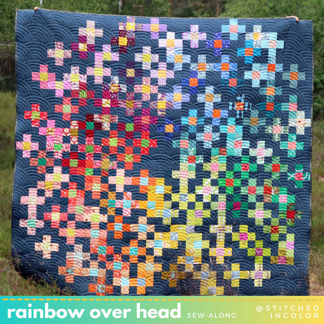
Here's a peak at my Rainbow Falls scrap quilt project! It's been amazingly scrap-friendly. I absolutely recommend this patchwork pattern if you're looking for a quick scrap quilt that can unify diverse scraps.
Arranging scraps into a rainbow is a classic approach to the scrap quilt. My Rainbow Falls design is a type of coin quilt, worked as it is in vertical columns with stacks of same-width bricks. I'm allowing the columns to be a variety of widths and allowing the coin "bricks" to be a variety of thicknesses, all in an effort to make the most of my scraps.
Are you thinking about making your own? Here are some tips for arranging your scraps in rainbow order.
Rainbow Starts Anywhere
Start the top of the column with any color scrap, then continue cycling through the color wheel as you make your way down the column. For example, my first row (at left, just a sliver of it shows below) starts with green. Lime Green - Grass Green - Blue - Purple - Red - Orange - Yellow - White - Green - etc.

Use Multiple Shades
Do you have a lot of orange scraps or many types of green? Your rainbow can progress through multiple iterations of one color before continuing to the next main color. This helps you use up whatever you have! I often use two shades of blue in my progressions, for example. Wondering which green to put first? Yellow-green (lime) goes closer to yellow and blue-green (teal) goes closer to blue. Consulting a color wheel should help!
Pick out a Main Color
I usually sew with fabrics that have one color (other than neutrals), my "helpful fabric" as I like to say. That makes my scraps particularly easy to pigeonhole as one color. For multi-color scraps, pick out which color stands out to you most (ignore neutrals). Often the background color is strongest.
If you absolutely cannot pick out a main color in your scrap, perhaps exclude it from this project.

Work in Low Volume
Low volume scraps are mostly white, so they can be tricky to place in color order. Still, pick out which colors are most prominent. For example, above left I placed the white print with the red/green flowers as if it were a red print. I did the same with the lemon print at right, treating it like yellow. You may also like to create clusters of low volume scraps in rough rainbow progression as I did above, center. These will create bright spots in your quilt that contrast nicely with the saturated colored sections.

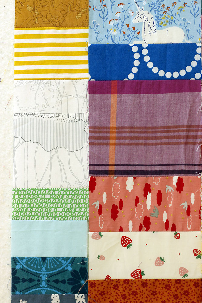
Watch out for Pink
Since pink is not in a traditional rainbow, it can be tricky to place in the color wheel. Think of your pinks as rosy pinks (cool pinks, above left) and peachy pinks (warm pinks, above right). Rosy pinks should go between purple and red, while peachy pinks are best between red and orange. Peachy pinks can also be used instead of orange, blending nicely into yellow.
For example, the image below left has a rosy pink below the purple and above the "red" strawberry print. The image below right has a peachy pink below the red stripe and above the soft orange.

Use Neutrals Too
Neutrals can really be placed anywhere in the rainbow progression. They rarely look out of place. I happen to like to place white by yellow (above left) and grays/browns between blue and purple (above right). I'm excluding black scraps from Rainbow Falls.
I hope this helps you with your rainbow scrap projects, whatever the design. Arranging scraps in rainbow order is a process that will teach you so much about color. The resulting rainbows are almost universally pleasing and irresistibly cheerful. Have fun!