and then Orange ruined everything
Ok, people, I fought with this quilt for hours on Friday. No exaggeration. My inspiration was all about color, namely burgundy, purple and fawn brown. But then I fell
for that orange Candied Lollie fabric. It's so pretty in and of itself! The moment I cut, I sealed my
fate.
Orange is so strong, so stand-out-ish. It can easily take control. And it doesn't help that I even set orange in the lead as the feature checkerboard tone. Der! When I first felt unease about my working color palette, I tried to console myself that the artificial lighting was misrepresenting orange. Which was true. But there's more to it then that...
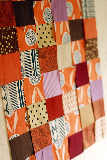
My mom saw it right away. She doesn't usually criticize my work, but she volunteered her opinion pretty much on first sight - take out the purple. No, mom, this quilt is all about autumn, fireside tones: burgundy, purple, brown... and orange. Because there's orange at the fireside. Get it?
Well, now orange is officially my least favorite color. I apologize to everyone out there who loves orange, but this time orange ruined everything. It totally took control of my color scheme!
You see, orange and purple are opposites, otherwise known as complementary colors.* When opposite colors are mixed together the enhance or intensify each other. The purple was making the orange brighter and the orange was making the purple stand out from all the other warm tones like a sore thumb. I tried and tried adjusting other things - removing the dark brown, removing the medium brown, adding more light fabrics. To test out "removing" a color from the work, since I'd already sewn and cut the patchwork strips, I simply covered up the color in question with floating patchwork squares. Eventually I had to admit that what I wanted to remove was the ORANGE so as to preserve my original inspiration palette. But I'd cut too much orange to shelve it.
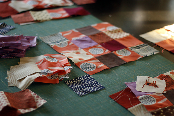
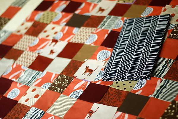
So I removed the purple. Painstakingly ripped. out. the. purple. square by square. And I added a little dark blue Dewberry herringbone. Because that print always helps.
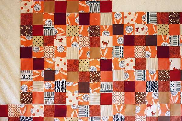
Yeah, mom was right. Go mom.
p.s. If you struggle with color in your sewing, I hope you'll join us for an encore of Color Intensive in the new year. We talk about color theory and get practical about application for quilters in an interactive online class format. More details about my class encores coming soon!
*Edited to add: So this is me admitting I was completely wrong. Purple and YELLOW are complementary colors. Orange and BLUE are complementary colors. I promise I got it right in the Color Intensive! Yep, I can be a dolt sometimes!
Also, in my defense, the boundary between yellow and orange is a fine line. It's pretty hard to make a monochromatic yellow work without actually including orange, you know? Anyhoo, I love yellow with everything and orange with few things. Tis true that orange and blue is a combo I do like.
...Ok now my poor addled brain is really spinning!
Orange is so strong, so stand-out-ish. It can easily take control. And it doesn't help that I even set orange in the lead as the feature checkerboard tone. Der! When I first felt unease about my working color palette, I tried to console myself that the artificial lighting was misrepresenting orange. Which was true. But there's more to it then that...
My mom saw it right away. She doesn't usually criticize my work, but she volunteered her opinion pretty much on first sight - take out the purple. No, mom, this quilt is all about autumn, fireside tones: burgundy, purple, brown... and orange. Because there's orange at the fireside. Get it?
Well, now orange is officially my least favorite color. I apologize to everyone out there who loves orange, but this time orange ruined everything. It totally took control of my color scheme!
You see, orange and purple are opposites, otherwise known as complementary colors.* When opposite colors are mixed together the enhance or intensify each other. The purple was making the orange brighter and the orange was making the purple stand out from all the other warm tones like a sore thumb. I tried and tried adjusting other things - removing the dark brown, removing the medium brown, adding more light fabrics. To test out "removing" a color from the work, since I'd already sewn and cut the patchwork strips, I simply covered up the color in question with floating patchwork squares. Eventually I had to admit that what I wanted to remove was the ORANGE so as to preserve my original inspiration palette. But I'd cut too much orange to shelve it.
So I removed the purple. Painstakingly ripped. out. the. purple. square by square. And I added a little dark blue Dewberry herringbone. Because that print always helps.
Yeah, mom was right. Go mom.
p.s. If you struggle with color in your sewing, I hope you'll join us for an encore of Color Intensive in the new year. We talk about color theory and get practical about application for quilters in an interactive online class format. More details about my class encores coming soon!
*Edited to add: So this is me admitting I was completely wrong. Purple and YELLOW are complementary colors. Orange and BLUE are complementary colors. I promise I got it right in the Color Intensive! Yep, I can be a dolt sometimes!
Also, in my defense, the boundary between yellow and orange is a fine line. It's pretty hard to make a monochromatic yellow work without actually including orange, you know? Anyhoo, I love yellow with everything and orange with few things. Tis true that orange and blue is a combo I do like.
...Ok now my poor addled brain is really spinning!