What's wrong here?
The other day I plotted a new project with a simple 1.5" square patchwork pattern. I felt wide open on the color scheme, so I poked around in my stash until something stood out at me.
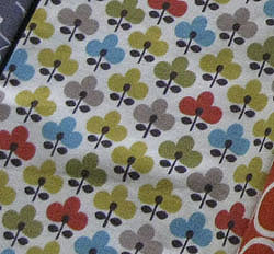
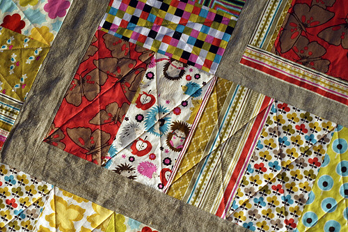
This is a print by Michael Miller that I bought earlier this year from Sew Love Fabrics. I adore the cute little shape, which would show off well in small patchwork! I've used this print before in my Brick House baby quilt with an overall warm color scheme. See:
But at this time of year I was feeling something that would bring the turquoise into focus, peppered with pops of gray and black. Cause lately, I can't get enough of black with COLOR.
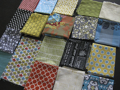
Well, I spent a lot of time with my fabrics. Not surprisingly, they convinced me to pull the other colors in my inspiration fabric. So, I included prints with mustard yellow, olive green and burnt orange. And while I love the inspiration fabric, this mix left me feeling utterly "blah". Totally unconvinced. As in, hold the phone people - we're not cutting yet!
I slept on it and came back to it next day. Still nothing. I've stared and stared and really can't put my finger on what is bugging me about this group of fabrics. So.... I'd love to know what you think is going wrong with this fabric mix?
Thanks, friends!
This is a print by Michael Miller that I bought earlier this year from Sew Love Fabrics. I adore the cute little shape, which would show off well in small patchwork! I've used this print before in my Brick House baby quilt with an overall warm color scheme. See:
But at this time of year I was feeling something that would bring the turquoise into focus, peppered with pops of gray and black. Cause lately, I can't get enough of black with COLOR.
Well, I spent a lot of time with my fabrics. Not surprisingly, they convinced me to pull the other colors in my inspiration fabric. So, I included prints with mustard yellow, olive green and burnt orange. And while I love the inspiration fabric, this mix left me feeling utterly "blah". Totally unconvinced. As in, hold the phone people - we're not cutting yet!
I slept on it and came back to it next day. Still nothing. I've stared and stared and really can't put my finger on what is bugging me about this group of fabrics. So.... I'd love to know what you think is going wrong with this fabric mix?
Thanks, friends!