Pretty Potent
On first glance, I was not actually drawn to Anna Maria Horner's most recent collection, Pretty Potent. This collection has lots of dark value prints, which may be why it wasn't initially speaking to me. In the spring and summer I tend to crave clear bright or even soft colors.

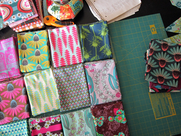
Then I saw the above photo by Kathy of Pink Chalk Fabrics. I subscribe to her newsletter, which keeps me informed on new fabrics and patterns and other misc. happenings in our quilty world. Kathy has a talent for taking beautiful photos of fabrics on the bolt. I know I'm seeing the real colors when I take in her photographs, which is one reason I make space for her newsletter in my inbox.
Anyhoo, that photo of Pretty Potent charmed me, and started me hankering for these fabrics. I asked my contact at FreeSpirit if they could send me some (I occasionally ask manufacturers for fabric. They do not send it unrequested, but sometimes will send it if I have a project in mind). When I didn't get a reply, I realized... duh, Quilt Market! And then one day last week a mysterious box appeared and it felt like my birthday. (Only better. Let's be real - I never get such good birthday presents!)
So this weekend I've been folding and arranging and rearranging and petting my cuts of Pretty Potent, while feeling incredibly grateful for my extraordinary good luck. I'm itching to start a new quilt, so the timing couldn't be better!
I decided not to check how Anna Maria grouped these fabrics for the collection, but rather to try to feel for myself how I would group and match these prints. Most all of them are multi-color and not in obvious same-color groupings. I ended up pulling out solids to cement the colors I was seeing in my groups. I created two colorways:
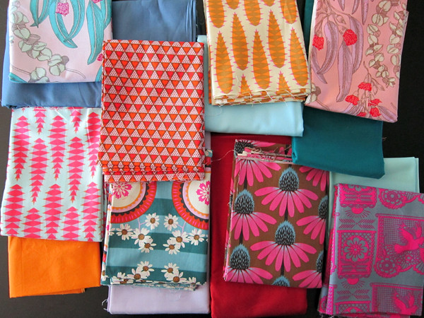
This grouping focuses on oranges, reds and dusky blues. Plus pink, but that feels like an afterthought to me, maybe because there's a ton of pink in Pretty Potent. It feels like an autumn bonfire at dusk.
Kona cotton solids shown in top row: Cadet, Lake and Glacier
and bottom row: School Bus, Thistle, Paprika, Aqua.
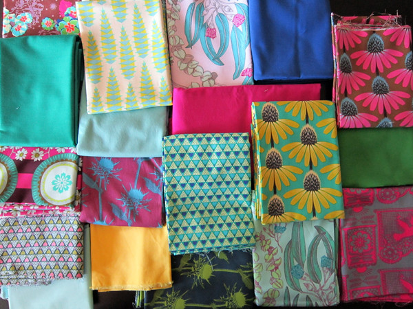
This group feels much more "now" with watery blues, cool greens, yellow and warm pink. As you can see, I was also able to pull lots more Pretty Potent fabrics into this grouping, though I still kept out several darker prints which matched, but seemed to change the mood. This group feels like being poolside all summer. I'll be sewing with these!
Kona cotton solids shown in top row: Willow, Sage, Cerise, Ocean, Leprechaun
and bottom row: Aqua, Canary.
Ok, off to start cutting... in between hanging the laundry. Hope you all have a great day!