Penny Patch: Color Scheme Ideas
This post is part of a series {Penny Patch} a Beginner’s Quilt-Along. You can join in anytime, even if you’re not a beginner! Please see this page for links to all posts.
Hi again! When I asked about interest in doing this quilt-along, lots of you said you wanted to make a quilt with a similar color scheme to Vintage Tangerine. Since then my wheels have been turning, thinking of ways to help make that color scheme (or its mood) easily transferable to new quilters. Here goes...
Big Picture
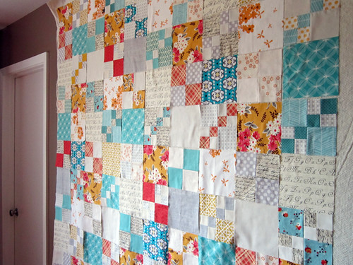
Low Volume. More than half of my Vintage Tangerine fabrics are low volume prints. Low volume is the same as low-value. It refers to fabrics that are "light colored" overall. A few low volume prints are truly white or cream all over, with subtle hard-to-see textures. Many other low volume prints actually have tiny black or colored patterns on them, but when you step back those prints kind of take a back seat so that the fabric reads mostly white or light colored (yes, this is subjective). The use of many low volume prints creates a soft or glowing effect. I think that my use of low value prints is one of the key factors that sets the mood in Vintage Tangerine.
Vivid Colors. The two main colors in my quilt are aqua/teal with soft tangerine orange. These colors are opposite on the color wheel, which makes this a strong, complimentary color scheme. That means that these colors, when combined, enhance each other and feel dynamic to the observer. The combination of low volume (soft) with complimentary colors (vivid) is delightful! My color scheme also had a POP of coral red, which is near tangerine orange on the color wheel, to keep things interesting.
Vintage-y prints. Remember, my quilt was first inspired by this one, with an incredible vintage charm. Although I wasn't a purist about it, I did try to use small scale prints, often simple geometrics (dots) or florals. I did not use solids. These small scale prints create a kind of dappled effect with less contrast than solids.
Choosing Fabrics
Not so sharp on color theory? No problem! How about I share a few complimentary color scheme ideas right here.

To start off I pulled a pile of low volume prints, which included white, cream, tan and pale gray. You'll see the same low volume print pile used with each color scheme!
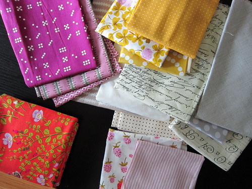
Purple and yellow are also opposites on the color wheel, so they combine in a complimentary scheme. You can see I pulled a variety of purples from dark plum to more of a pastel purple. No need to keep the hue exactly the same. As long as the colors look good together to you, it works!
I pulled a fiery orange fabric for my contrast "pop" color. At bottom right are two low volume fabrics I'd add to this color scheme, since they have purple in them.
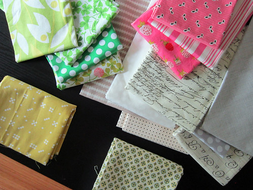
Red and green are another complimentary color scheme, but most people save that for Christmas. We can get the same dynamic effect combining pink and green! Again notice that different shades of green totally work here.
My unexpected "pop" color is yellow. Plus, I'm showing a low volume print (bottom right) that has green and yellow in it, making it a great low volume addition for this scheme.
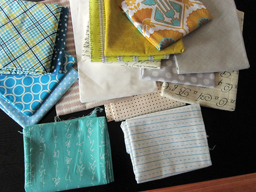
Here's another classic scheme - true blue and yellow. Now, these are not actually complimentary colors, but close. I happened to have that yellow/blue plaid print on top, which inspired the whole thing.
This color scheme looks great with a pop of orange, which is the true opposite of blue. But, I ended up going with a pop of teal for a softer look. My add-in low volume print is white with blue ruled lines.
And then, of course, there's the same color scheme I used! That's orange and teal with a pop of coral.
the Nitty Gritty
Want more info? Let's get specific. If you want to create the same mix of low volume and color, with 2 main colors and 1 pop color, I've got a list for you:
for a Baby Penny Patch quilt top
2 Fat Quarters in color A
3 Fat Quarters in color B
1 Fat Quarter in POP color C
7 Fat Quarters low volume
for a Throw Penny Patch quilt top
4 Fat Quarters in color A
5 Fat Quarters in color B
1 Fat Quarter in POP color C
1 Fat Quarter in mid-value neutral (gray or brown)
10 Fat Quarters low volume
for a Twin Penny Patch quilt top
6 Fat Quarters in color A
7 Fat Quarters in color B
2 Fat Quarters in POP color C
2 Fat Quarters in mid-value neutral (gray or brown)
14 Fat Quarters low volume (or 7 half yards)
Remember you can always use more prints than I've suggested to increase variety (such as 2 different color C prints). Also, experienced quilters can feel free to convert fat quarters to half yards (ex. 6 Fat Quarters converted to 3 Half Yards), if they prefer to have less variety.
I'll refer to colors A, B, C and such as we move forward in the quilt-along so as to help you cut and sew blocks to achieve this sort of color scheme. Of course you are welcome to pursue a completely different color mood! At the moment I'm thinking I might make two penny patch quilts... one in this color mood and one pretty different. We'll see!