Celebrate Color with Joel Dewberry

Today we're Celebrating Color with fabric designer Joel Dewberry! I thought it would be fun to see color through the eyes of a favorite designer. These talented artists skillfully mix shapes and colors that become the substance of our own creations. Their inspirations become ours. I know we are all so grateful! Joel kindly agreed to have a chat with me, so here goes....
Rachel: This Celebrate Color extravaganza is our chance to take pause and thank goodness for the colors and moods of the autumn season. As autumn approaches what colors speak to you most?
Joel: For me, this autumn is about a changing season, a changing perspective and a return to saturated yet dark hues. In particular, I have had garnet and mustard on my mind. Savory colors that feel season appropriate, but still have a life and vitality to make me happy in a season that can at times be cool, dry and void of bold colors. I connect these colors to a rich sophisticated style, warmth, delectable foods including warm bread and jam. Currently, I am seeing these colors in fashion, home interiors and in my most recent fabric collection.
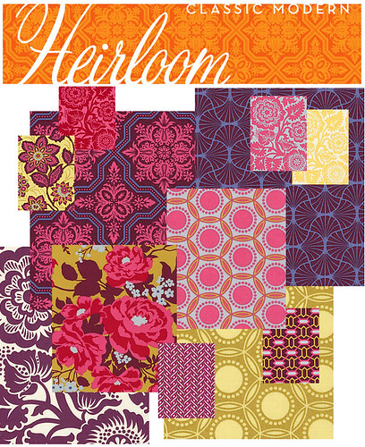
Rachel: Mmm, yes, garnet and mustard! When I made this mosaic of "what I want" from your Heirloom collection, those hues were well represented! Now I wonder how color has helped to define your brand. After all, fabric design is such a competitive space. What are Joel Dewberry colors?
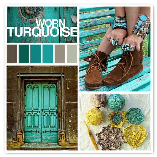
Joel: From my very first collections, I have been committed to bold and unexpected use of color. In 2006, I claimed a bold turquoise color as a part of my brand's signature style and added it as a grounding element in my early collections. From that point moving forward, it has been difficult for me to not use it as a core color among the palettes I have explored. I have begun to use it as a neutral tone in my collections and love the fresh and brilliant life it adds to my design. I was pleased that a few years later Pantone even positioned turquoise as "Color of the Year for 2010".
Rachel: Many of us have colors that we gravitate to over and over again. I often wonder where these preferences originate. Can you pinpoint what calls you to your signature colors? Could they be a reflection of your personality or temperament? Or perhaps of your upbringing?
Joel: Interesting question. In hindsight, my passion for turquoise was probably driven by a combination of my personality, gender, preference in design aesthetics and desire to be a bit bold and memorable at the time. By nature I have a pretty easy going and mellow disposition. I've been told I can have a calming influence on those around me. For me turquoise has the same effects. Being a male textile designer in a primarily female dominated industry may have also played into my selection of a cool tone in the blue family. While I did not think of it at the time, my upbringing in Florida and experience along the coast may have had some influence in my selection as well. At the end of the day though, I felt most driven to the color turquoise because of how it embodied a visual style I wanted my brand, Joel Dewberry Eclectic Modern to imbue.
Rachel: It is inspiring to see how you and your wife have worked together to build your brand. Laurie obviously has lovely taste, which seems to pair so well with your fabrics. This cabinet that Laurie recently renovated is case in point. Do you two share the same design aesthetic so seamlessly?
Joel: The simple answer is, Yes. I have created my brand and each respective design collection with her participation. Together we seem to be evolving our mutual/collective style based upon the changing priorities in our lives and our maturity as designers.
Rachel: Well I think that's a little bit amazing! And rather handy too. Ok, one more question! Where do you see color "headed" in the fabric design industry overall? As fabric consumers, we often miss the big picture. As a designer, you're thinking ahead. What might we see around the corner?
Joel: Over the past six years, I have learned that color trends in the fabric industry tend to follow those in fashion and home interiors to the second power. What that means to me is that within the world of fabric consumers are buying with the intent to create something to complement their home, their wardrobe or their life. This requires effort and more often than not, they err on the side of bold with the hopes their creations will be noticed. I believe they are often drawn to fabric that is bolder than what they might otherwise purchase in a finished good. Like us all, they enjoy the recognition and satisfaction associated with having created something by yourself and they appreciate the attention it will bring them. With this in mind, I believe color trends in the fabric industry will likely be amped up a few degrees from what we see in fashion and home interiors but they will continue to parallel them as well.
In terms of new palettes of color on the horizon, as a designer, I am still invested into infusing extraordinary into the vintage and classic with the result of unexpected juxtapositions of color rooted in the familiar and memorable. I am also sensitive to a focus on sustainability and how that will be interpreted in color and hue.
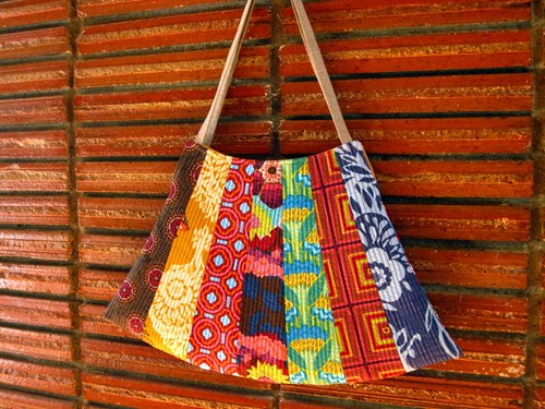
Rachel: Oooh, that's interesting! I've never thought of my fabric choices that way, but now that you point it out, I do think I can see it. When I made myself this bag, I chose fabrics and colors with a sort of childish glee and the result is probably a bit louder than what I'd select in the store. But, I think this works out because the colors are exactly "me". And that experience of creating your own style is something that just can't be duplicated out there.
Thanks, Joel, for chatting with us about color. It's been an honor to have you as a guest. And now, you have enlivened my love for turquoise! I'll leave everyone with some inspiration in turquoise as befits autumn. Happy Creating!