Fabric Shopping for Quilters: Begin with Color
The modern quilter loves fabric. Fabric is beautiful, endlessly inspiring, a joy in itself. However, our joy becomes complete when we transform fabric into something both beautiful and useful - often a quilt. I seek that balance between collecting and creating by thoughtfully cultivating my fabric stash.

My fabric stash is my artist’s palette. I can only create with the colors and forms which I have on hand. My fabrics must live in a finite amount of space, so I shop just a handful of times a year and with intention. I love how online shopping allows me to compare my shopping cart with my fabric stash to make informed choices.
What can I add that will help me create quilts from the heart? How can I express my truest self? What additions will spark joy?
At the root of each answer is Color. That is why my fabric shopping always begins there.
Colors to Replenish
Most artists tend to gravitate towards certain colors, and quilters are no different. From time to time your go-to colors will change, so don’t make assumptions. If your fabric stash is organized by color, you can easily judge which colors are running low. Compare relative quantities and make a quick evaluation.

I noticed, for example, that my blue fabric stacks are missing medium-value blues. I have lots of dark and light blues, but hardly any fabrics to bridge the gap. I also noticed a shortage of peach fabrics, no surprise given that I love peach with everything these days.

Even my peach solids were almost out. That’s right - don’t forget to consider your solid fabrics in this process. It’s well worth the investment to purchase color swatch cards in the solid fabric lines that you shop. I used my Painter’s Palette Solids card to determine which peach fabric would truly fill the color hole in my stash. Without this tool I might accidentally order a solid color that only repeats what I already have on hand.

Here are the solids I chose at Quilt Sandwich Fabrics, from top: Wine, Peach, Violet, and Jade. These are Painter’s Palette Solids, which have a lovely hand. (For more details on solid fabrics, check out my Comparison of Quilting Cotton Solids.)
Colors to Add
My fabric stash holds a rainbow of colors. Do I have every color in the world? Far from it! From time to time I realize that a color I’d like to use is not represented at all in my stash. This usually happens when I observe that color as an accent hue in a print. I search for something in my stash to emphasize that hue, but find nothing. Other times I am inspired by a color in another artist’s work and realize that it is absent from my own color library.
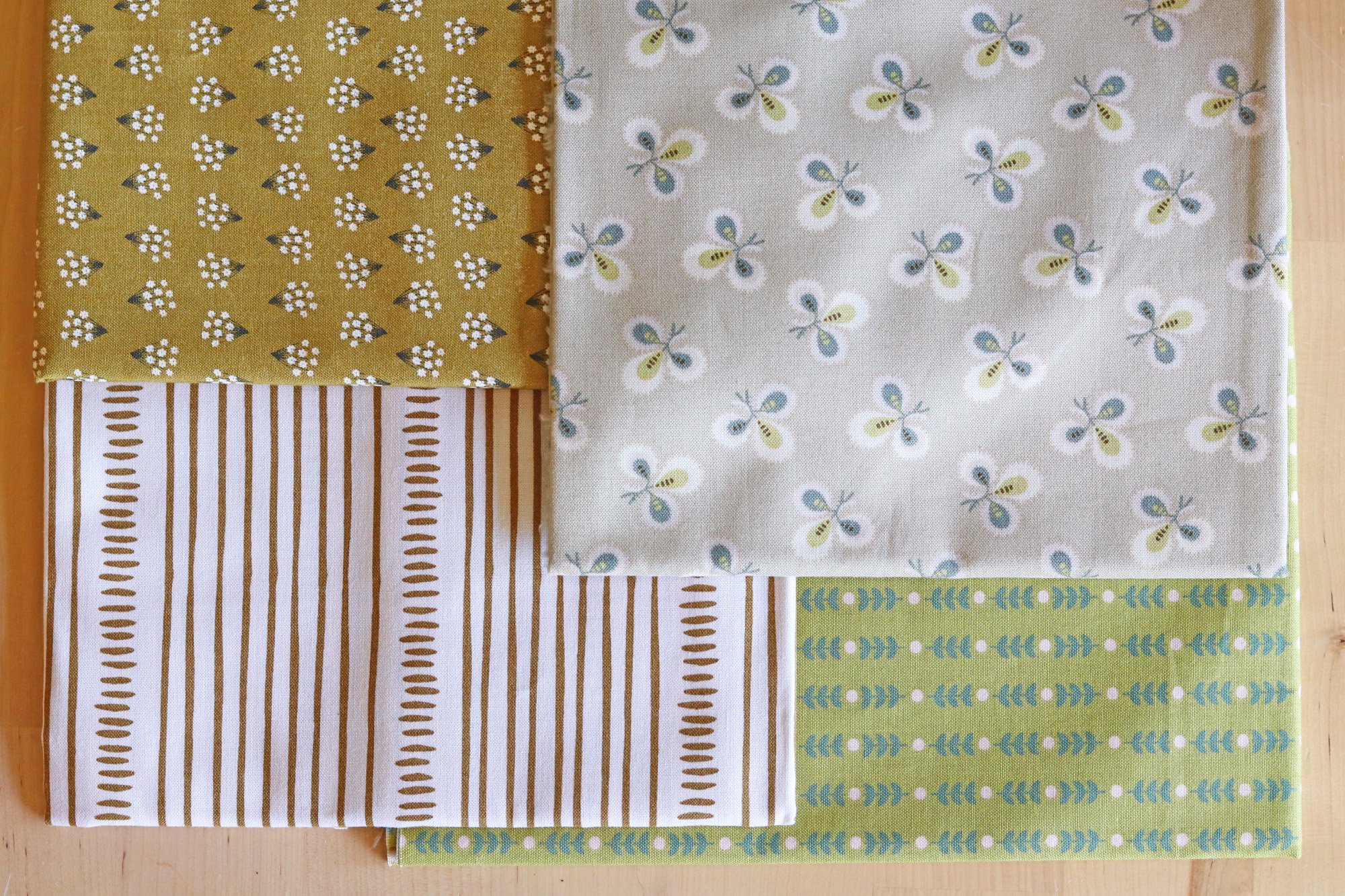
On this shopping trip, I was on a lookout for gold and burgundy. I added these prints from Quilt Sandwich Fabrics, beginning top left and moving clockwise: Mini Flowers Umber, Lady Tulip Cloverleaf, Community. Stems Olive and Martha Stripe. The first and the last represent just the gold for which I was searching - not too yellow and not too orange. These fabrics offer a saturated version of the shade (Mini Flowers) and a low volume version too (Martha Stripe).

My picks from A Thrifty Notion, pictured here, include the only burgundy fabric I found that really suits me. This is Speckled Purple Velvet, which I bought on a whim last year. I’ve since almost used it up because I have no color like it in my stash. A Thrifty Notion stocks the full range of Speckled fabrics, which is a great basic with unique and intense colors.
Stash Smart: Colors to Avoid
How to keep a fabric stash from growing unwieldy and overwhelming? Stash smart. Use the tools available to modern quilters to cultivate a healthy stash. For me this means shopping online so that I can compare the fabrics in my cart directly to those I already own. I actually carry my laptop to my fabric shelves and compare before completing a purchase.
This time, look for areas of overflow in your fabric stash. What colors do you already have in plenty? For me that’s dark orange and red. But, oops, I had a few of these in my cart! Out they go, saving space and money for the smarter additions.

Sometimes it takes a closer look. Here’s my stack of white/cream/low volume fabrics. I needed to replenish, but the new low volumes I was gravitating towards were white/cream fabrics with black details (like this and this). Something felt off about that, so I looked closer at my stash. Then I realized that the low volumes with black details are the ones I’m least likely to use. Some of them have been sitting in my stash for awhile. Instead, it’s the creamier low volumes that I reach for first.

My final selections from A Thrifty Notion include two beautiful creamy low volumes. I’m certain to use these soon!
Line 1 from left: Foxley Floral Natural Beauty, Menagerie Champagne (consistent favorite), Sandbox First Light, Cleats Blue (there’s a medium blue!)
Line 2 from left: Parchment First Light, Speckled Purple Velvet, Speckled Cactus, Hawthorne Black Strawberry Fields
How Much to Buy?
And that’s no simple question, am I right? My default is to purchase 1/2 yard cuts. That requires more fiscal commitment than a fat quarter, which I believe helps me be more selective. It’s also a more versatile cut, as compared to precuts. But a default is really just a starting point!
In this fabric shopping mini-series, I’ll highlight a few different ways to decide how much yardage to buy. The first: plan yardage based on category. The categories are: New Prints, Repeat Prints and Solids. As a rule, buy 1/2 yard cuts of new prints and 1 yard cuts of solids, when purchasing for your stash. If you’re restocking a print that’s proved especially useful to you, go in for 1 yard or more, based on your feeling.
I chose 1/2 yard cuts for all fabrics in this blog post, with two main exceptions. I opted for 1 yard cuts of each solid and a 1 yard cut of repeat favorite Speckled Purple Velvet. I consider it a rare color and want to make sure that it lingers in my stash.

on left, purple stash solids. on right, new purple solids and Speckled Purple Velvet
To create your own look and to express your true self as a quilter, begin with colors that spark joy. Try to think of color as a separate thing from designer collections or favorite stand-out prints. Think in hues, shades, intensities. Build a library of color in fabric that’s ready to cut and sew when your heart speaks.
A fabric stash is a privilege and an invitation. Begin with color!


