Temperature: Quilter's Color Quest

Welcome to March and the first step in Quilter’s Color Quest!
Are your color swatches ready? I think so! I’ve been seeing lots of color chips swirling around Instagram. Love your enthusiasm for our expedition through The Quilter’s Field Guide to Color: A Hands-on Workbook for Mastering Fabric Selection. Let’s start today in Part 1, Understanding Color.
When I organized my color course, I made a conscious decision not to start with color theory: you know, the color wheel and all that. Color theory is definitely useful (and interesting!), but I think we can get lost in making technical observations and forget the point.
“At its best, color is something we feel.”
In Part 1 of the book, my goal is to help you make very subjective connections to color, using the lenses of Temperature, Seasons and Emotions. During the month of March we’ll focus on two chapters: Using Temperature (pg. 16) and Seasonal Inspiration (pg. 22).
I first connected color temperature with patchwork when reading Jeni Baker’s blog in 2011. She led a Warm Cool Quilt-Along, where the patchwork pattern emerged by contrasting warm vs. cool colors. Such a simple concept, but so effective! I don’t think I’ve yet made a quilt 100% focused on warm vs. cool, like Jeni’s, but I have definitely used the concept to springboard scrap quilting ideas.

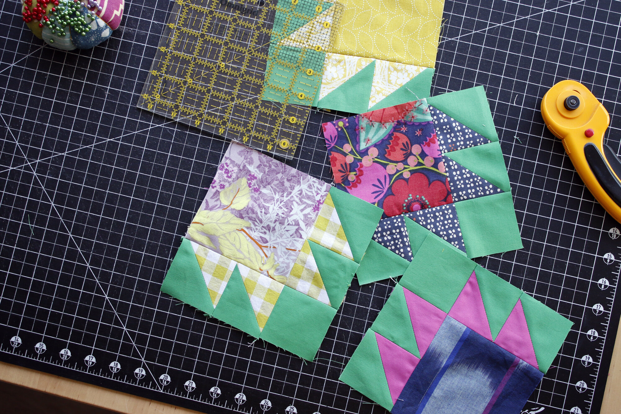
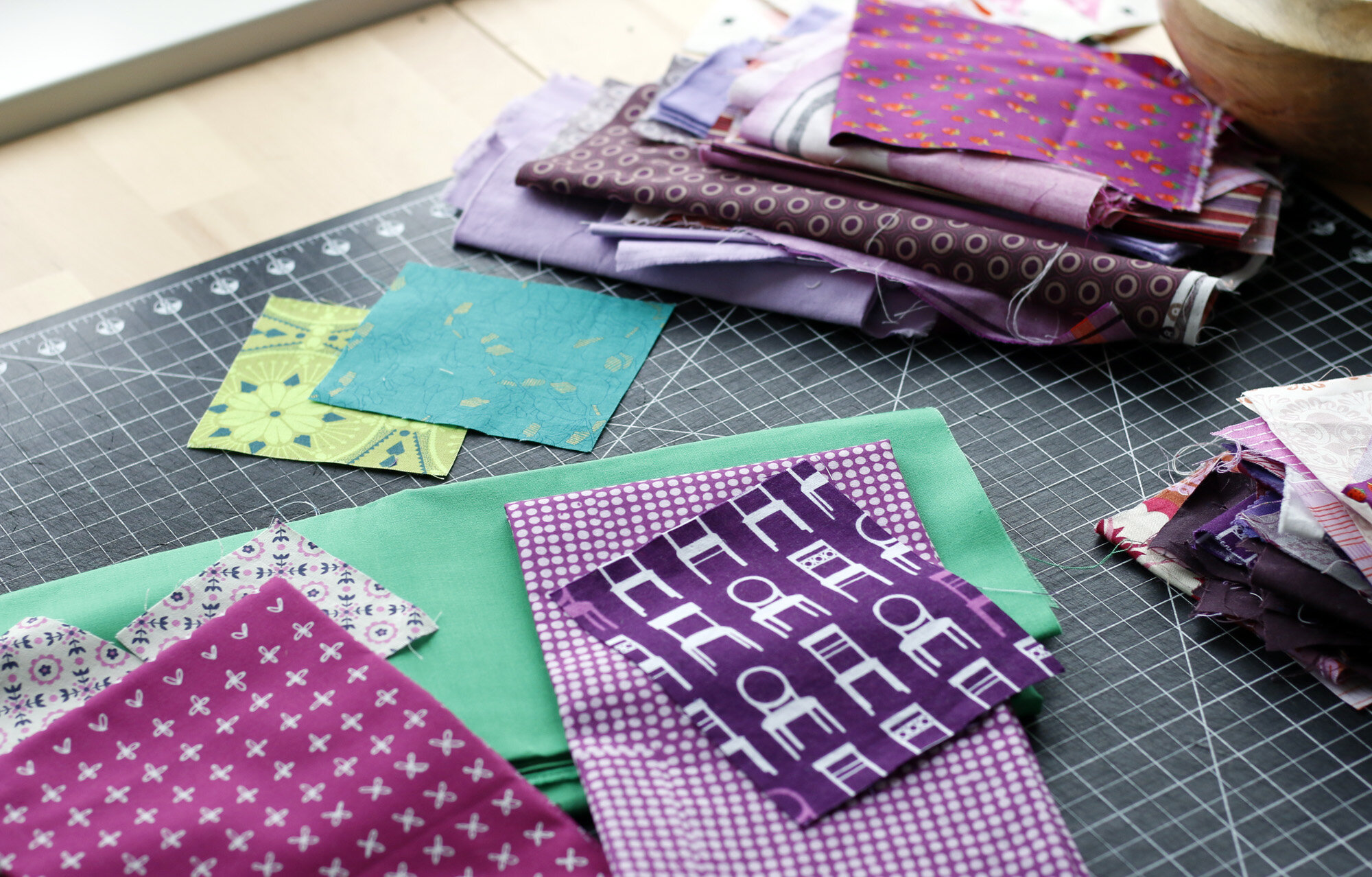
Yesterday I dumped out a box full of fabric and patchwork samples, created for The Quilter’s Field Guide to Color. They are all carefully separated and labeled. Inside each baggy is a collection of color ideas or patchwork made to illustrate a particular concept. So many possibilities!
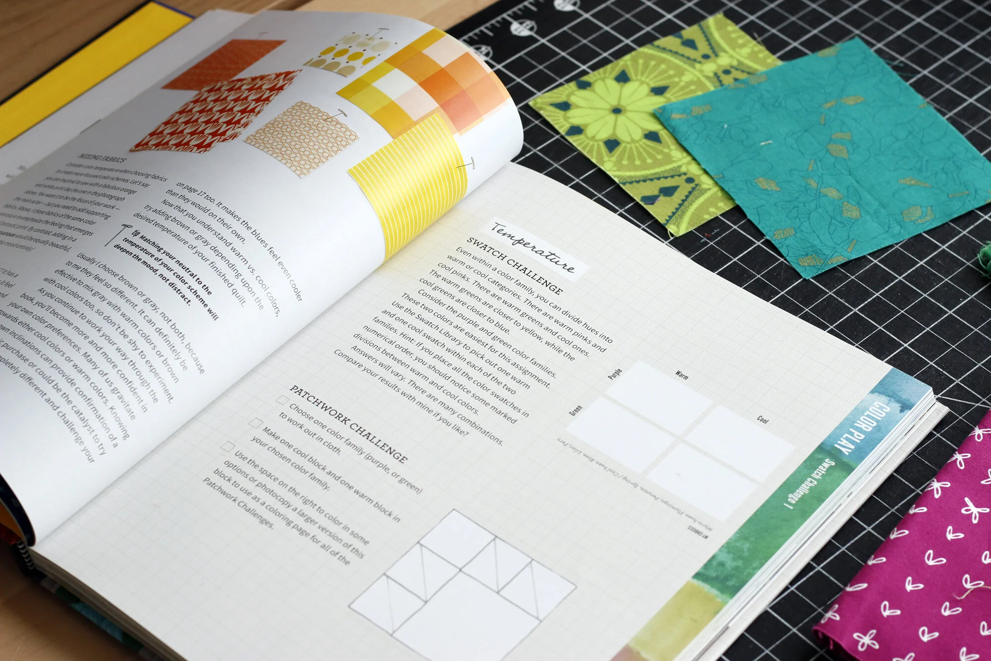
I shopped for very few fabrics when creating my book. The majority came from my stash, and I’m very glad to welcome them back. These two green squares make an appearance on pg. 18 to illustrate how we can identify warm and cool versions even within one color family. The lime fabric feels warm, while the emerald is cool.
Not sure what I’m talking about? Well, if you have the book, stop now and read the Temperature chapter! Then go ahead and do one or both challenges on page 21. Share a photo of your results on Instagram with #QuiltersColorQuest and #QuiltersFieldGuidetoColor. Each month I’ll be drawing one random winner from those who use the Color Quest hashtag. Each photo is a chance to win fabric! More on that later.

For the book I made these two blocks to illustrate warm vs. cool in the pink color family. They didn’t end up in the book, but I’m determined they shall end up in a quilt. No patchwork left behind! The cool pink (up top) is close to purple and the warm pink (lower) is akin to orange. That’s how it works in color families. You’re always bumping up against a neighbor when you look for the extremes of cool and warm.
In the book, I explain why temperature can be helpful beyond dividing warm vs. cool colors for a scrap quilt. The tip on page 20 is an excellent rule of thumb, for example. When mixing fabrics, temperature can light the way.
This weekend I made Bear Paw blocks in warm and cool versions of purple, a la the Patchwork Challenge on page 21. But, in a wild twist, I’m using Kona Fern green (available at Purple Stitches in the UK) as my background color, instead of a neutral. Yep, I’ve decided to challenge myself by using a bold color for my background color throughout Quilter’s Color Quest. On the one hand, it will make some exercises difficult (hmm, I like a challenge!); but on the other hand it will give my blocks a natural unity when they eventually come together as a quilt.
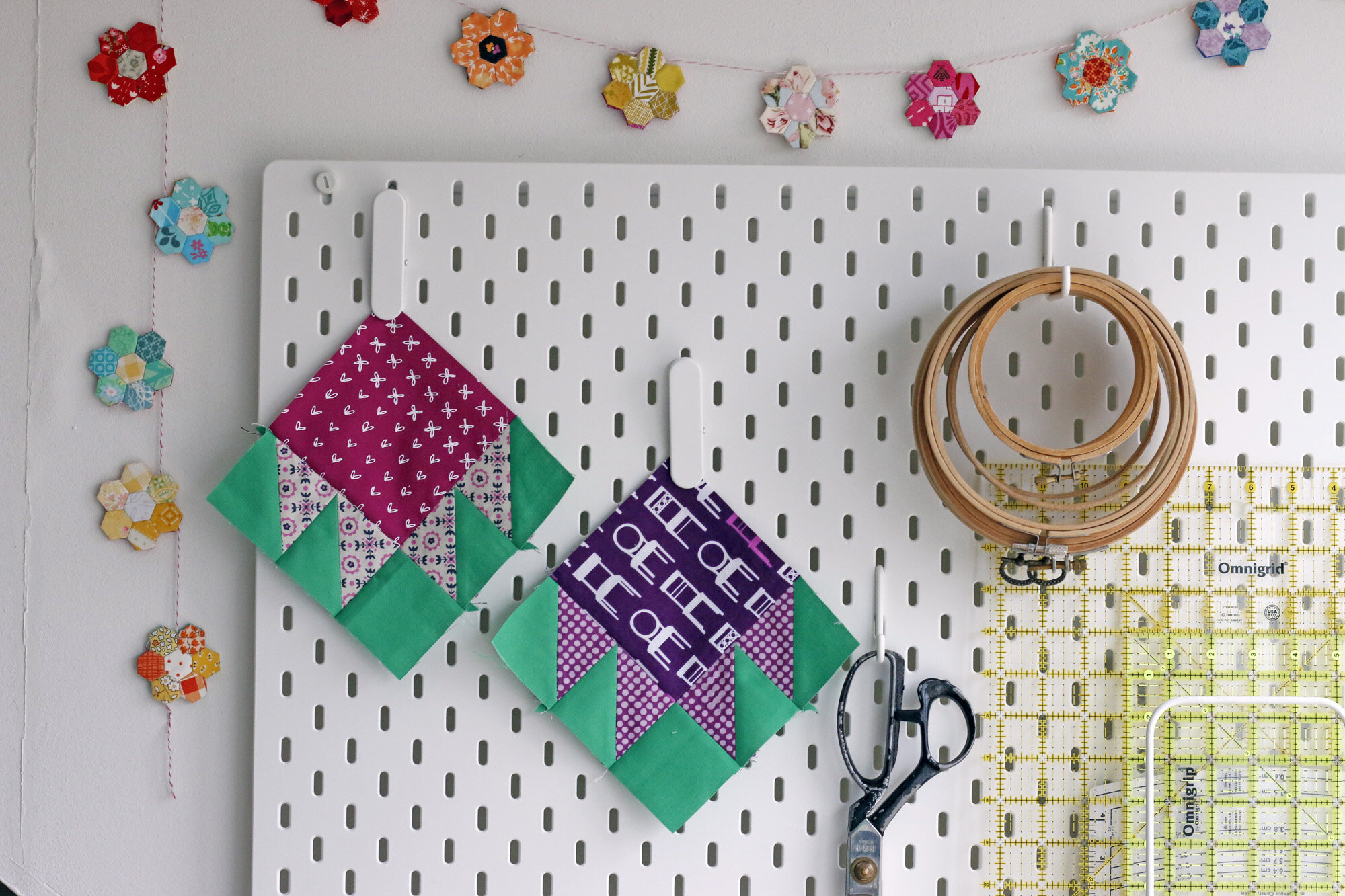
Here’s where I landed. Warm and cool and cute, cute, cute.
Can’t wait to see your blocks. Let the quest begin!