how to Choose Fabrics for English Paper Piecing
English Paper Pieced (EPP) quilts can be so incredibly stunning! The technique allows for intricate patchwork designs, but another key factor that makes certain EPP quilts extra special is the creative and intentional use of fabrics. There’s so much potential to play with fabric when sewing EPP!
I’m over a year into my Ice Cream Soda EPP project, and I’m still enjoying the meditative, hand-sewing process. Designer and paper-kit maker, Jodi Godfrey of Tales of Cloth, has asked me to share some tips today about using fabrics effectively for EPP. Jodi knows from my book, A Quilter’s Field Guide To Color: a Hands-on Workbook for Mastering Fabric Selection, that I like to get nerdy about fabric choices! Haha. I hope this is helpful!
6 Tips for Choosing EPP Fabrics
#1 Floaty Fussy Cuts
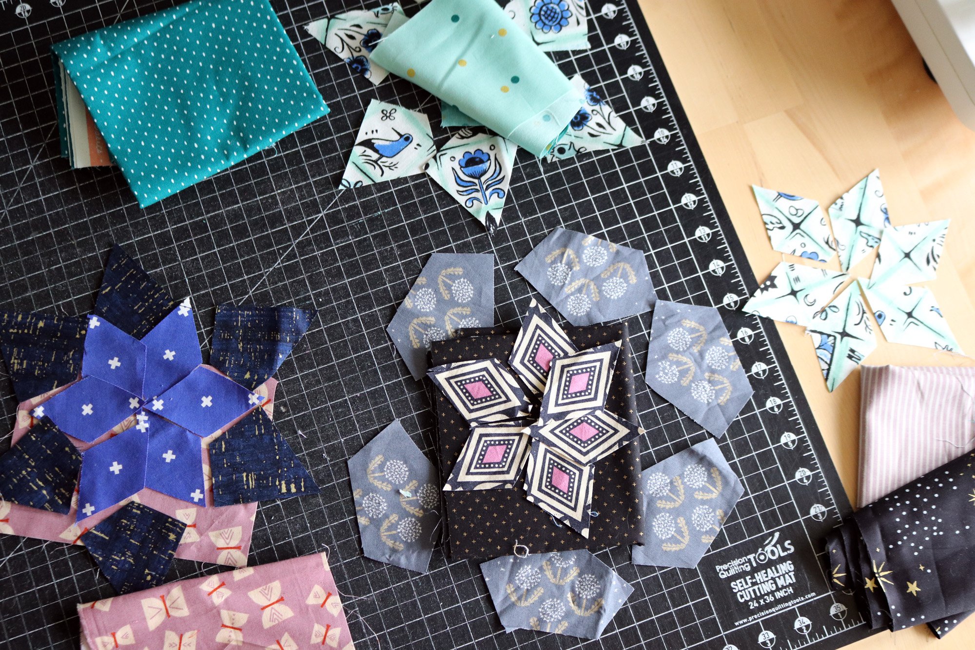
I bet you’ve heard of fussy cutting. It means you target a particular part of a printed fabric when you cut. Say you’re cutting a diamond shape? With fussy cutting you make a large polka dot fall in the very center of the diamond. That’s cool!
In this example, I’ve fussy cut fabrics for the kite-shaped pieces: flowers for the block to the left and racoons/flowers for the block to the right.

Both are fussy cut, but the block on the right looks much cleaner and prettier because the fussy cut shapes are floating in a lot of background. In contrast the flowers on the left are nested closely together in the printed fabric. Thus, little bits of other flowers show in the kite shape. It’s wise to search your fabrics for more floaty, generous backgrounds when planning to fussy cut.
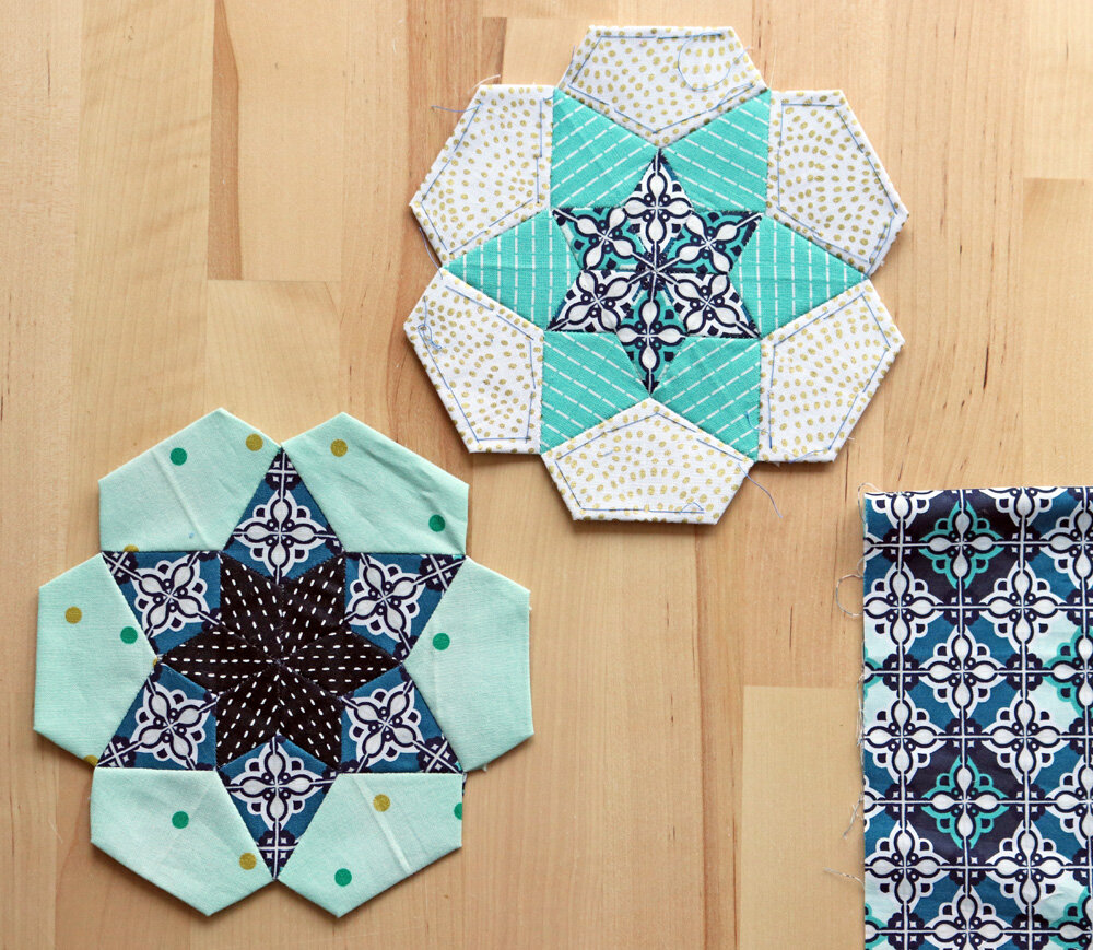
#2 Transformative Fussy Cuts
Fussy cutting doesn’t have to be limited to using fabric motifs as they exist. It’s rather exciting when you use a print to make a new shape! Pay attention to how patchwork EPP elements connect when joined. Can you transform your fabrics to create something unexpected?
In each of these examples, look for transformative fussy cutting in the center star shape. The plaid fabric transforms into a spinning pinwheel. The floral fabric makes a collaborative flower. The striped Dottie print distributes the dots only at the edges of the bright, blue star.
Such fabric wizardry is super satisfying! These ideas might not strike the first time you cut into a fabric for EPP. Usually, it’s the 2nd or 3rd time that I get a new idea. Experiment and explore!
#4 Multifaceted Fabrics
And speaking of exploration, take a second look at your more complicated prints. Fabrics that have several different color patterns, many different flowers, shapes, etc. offer a treasure trove of potential fussy cuts.
Take, for example, this diamond print with a repeating geometric design combined with a variety of background shades.
At first I didn’t feel that this print had much potential for my project. Then I realized I could target just one background shade to make a clean, saturated teal kite-shape (bottom, left).
The leftover fabric scraps from all that fussy cutting didn’t want to be thrown away. I found I could cut the smaller, diamond shape from the scraps and create the alternating white/turquoise center star (top, right).
And, I’m not done! I have a few more sets ready-to-sew that use the same print in other ways. Multifaced fabrics are full of possibilities!
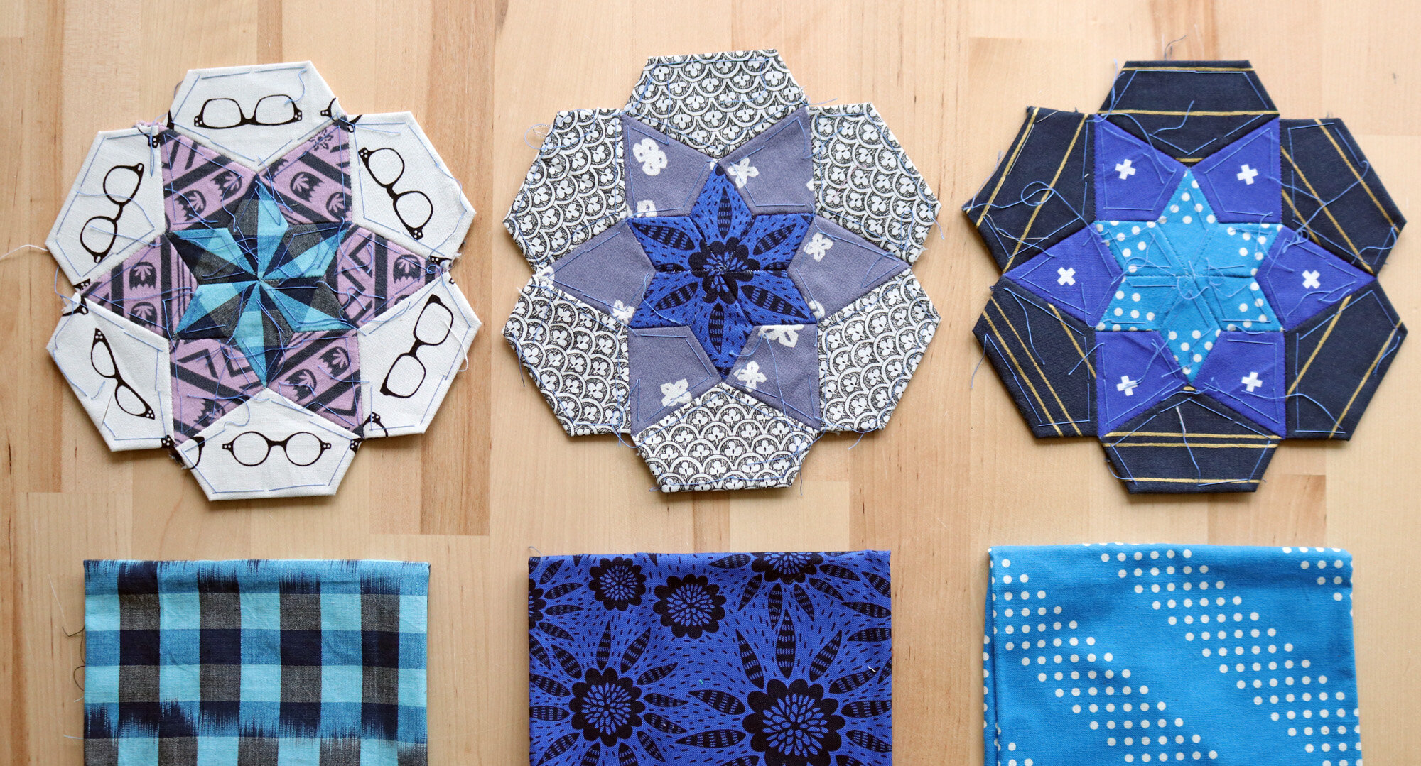
#3 Directional Fabrics
Directional prints are those that can be oriented upside down or sideways. A stripe, for example, is quite directional. A tossed star print is not.
How many directional prints can you spot here? The answer is - a lot! Yes, I use lots of stripes, but also grids, diamonds, and birds, all of which give the viewer a sense of direction.
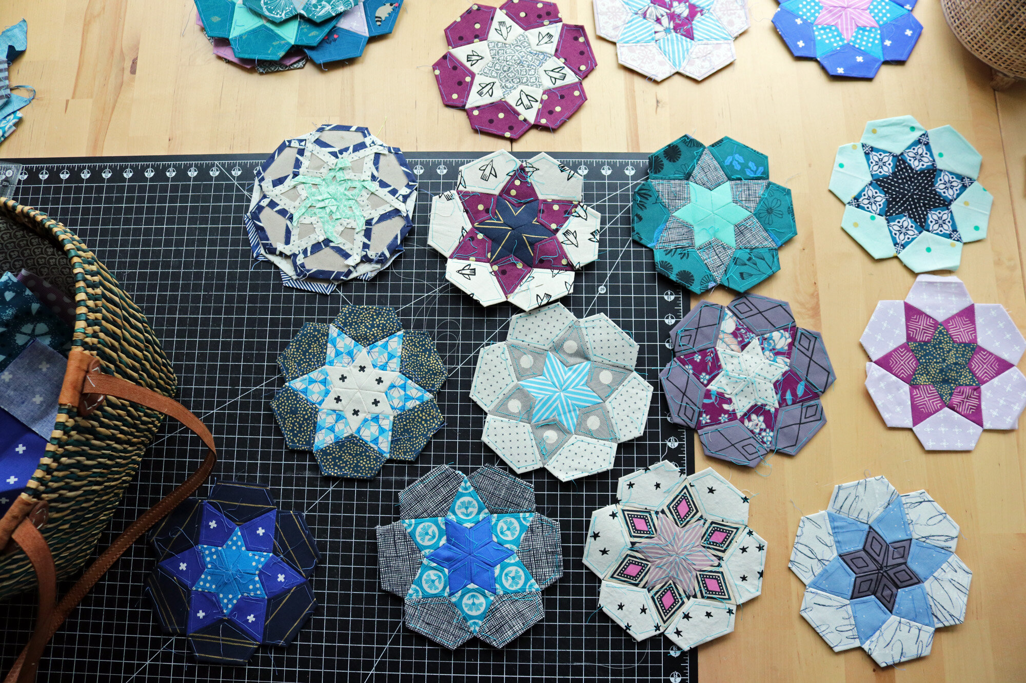
Why directional prints? They create movement. English paper pieced (EPP) designs often have block styles with a strong sense of center. Use directional prints to create a sense of moving around that center, in a circle, as with the block at the bottom left with dark navy/gold stripes. Or, use directional prints to create a sense of moving outward from or toward center, as I’ve done with the center stars below.

As much as a I love fussy cutting, I find using directional fabrics just as important. The black, pinstriped exploding star is one of my favorite fabric effects yet in this project. That’s why I’ve repeated it already three times!
#5 Simple Fabrics
EPP quilts are often quite complex, with unusual shapes such as kites and crowns. Add to that fussy cutting, plus directional movement and you might find the quilt growing a wee bit chaotic. It helps to use some simple fabrics, like simple stripes, solids and near-solids so that your more dynamic prints and special fussy cuts can breath.
It’s possible you’ll realize after you completed a block that fabric combos that seemed fun at first are actually a bit over-the-top. It happens to all of us!
Here’s a photo of just such a block. Every layer of the block is complex. The star center has an irregular print that is not fussy cut, but rather flighty (wink). The kite-layer has irregular gold stripes, which easily feel off-balanced. The final layer of bold plaid adds to the chaos, in my opinion.
It’s just a bit too much.
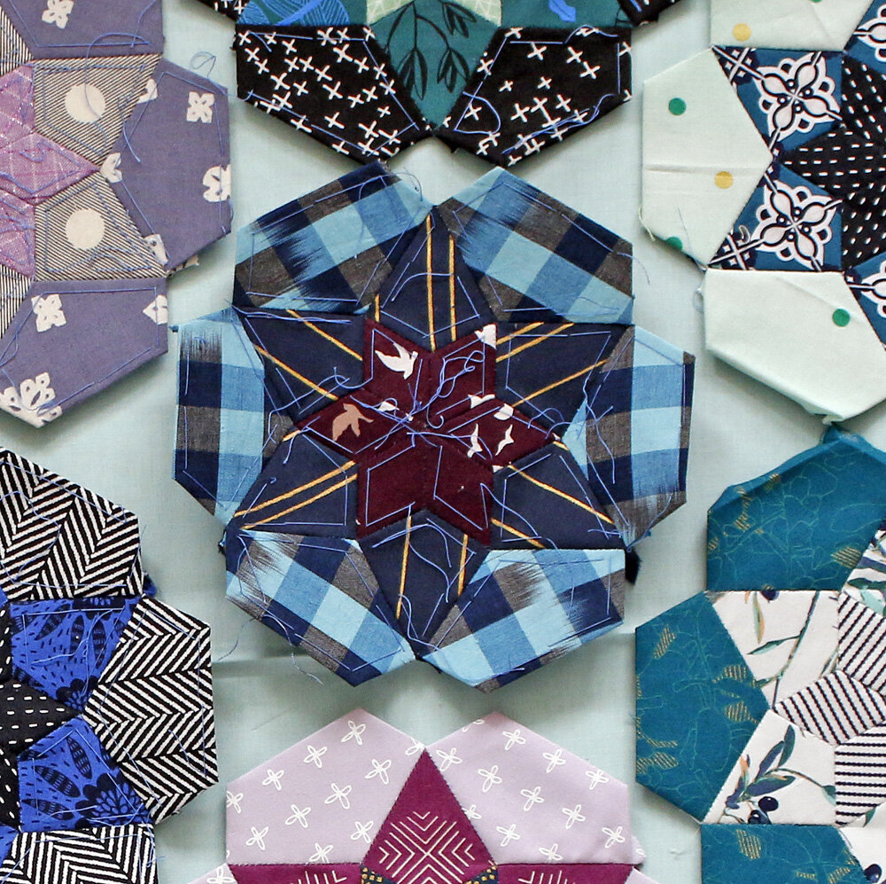
I usually don’t perform block-surgery, because less-than-ideal blocks blend with the rest and give a quilt character. However, in this case I decided to remove the plaid round and try again.
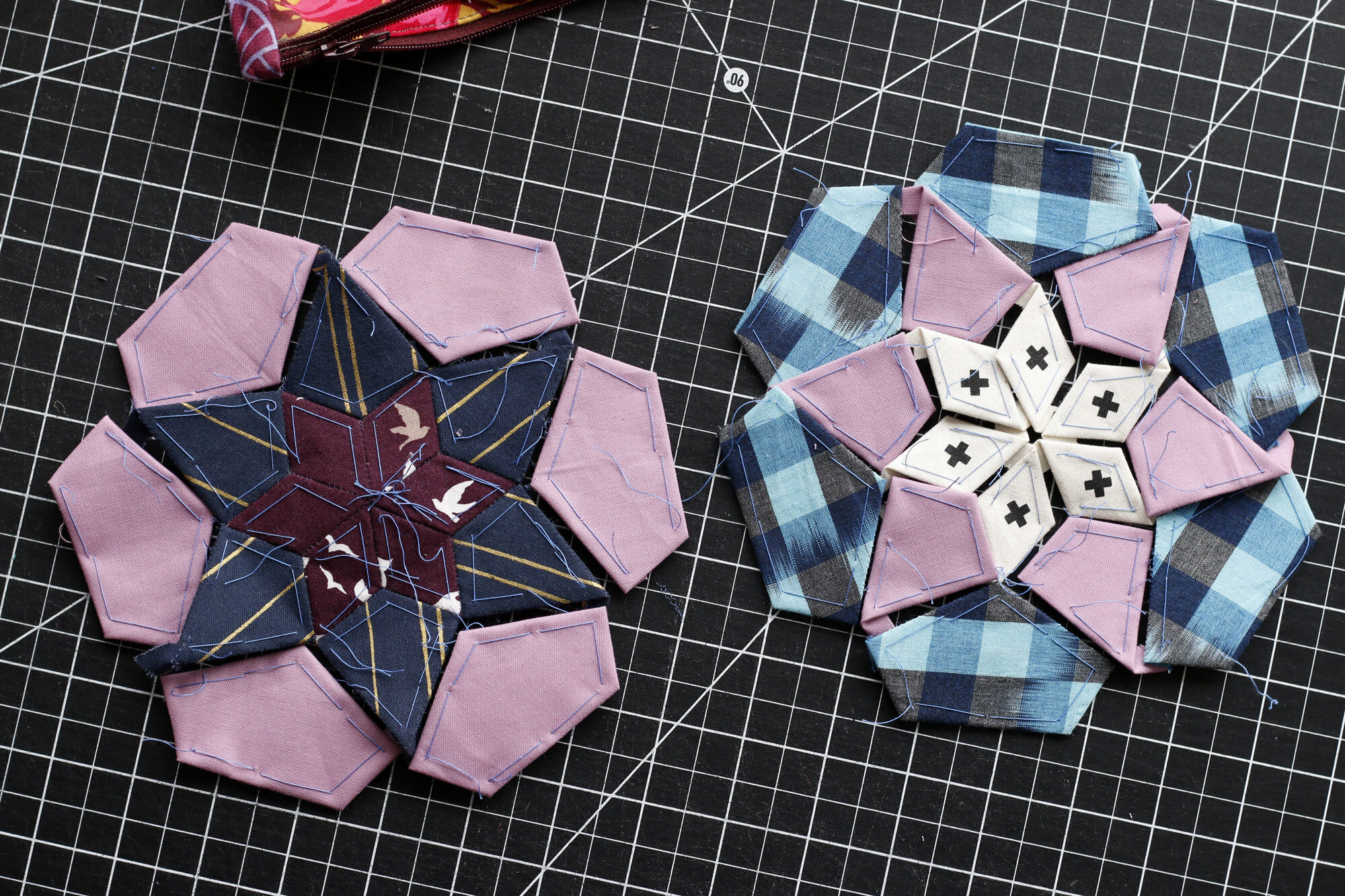
I created two new blocks from the one chaotic block. Notice I added simple, solid purple to calm things down. And, you know what? I like them both very, very much. It was totally worth the trouble!
#6 Play with Contrast
One last thing to consider - contrast. Contrast is a factor of color or value. I talk about both a lot in my book. For EPP you’ll often want to emphasize contrast between the layers of your blocks in order to draw attention to the beautiful, hand-sewn pieces.

Lots of Contrast
Probably your English paper pieced block has many layers or rounds. My Ice Cream Soda blocks have three rounds. Here are some blocks that have contrast between all three rounds, making each layer of the block stand out distinctly.
Less Contrast
It’s also fun to blend some of the EPP layers to limit the contrast to certain parts of the block. Playing around with contrast in this way can cause the different blocks to seem like a different construction, even though they are all sewn the same way.
The top two blocks blend the 2nd and 3rd layers so that the small, center star leaps out from the block.
The bottom two blocks blend the 1st and 2nd layers so that the larger star grabs the attention.
The more EPP layers you have to work with, the more possibilities for blocks with different emphasis!

Low Contrast
Of course, you can also make blocks with hardly any contrast between the EPP layers. This creates a softer, more subtle quilt. Sometimes it can even seem that the colors are shimmering!

Here are a few low contrast blocks of my own. I think that their quiet, subdued nature will add depth to my quilt.
Well, now I’m eager to go cut some new fabric groupings for my Ice Cream Soda quilt! I find fabric planning and cutting to be the very most fun part. I hope these tips will inspire you to explore and enjoy as well!