Gypsy Wife: Choosing Colors + Fabric
This post is part of the 2019 Gypsy Wife Quilt-Along! See all posts.
Whether you’re starting a new Gypsy Wife quilt or picking up a WIP, choosing colors and fabrics is probably on your mind as we get started. Here are some thoughts to help guide your decision-making process.
Contrast
The Gypsy Wife quilt has two main design aspects: blocks and background strips. I suggest you begin by deciding how much contrast you’d like to create between those aspects.
Low Contrast
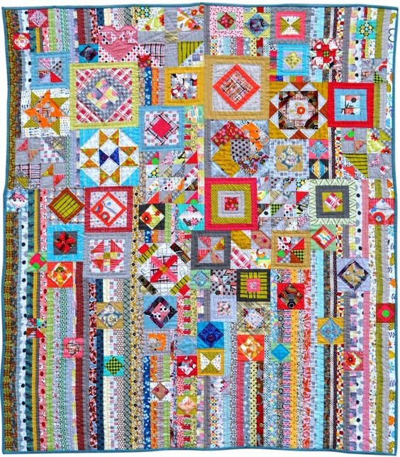
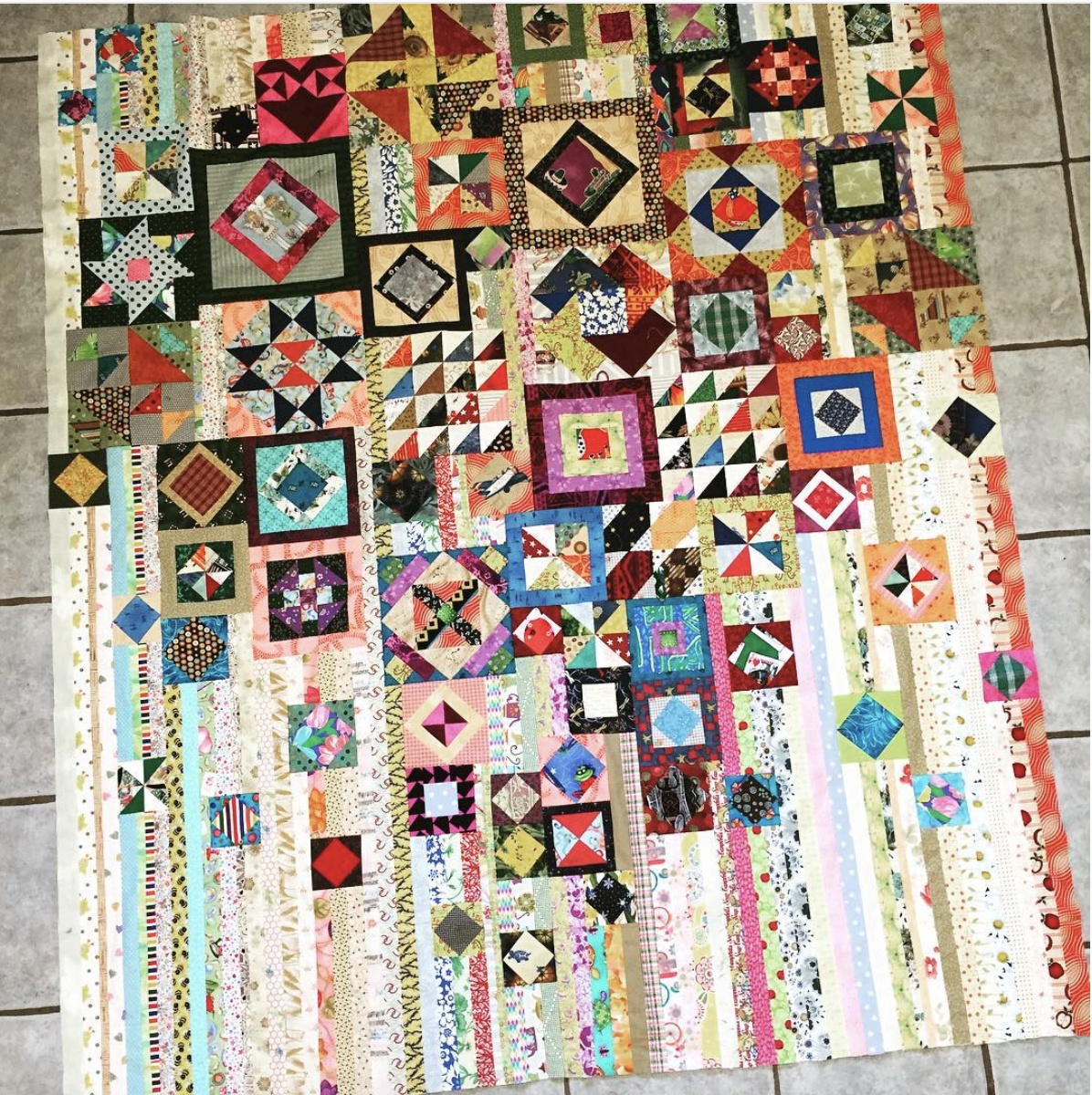
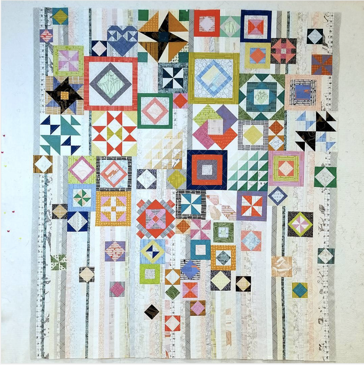
Pattern designer Jen Kingwell’s Gypsy Wife quilt (below) is scrappy. Notice that the colors and value (light/dark) are mixed fairly evenly throughout her quilt, including between blocks and background strips. Thus, her quilt does not have high contrast between those design elements.
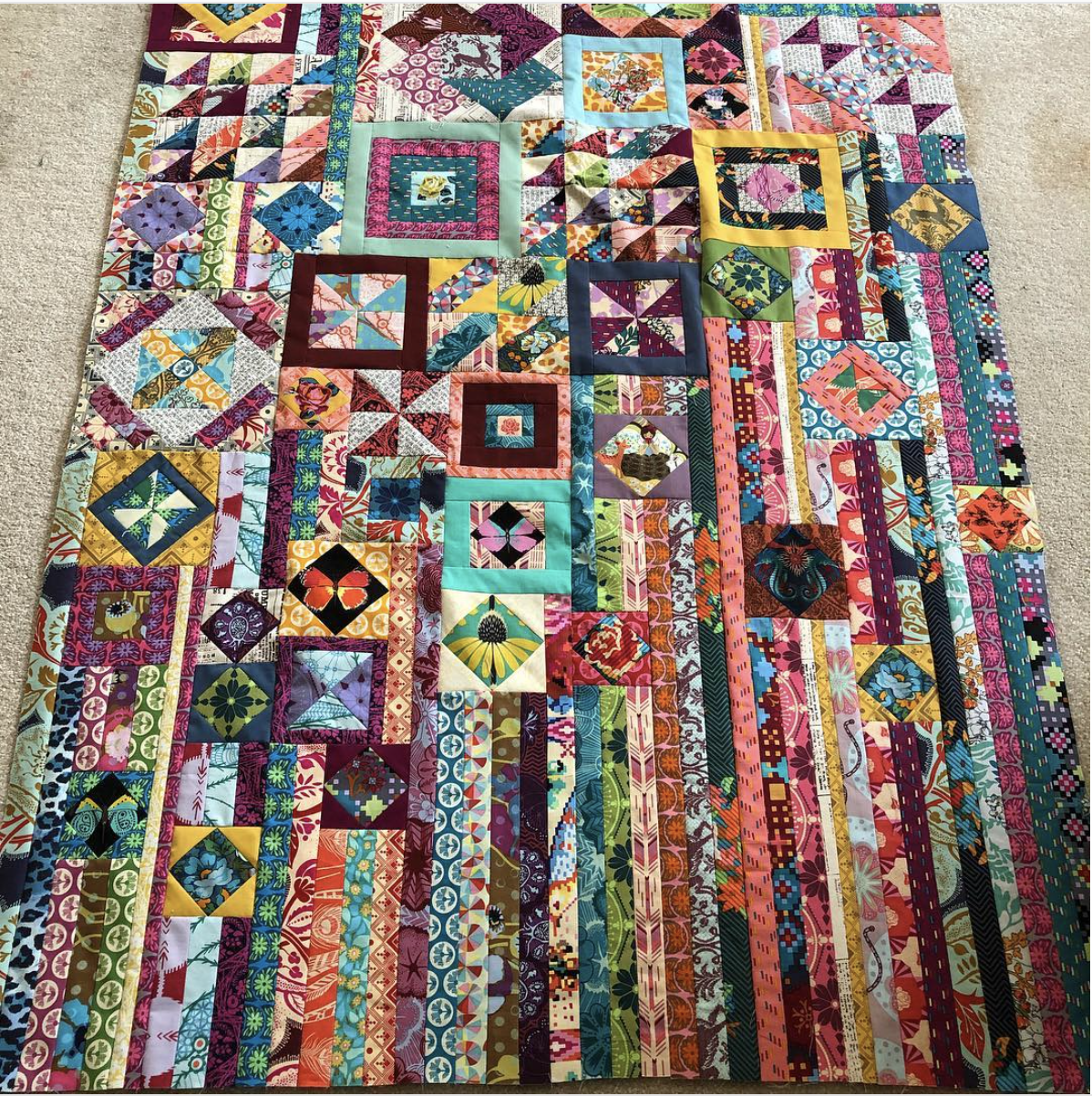
Here are two more quilts utilizing low contrast between blocks and strips. Fargo Quilter used Anna Maria Horner fabrics in a wide range of saturated and often dark colors. Susan Loretta Squirrel used a soft, targeted color scheme in medium to low value fabrics. Her quilt has the most contrast because her background strips alternate consistently.
If you plan to go scrappy, a low contrast design will be easy to achieve. Mixing fabrics without planning will usually create this effect. If you want to use the same fabrics in your blocks as in your background strips, cut background strips as you make blocks. You’ll already have fabrics out, so you’ll save time and create a nice assortment this way.
High Contrast
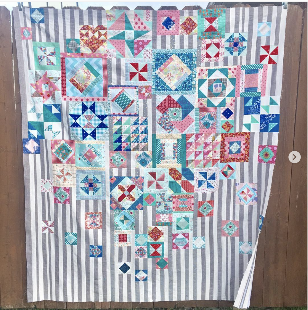
If you wish your blocks to stand out from the background strips, you’re thinking of a high contrast design. There are lots of ways to achieve this. You could still go scrappy, but use lighter value fabrics for your strips. Dark value tends to stand out. See Holly’s quilt for a good example of this approach.
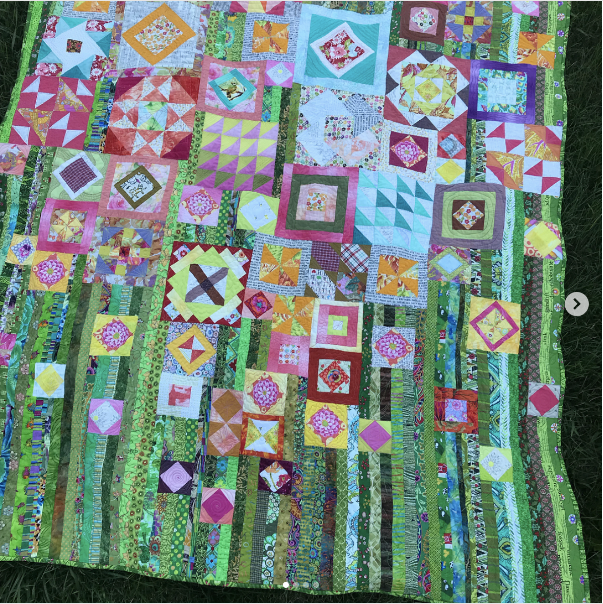
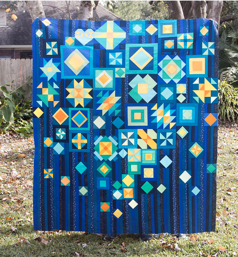
Or, create contrast with color. The blocks in ViolaKnitSew’s Gypsy Wife quilt leap out, since all her strips are green. An example of high contrast within a carefully controlled color scheme is Saroy’s blue version. Here entire quilt includes midnight blue and black, but the blocks are highlighted with the addition of low value yellow and aqua.
Creating contrast in these ways isn’t complicated. You can even wait until your blocks are complete to decide on background strips that will provide contrast. On the other hand, if you know from the start that you’d like to use low value strips to provide contrast with your blocks, you can be sure to make blocks that are medium/dark value so that they will really pop on those strips!
Color
Once you have an idea of your contrast goals, it’s a little easier to choose colors. We’ve already seen several examples of scrappy color schemes.
Do you prefer a focused color scheme? To get specific, consider browsing my Color, Color page. There you’ll find my mosaic contest prompts, each which presents a focused and inspiration-rich color scheme. Then pull fabrics from your stash that follow the prompt, just as you would for a mosaic contest.


You could also start with a favorite designer or fabric bundle. The below quilt by Nancy Little features fabrics by Carolyn Friedlander. As such, it has a natural sense of cohesion.
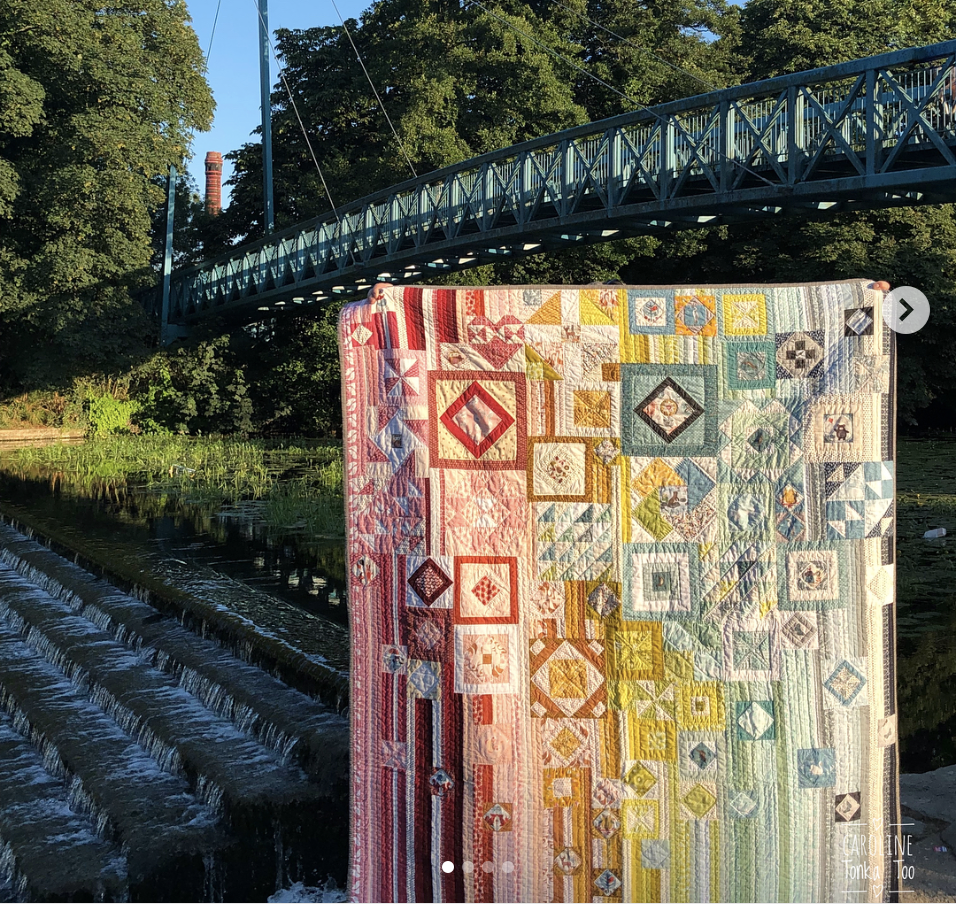
One Gypsy Wife quilt that really stands out to me is the above version by Carolyn Tonka Too. Her quilt has low contrast between blocks and strips. Instead, the blocks melt into a whole that blends from pink through orange-yellow-away and into gray. Lovely!
Scale + Style
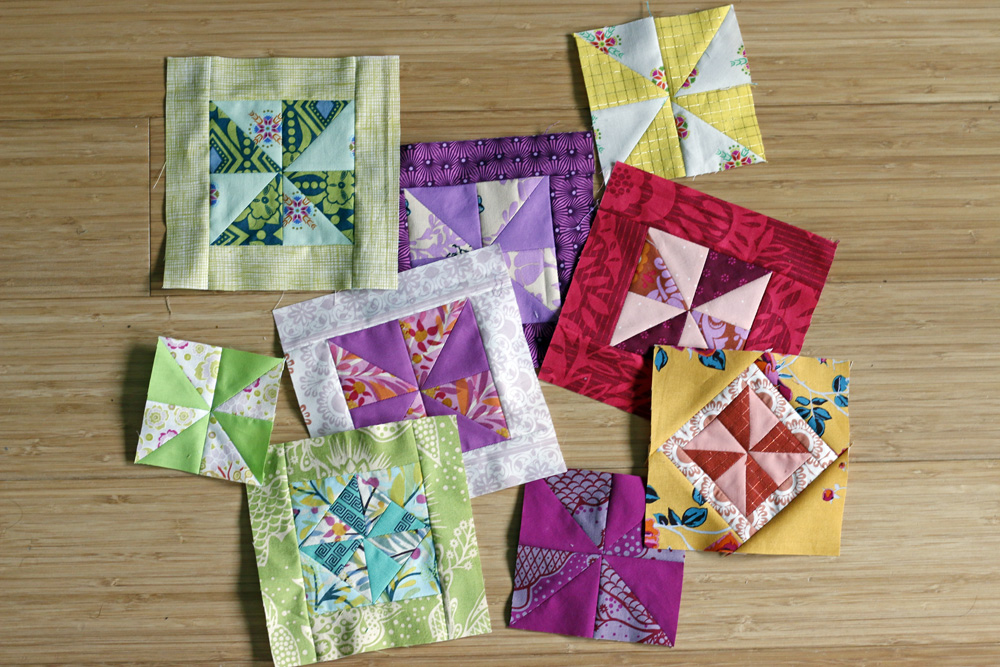
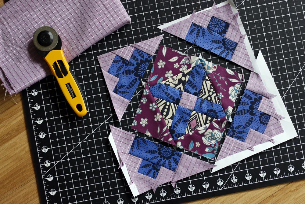
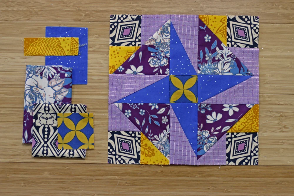
Assembling a fabric stack is one thing. Maybe you really get stuck when it’s time to choose fabrics for a particular block.
First, try not to stress. With a complex sampler quilt like Gypsy Wife, no one block really needs to be fantastic. They work together to make an impact. A few blocks with disappointing fabric and/or color choices isn’t going to ruin your quilt!
When you’re choosing fabrics for a block, consider scale. We often reach for medium to large scale prints first, because they grab our attention. Always do a mental check to ask if you’ll like the print when it’s cut into the pieces required for your block. Save the larger prints for blocks that have large cuts.
Lastly, consider your style. Do you want your Gypsy Wife quilt to feel quite visually complex, creating lots of movement? Then, use lots of different fabrics, colors and go light on solids. Do you prefer the versions that are quicker to visually process? Use a cohesive color scheme or an infusion of solids to create a more restful Gypsy Wife quilt. Also, don’t be afraid to repeat fabrics, especially ones that you feel are working well in blocks you’ve already made.
My Color + Fabric Choices
When I studied the GypsyWifeQuilt hashtag, I was drawn to versions that use low volume fabrics for the background strips, creating contrast between blocks and strips. I’ve decided to aim for medium contrast, something like Susan Loretta’s or ViolaKnitSew’s, where the blocks stand out gently.
Drawing inspiration from my great love for Anna Maria Horner fabrics and Caroline Tonka Too’s quilt, I’ve decided to create a rainbow-blend Gypsy Wife quilt. I began by pulling a rainbow of mostly AMH fabrics from my stash:

Next I printed the color sheet from GnomeAngel’s quilt-along and penciled in a guide for color placement above the quilt. I’m using purple as my rainbow bridge from cool colors (left) to warm colors (right).

Now I’m ready to start sewing!