choosing Fabrics
Half the fun of crafty blogs is getting inside the head of another creative, kindred spirit. Come along on my latest fabric-choosing journey and watch how my next quilt's fabric stack emerged and evolved, step-by-step.
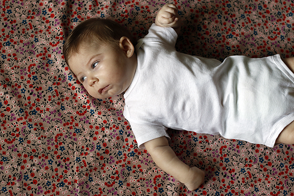
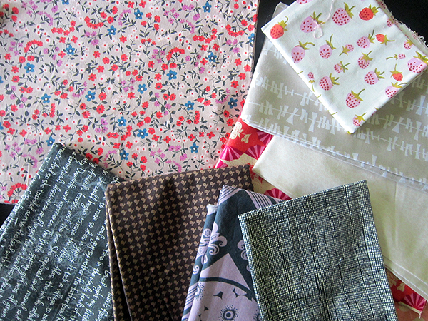
First, inspiration. I adore this vintage-inspired floral print by Kimberly Knight for Cotton & Steel. It has a sweet scale and personality, but (as usual) it's really the colors that get me. I'm most drawn to the background. That color is not-quite.... anything. Or not quite anything familiar. I'll say it's sort of a pink latte which reads warm, luxurious, sophisticated. I want this fabric to stand out in my quilt, and I'll draw my color scheme from its palette.
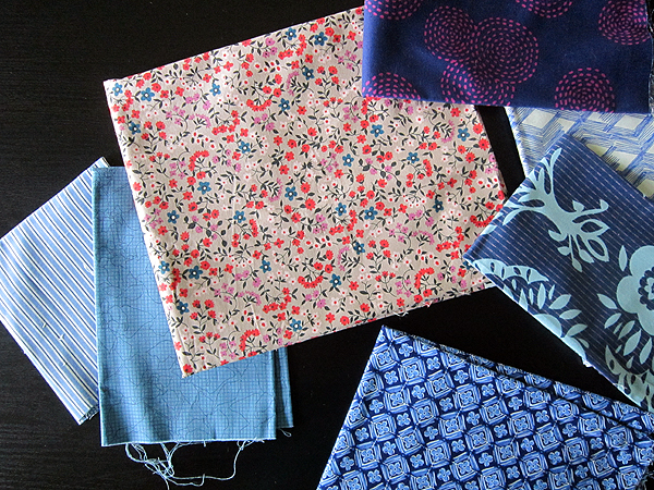
I begin by pulling dusty blues in a range of value, light through dark. The two on the left are immediate wins. Top right, the dark blue with purple circles has two colors from my inspiration fabric, but it's too geometrically bold. Nearby, the white/blue zigzag seems to modern. I like the navy print (middle right) for a darker value in the quilt, to create movement. The bottom print has flowers that look too much like my inspiration print. Sometimes matchy-matchy reads too flat.
Next I pull a variety of neutrals, hoping to harmonize with the pink latte background. Nothing works! Too brown, too gray, too complex. I decide I won't include yellow or orange in this quilt.
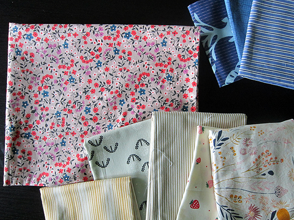
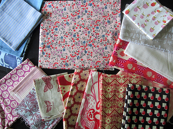
Choosing fabrics is always a learning process. That bum batch of neutrals helped me choose better ones - the three at far right. I like how the strawberry print has the exact warm purple and coral red as my inspiration print. The "kites" fabric is a rare shade of cobblestone that harmonizes well with the pink latte. The other is an extremely pale pink.
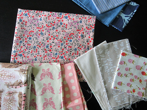
Building on that, I try three other light pink fabrics. I rule out the feathers (too distracting) and the butterflies (has some aqua butterflies that won't go).
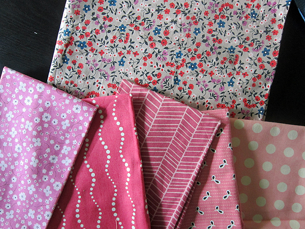
Hmmmm... maybe more pink? The print far left seems to match best, but it doesn't add anything interesting to my collection. "Same" is not always best! Moving on.
While putting the failed pinks back, I landed on a favorite coral/purple print from Anna Maria's Dowry collection (far right). Yes! These flowers feel right with my inspiration print, but are on a much larger scale, adding interest. Now I like where this is going!
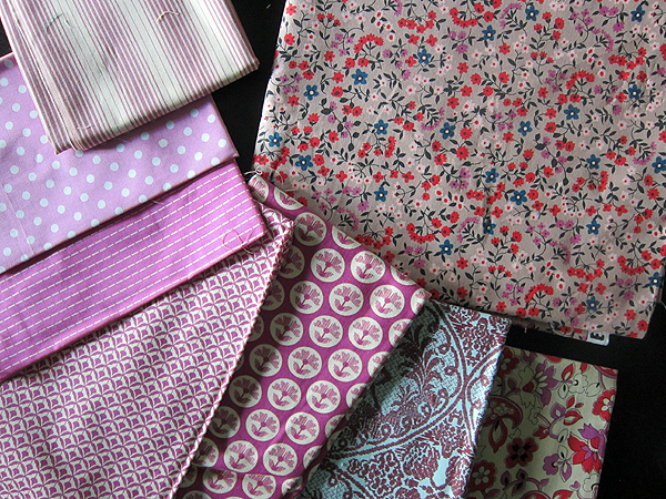
How about some purple? Most any of these could work. Funny how the purple/coral print at far right matches my inspiration exactly, but I know instantly I won't include it. The two prints have a different personality, in my opinion, with the lower Chicopee print reading more flat and modern. My inspiration print seems more sophisticated than that.
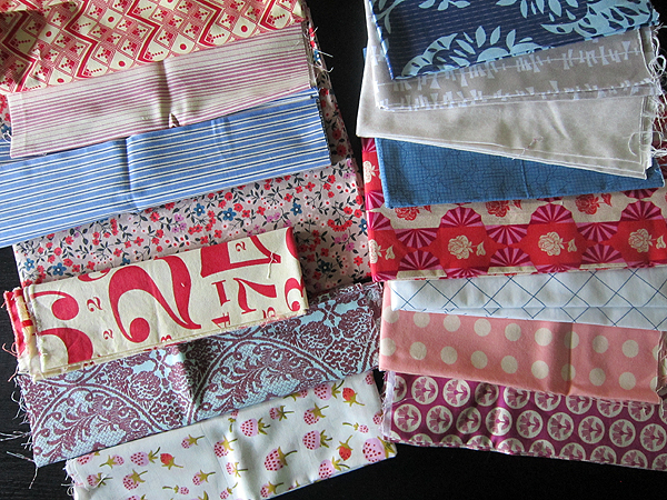
Here is my collection so far. I've gathered a range of dusty blues, purples, one pale pink, one interesting red and some neutrals. I can see now that the deer fabric has a slightly blue background. It's meant to be.
What's missing?
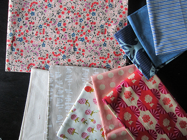
Maybe some more dark value fabrics? After all, the inspiration floral has almost-black leaves. But I can't tell at this point if any of these dark prints will enhance my work, so I set them aside.
I consider more reds. The black/red geometric would clearly take over. It's out. I'm not sure about the rest...
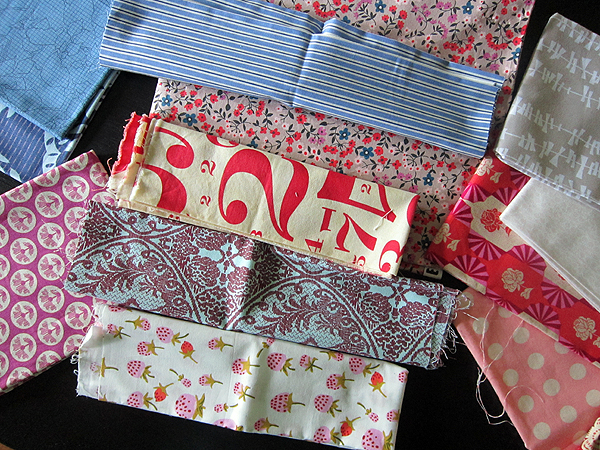
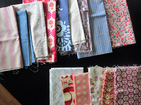
So I figure it's time to arrange my fabric more like I will cut and piece it in the quilt. Hmmm.. maybe that big numbers print could be an interesting contrast? It would be that quirky print in the piece, with loads of personality.
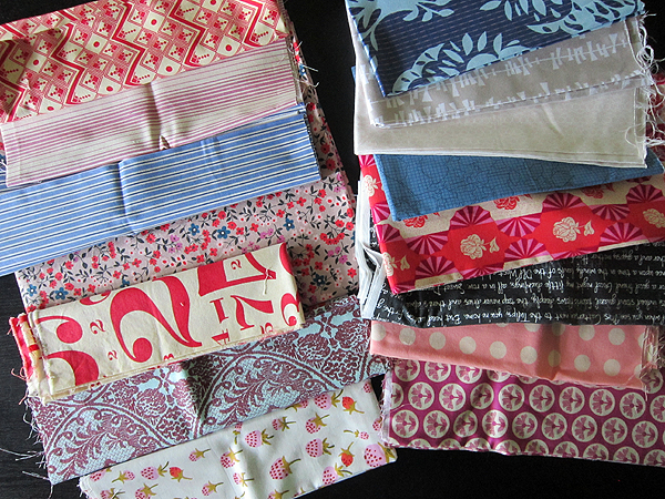
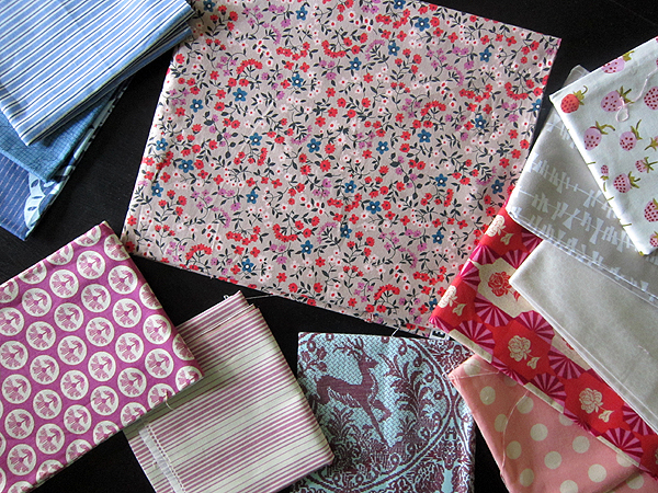
Now I lay out all my fabrics and take a step back. I slip the dark value fabrics in and out of the picture to decide if they enhance the work. Here I'm trying the black text print in the right column of fabrics.
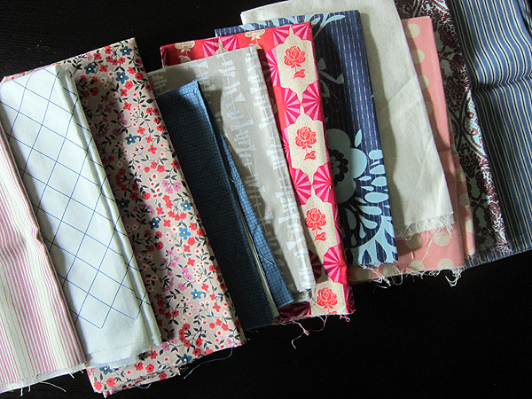
Here I've swapped out the black text for a white/blue grid.
I like the effect of the lighter print best. I realize that the dark values have a tendency to distract from my inspiration print. Ok, but I still don't feel sure about this collection. At this point I keep pulling out fabrics from my stash, but nothing improves the mix. I wonder... is it too busy?
In a flash of insight I decide to pull all the fabrics I like best towards the top. At first I'm thinking that these are the fabrics I'll cut more of, with the lower fabrics being used in lesser quantity. But once I see my favorites arranged at top, I realize that less is more. I want to create a warm, luxurious look (like my inspiration print), not a funky, scrappy look. Using only a few prints with personality will help my inspiration print have visual room to shine.
So, there you have it - my finished collection. Do you like how it turned out? I bet you would have made some different decisions, and that's quite all right. Our different ways of seeing color and design are what keeps this all so interesting. And I hope this has been interesting!
Alright, I best get to cutting! Thanks for stopping by.
First, inspiration. I adore this vintage-inspired floral print by Kimberly Knight for Cotton & Steel. It has a sweet scale and personality, but (as usual) it's really the colors that get me. I'm most drawn to the background. That color is not-quite.... anything. Or not quite anything familiar. I'll say it's sort of a pink latte which reads warm, luxurious, sophisticated. I want this fabric to stand out in my quilt, and I'll draw my color scheme from its palette.
I begin by pulling dusty blues in a range of value, light through dark. The two on the left are immediate wins. Top right, the dark blue with purple circles has two colors from my inspiration fabric, but it's too geometrically bold. Nearby, the white/blue zigzag seems to modern. I like the navy print (middle right) for a darker value in the quilt, to create movement. The bottom print has flowers that look too much like my inspiration print. Sometimes matchy-matchy reads too flat.
Next I pull a variety of neutrals, hoping to harmonize with the pink latte background. Nothing works! Too brown, too gray, too complex. I decide I won't include yellow or orange in this quilt.
Choosing fabrics is always a learning process. That bum batch of neutrals helped me choose better ones - the three at far right. I like how the strawberry print has the exact warm purple and coral red as my inspiration print. The "kites" fabric is a rare shade of cobblestone that harmonizes well with the pink latte. The other is an extremely pale pink.
Building on that, I try three other light pink fabrics. I rule out the feathers (too distracting) and the butterflies (has some aqua butterflies that won't go).
Hmmmm... maybe more pink? The print far left seems to match best, but it doesn't add anything interesting to my collection. "Same" is not always best! Moving on.
While putting the failed pinks back, I landed on a favorite coral/purple print from Anna Maria's Dowry collection (far right). Yes! These flowers feel right with my inspiration print, but are on a much larger scale, adding interest. Now I like where this is going!
How about some purple? Most any of these could work. Funny how the purple/coral print at far right matches my inspiration exactly, but I know instantly I won't include it. The two prints have a different personality, in my opinion, with the lower Chicopee print reading more flat and modern. My inspiration print seems more sophisticated than that.
Here is my collection so far. I've gathered a range of dusty blues, purples, one pale pink, one interesting red and some neutrals. I can see now that the deer fabric has a slightly blue background. It's meant to be.
What's missing?
Maybe some more dark value fabrics? After all, the inspiration floral has almost-black leaves. But I can't tell at this point if any of these dark prints will enhance my work, so I set them aside.
I consider more reds. The black/red geometric would clearly take over. It's out. I'm not sure about the rest...
So I figure it's time to arrange my fabric more like I will cut and piece it in the quilt. Hmmm.. maybe that big numbers print could be an interesting contrast? It would be that quirky print in the piece, with loads of personality.
Now I lay out all my fabrics and take a step back. I slip the dark value fabrics in and out of the picture to decide if they enhance the work. Here I'm trying the black text print in the right column of fabrics.
Here I've swapped out the black text for a white/blue grid.
I like the effect of the lighter print best. I realize that the dark values have a tendency to distract from my inspiration print. Ok, but I still don't feel sure about this collection. At this point I keep pulling out fabrics from my stash, but nothing improves the mix. I wonder... is it too busy?
In a flash of insight I decide to pull all the fabrics I like best towards the top. At first I'm thinking that these are the fabrics I'll cut more of, with the lower fabrics being used in lesser quantity. But once I see my favorites arranged at top, I realize that less is more. I want to create a warm, luxurious look (like my inspiration print), not a funky, scrappy look. Using only a few prints with personality will help my inspiration print have visual room to shine.
So, there you have it - my finished collection. Do you like how it turned out? I bet you would have made some different decisions, and that's quite all right. Our different ways of seeing color and design are what keeps this all so interesting. And I hope this has been interesting!
Alright, I best get to cutting! Thanks for stopping by.