a Value Dance quilt
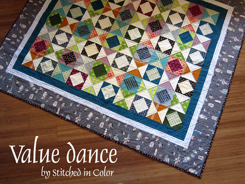
When you look at this quilt, I wonder what you see? Do your eyes move about? Is it visually overwhelming, crowded? Or, perhaps, entirely underwhelming in it's overall predictability?

I confess, I have had and probably still have mixed feelings about this quilt. It didn't come easily. As I weighed different options, I often felt hemmed in by my assignement to use value in a predictable, repetitive way. Repetitive kept feeling... well borring. And I knew it didn't have to be. One glance at Amy's Bargain Basement layout shows that repetitive use of value can be pretty sharp, to say the least.

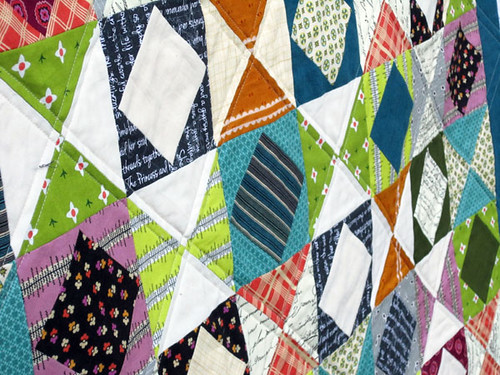
Rather than picking up an existing block design, I decided to put something together myself so that I'd be entertained by the new (to me) layout, at least. Since I have a soft spot for on point squares, I combined those with hourglass blocks and assigned value relationships that would create the appearance of larger square-in-square blocks.

Here's the quilt in black and white. With the colors washed out, it's easy to see the value relationships. Larger squares emerge as the on point square and hourglass blocks work together.
With all the color rolling back in, those value relationships are definitely obscured. But, you know what? I like that! I was hoping that the value pattern would read a bit subtly, hopefully enticing the careful observer to study and muse until more layers emerge. In other words, I was hoping to make the quilt more interesting by making the values less obvious.

One way I blurred the value lines was to use prints for my light values. If you prefer to sharpen the value relationships, try using all solid white or another pale solid for your "light" values.

Another way I blurred the lines was by using lots of color. It seems that more color distracts the eye from perceiving value. In contrast, a quilt sewn in just blue and green, for example, would have much more obvious value patterns.
After I figured out that the gingham border was a no go, I really struggled to find another option. In retrospect, I would have preferred making more hourglass and on point blocks rather than bordering it at all. Oops. Well, mistakes are how we learn! Even so, I do like how the bright white memoir print border totally pops as a frame. Since I already had value on the brain, I think I made better choices in my border fabrics, even if it did take me eons to decide.

One thing I do love is the backing. Oh, the backing! This is not just a fab Chicopee print, it's a Chicopee Cordoruy fabric. And trust me - you want some for your quilt back. It's a.m.a.z.i.n.g. I love a quilt backed in flannel. This corduroy feels like flannel, just with slightly more heft. Slightly. It's a super fine whale corduroy. You can probably just make out the whales here. It's deliciously soft, cuddly and $7 a half yard at Fabricworm. This corduroy (from Freespirit, who also makes Anna Maria Horner's flannel) has a nice drape that would make it more suitable for pajamas than for your classic corduroy jumper. So really, think flannel. It's the perfect quilt back!

Am I done gushing? Well, did I mention that I think that red "simple plaid" is gorgeous, classic and modern all at once? And, I do love how it sits against a favorite Chicopee print I used for binding. There, now I'm done.

If there is a soul out there who wants to make Value Dance, it finishes at 52" x 62". The hourglass blocks are quick and fun to make, in my opinion and the on point squares are such cute little beings. I'd suggest this quilt to an experienced beginner or seasoned quilter, since it does require accurate piecing to make for happy points. I used 6-7 fabrics each for medium and dark values and only 4 fabrics for my light values. My first Value Dance quilt tutorial will post Tuesday of next week.
Meanwhile, do stop by Leila's blog at Where the Orchids Grow for a value primer today. If you have any lingering questions about what the heck value is, I trust they'll be satisfied!

I confess, I have had and probably still have mixed feelings about this quilt. It didn't come easily. As I weighed different options, I often felt hemmed in by my assignement to use value in a predictable, repetitive way. Repetitive kept feeling... well borring. And I knew it didn't have to be. One glance at Amy's Bargain Basement layout shows that repetitive use of value can be pretty sharp, to say the least.

Rather than picking up an existing block design, I decided to put something together myself so that I'd be entertained by the new (to me) layout, at least. Since I have a soft spot for on point squares, I combined those with hourglass blocks and assigned value relationships that would create the appearance of larger square-in-square blocks.

Here's the quilt in black and white. With the colors washed out, it's easy to see the value relationships. Larger squares emerge as the on point square and hourglass blocks work together.
With all the color rolling back in, those value relationships are definitely obscured. But, you know what? I like that! I was hoping that the value pattern would read a bit subtly, hopefully enticing the careful observer to study and muse until more layers emerge. In other words, I was hoping to make the quilt more interesting by making the values less obvious.

One way I blurred the value lines was to use prints for my light values. If you prefer to sharpen the value relationships, try using all solid white or another pale solid for your "light" values.

Another way I blurred the lines was by using lots of color. It seems that more color distracts the eye from perceiving value. In contrast, a quilt sewn in just blue and green, for example, would have much more obvious value patterns.
After I figured out that the gingham border was a no go, I really struggled to find another option. In retrospect, I would have preferred making more hourglass and on point blocks rather than bordering it at all. Oops. Well, mistakes are how we learn! Even so, I do like how the bright white memoir print border totally pops as a frame. Since I already had value on the brain, I think I made better choices in my border fabrics, even if it did take me eons to decide.

One thing I do love is the backing. Oh, the backing! This is not just a fab Chicopee print, it's a Chicopee Cordoruy fabric. And trust me - you want some for your quilt back. It's a.m.a.z.i.n.g. I love a quilt backed in flannel. This corduroy feels like flannel, just with slightly more heft. Slightly. It's a super fine whale corduroy. You can probably just make out the whales here. It's deliciously soft, cuddly and $7 a half yard at Fabricworm. This corduroy (from Freespirit, who also makes Anna Maria Horner's flannel) has a nice drape that would make it more suitable for pajamas than for your classic corduroy jumper. So really, think flannel. It's the perfect quilt back!

Am I done gushing? Well, did I mention that I think that red "simple plaid" is gorgeous, classic and modern all at once? And, I do love how it sits against a favorite Chicopee print I used for binding. There, now I'm done.

If there is a soul out there who wants to make Value Dance, it finishes at 52" x 62". The hourglass blocks are quick and fun to make, in my opinion and the on point squares are such cute little beings. I'd suggest this quilt to an experienced beginner or seasoned quilter, since it does require accurate piecing to make for happy points. I used 6-7 fabrics each for medium and dark values and only 4 fabrics for my light values. My first Value Dance quilt tutorial will post Tuesday of next week.
Meanwhile, do stop by Leila's blog at Where the Orchids Grow for a value primer today. If you have any lingering questions about what the heck value is, I trust they'll be satisfied!